Sites We Like: Type Quest, Letterpress of Tulsa, & University of Reading
We love everything about typography, so it’s no surprise that we spend a lot our online time reading about it in just about every form. Here are a few sites we noticed that not only taught us a little more, but also made some sleek type selections of their own.
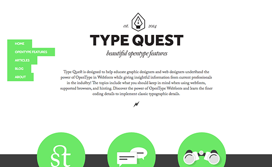
Using OpenType on your websites is a tricky undertaking for any designer, but Type Quest breaks the process down to make it a little less intimidating—and also shows off some of what OpenType can do. Body text is set in the fully-ligatured glory of Adobe Caslon, with headers in Effra Bold (and, if you can find it, one subhead demonstrating the swashy possibilities of Bello).
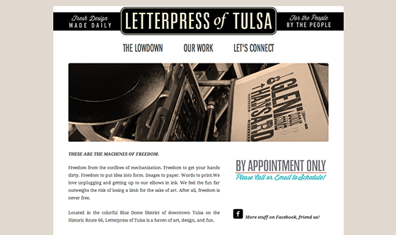
There is so much to love about the Letterpress of Tulsa, from its two antique presses (named Beatrice and Matilda) to the type choices for its homepage: Droid Serif for clean, friendly body text, and Franklin Gothic URW Extra Condensed for the headers.
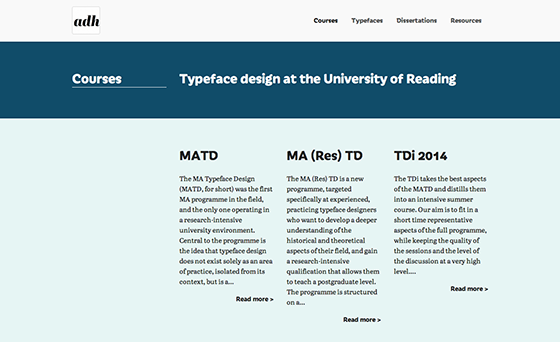
We expected a lot from the Department of Typeography & Graphic Communication at the University of Reading, and their website delivers with a fantastic type pairing. Abril Text is a lovely choice for long-form body text, and it reads beautifully here, and Iskra—the Extra Bold weight accentuating its quirks—makes for a surprising and effective match in the headings.
That’s it for this week; share sites you like in the comments!
2 Responses
Comments are closed.
I love that navigation. Its simplicity works so well.
…on the Type Quest site.