New on Typekit: Alverata from TypeTogether
Please join us in our excitement: Alverata, a new typeface from TypeTogether and designer Gerard Unger, is available today on Adobe Typekit.

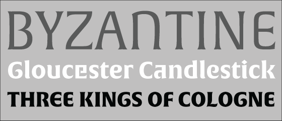
Alverata presents a blending of historical typographic and artistic elements, rooted in the typographic forms of the Romanesque period and brought up to date for 2014.
Unger explains how he drew inspiration from capital letters that were engraved, painted, or chiseled into stone during the Romanesque period, which in turn were derived from multiple Mediterranean and Western European scripts. The contemporary trend in art and architecture was to embrace variety and the combination of disparate elements, and this trend appears to have carried over to the use of type; letterforms from those scripts were interchanged at random, creating a rich nonuniformity.
Alverata Irregular
Unger created alternate glyphs inspired by the caps from those varying scripts, and brought those characteristics to an extensive set of lowercase alternates. The Alverata Irregular set makes good use of the Contextual Alternates OpenType feature; when enabled, alternates will sub in as you type, seemingly at random.
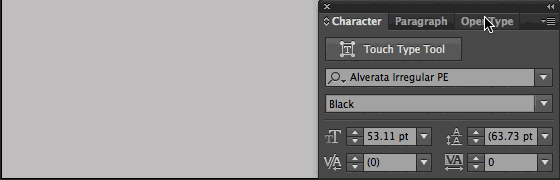
Alverata Irregular in Adobe Illustrator CC
The Romanesque caps also share some characteristics with contemporary type — namely, narrower forms with tighter spacing. It makes perfect sense to accompany those caps with a lowercase set with narrow body and tall x-height, in keeping with current trends of designing for readability across print and digital platforms — not to mention Unger’s personal preference as seen in much of his previous work. Unger also kept some meat on the bones of horizontal strokes that would normally thin out in written examples of the source scripts, opting instead for a sturdier structure that holds up better at small sizes. So while the Irregular set lends itself to display settings, the “regular” version of Alverata, complete with a full complement of italics (as well as Informal upright alternates) and a healthy range of weights, is well-suited for use at text sizes, whether in print or on screen.
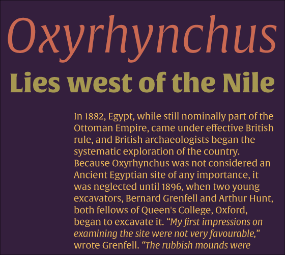
Alverata (headline and body text) and Alverata Informal (subhead)
TypeTogether has a lot more information on Alverata. Read Gerard Unger’s introduction and background, and check out the extensive PDF specimen. Portfolio subscribers can add Alverata to kits for web serving today; Alverata is also available for desktop use on all eligible plans. If you’ve never given Typekit a try, sign up (it’s free!) and upgrade to a paid plan whenever you’re ready.