Adobe Type in Use: Source Sans takes on good food, weather updates, and Cambodian education
We’re pleased to announce a new feature on the Adobe Type blog: Adobe Type in Use. This international typographic feast focuses on creatives doing great work with great faces from the Adobe library. Our team and our friends in the type community have been pounding the pavement, virtually, in search of exceptional projects to share, and we’ve discovered some real gems. We’re particularly excited about kicking off this series with a focus on Source Sans, Adobe’s first open source type family.
Designed by type team member Paul D. Hunt, under the direction of Robert Slimbach, Source Sans has been widely adopted since it was released in August 2012. It’s incredible seeing so many designers using Source Sans for a wide range of clients and causes. We’re quite fond of these worthy projects for Relay Foods, Weathertron, and L’Ecole du Bayon, and we think you’ll like them, too.

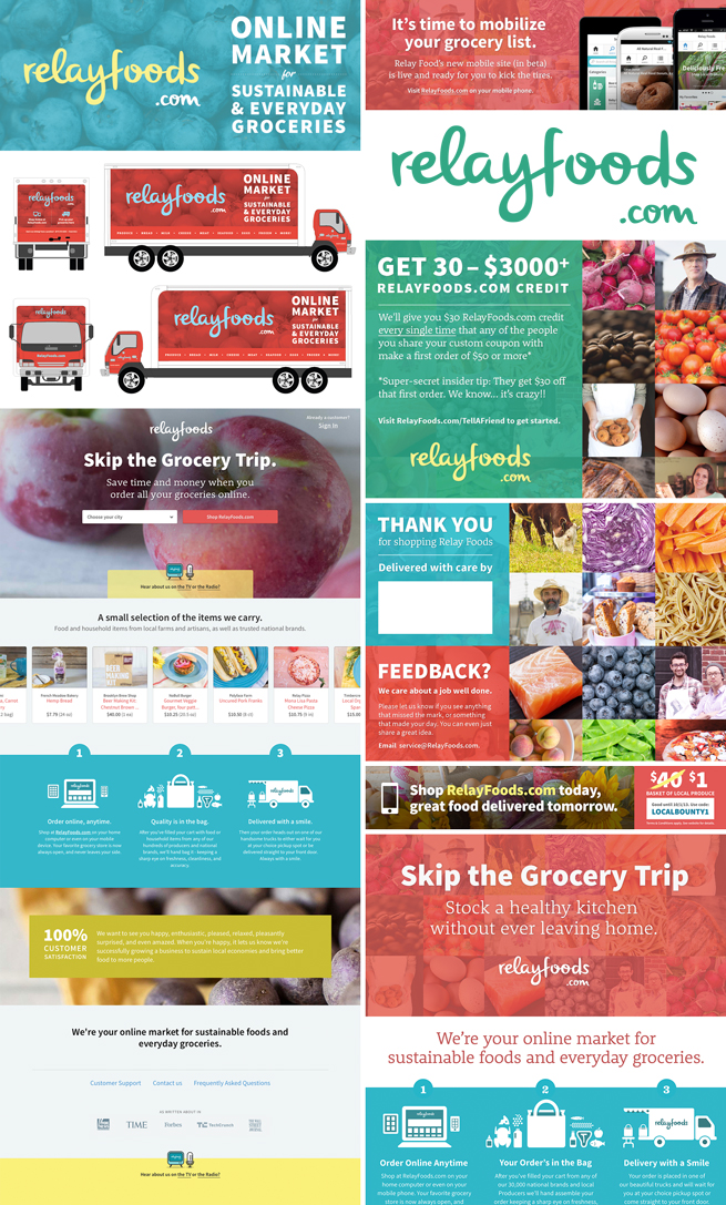
Source Sans in use for Relay Foods (clockwise, from top left): Large Banner, Phone Press, Logo, Grocery Insert (front), Grocery Insert (back), Metro Ad, Push Card, Website, Trucks. Credits: Matthew Smith, creative director; John Robinson, photographer; Chandler Van De Water, Designer.
Relay Foods: Making eating well easy.
Relay Foods, based in Charlottesville, Virginia, is an online grocer with a focus on sustainable foods and local producers. Currently operating in a handful of upper East Coast markets, including Baltimore, Maryland, Washington, DC, and Richmond, Virginia, Relay offers a clean, easy-to-use shopping interface. Customers can choose from products procured from local stores, restaurants, and farms, and have the option of home delivery or picking up their orders at readily accessible distribution spots in their cities.
The company’s stated aim is “to make eating quality, healthy, and sustainable food simple.” In developing a mission-friendly tone for the website and everything from delivery trucks to tees, Greenville, South Carolina’s Matthew Smith, Chief Creative Officer for Relay, combined Source Sans with Rooney, Parsley Script, and DIN Condensed.
“We knew we wanted a sans face that was tighter and less formal and gothic than the catch-all Helvetica. Open Sans is a great typeface, but a little more ‘open’ than we were looking for,” Matthew said. “When I first saw Source Sans blown up black and strong above a Rooney Regular subtitle, I knew we had the right balance. It’s a great readable face.”
Matthew said Source Sans is particularly well suited to Relay’s marketing because it has “warmth in the letterforms without being sissy; strength without being macho. [It’s a] great balance for a typeface that needs to convey simplicity as a service—our core motto.”
“People often ask what faces we’re using and why we’ve paired the fonts the way we have,” Matthew said. “My own feedback is that it’s growing, and it’ll be refined more and more as we move along in the product.”
Follow Relay Foods on Facebook and Twitter. Follow Relay’s creative chief Matthew Smith on Dribble and Twitter.

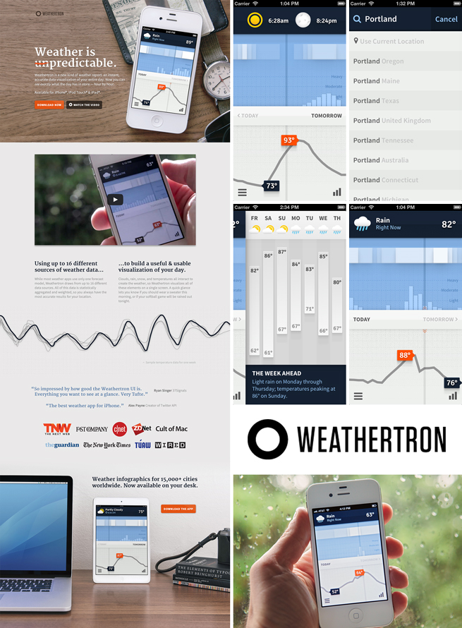
Source Sans in use for Weatheron (clockwise, from top left): Desktop Version of Site, App (Sunrise–Sunset), App (Search), App (Weekly Forecast), App (Main Window), Logo, and Handheld Hero Image. Credits: App co-authored by Ryan Lucas and Kevin Lynagh.
Weathertron: The mobile meteorologist.
A noteworthy app by designer Ryan Lucas and developer Kevin Lynagh of Keming Labs (both based in Portland), Weathertron is a live data visualization of an entire day’s rain or shine (and everything in between).
Developed for the iPhone, iPad, and iPod Touch, Weathertron provides an hour-by-hour view of expected location-specific weather events on a single screen. Powered by up to 18 unique weather data sources, statistically aggregated and weighted, the app strives to provide the most accurate results possible for a given location.
“Our goal was to condense a complex data set into a useful, usable, and desirable interface,” Ryan said. “You can quickly plan your day around the weather—like knowing if you should wear a sweater when you leave the house, or if your softball game will be rained out after work.”
Rated 4.5 stars on the iTunes Store, Weathertron has received rave reviews by the press and users alike. The app has been featured by Apple, The New York Times, Wired, Fast Company, and The Guardian.
During initial development stages, Ryan took to pen and paper for ideation and sketching. He used Adobe Illustrator for icon design and Photoshop for creating interface comps. The app was built with Clojurescript, Angular JS, HTML, and CSS. Source Sans is used extensively throughout both the app and website, supported by Signika in the app and Merriweather on the site.
Weathertron’s interface is elegantly simple to digest on the fly, providing one of the sharpest mobile weather-geeking experiences around.
Find out more about the Weathertron project on Behance. Follow Weathertron, Ryan Lucas, and Kevin Lynagh on Twitter.

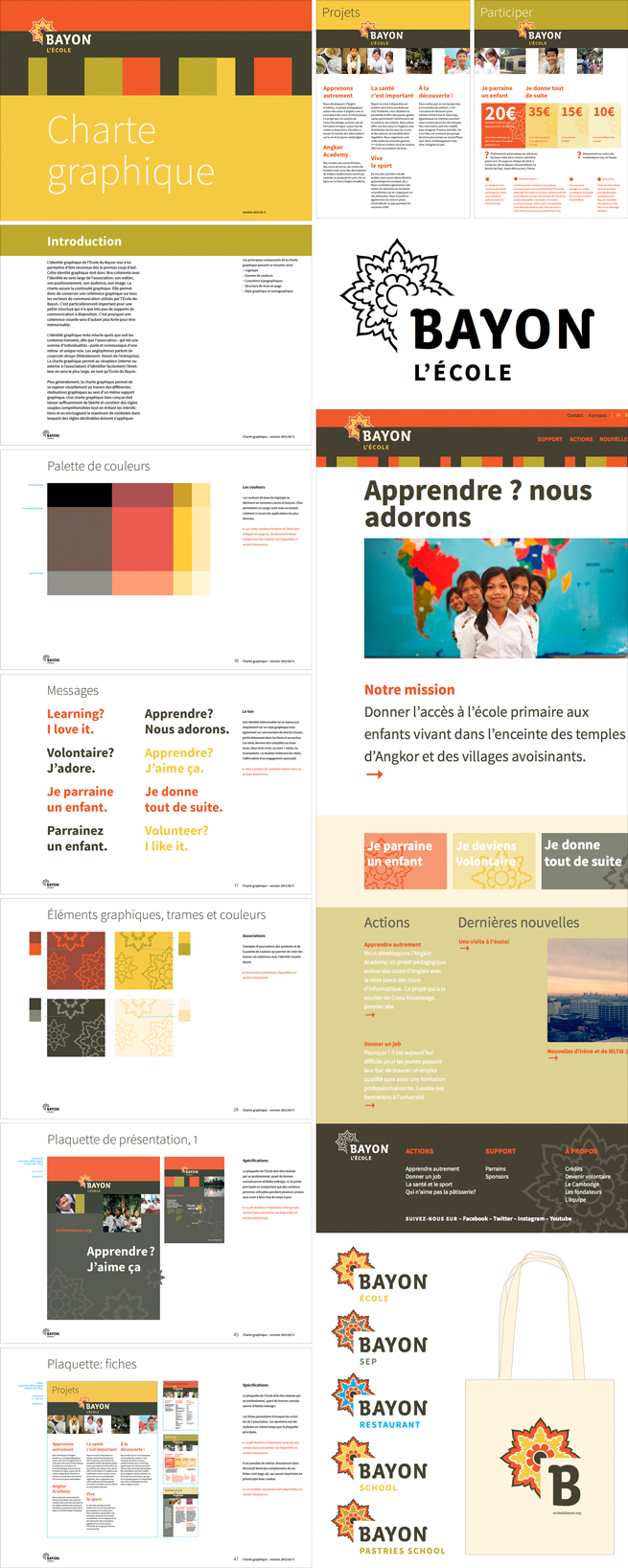
Source Sans in use for L’Ecole du Bayon (clockwise, from top left): Entire left column is from the Brand Book; both images, top right, are from the Dossier; followed by Logo, Website, Logo Variant, and Tote Bag. ZeCraft’s key contributors to the project were Jean François Porchez, logotype and identity concepts, creative direction and design; Véronique Porchez, project management, Morgane Pambrun and Clément Ducerf, designer assistants; and Nicolas Turlais, web development and coding. Photography is by members of the Bayon team, who are all volunteers. Leaflet printing in 4-color offset litho by Ribet prissy, Issy-les-Moulineaux, France. Stationery printed in Siem Reap, Cambodia. Tees and tote bags produced by Papaya T-Shirts.
L’Ecole du Bayon: Educating disadvantaged children in Cambodia.
Located in Angkor Thom, Siem Reap, near the Bayon temple of Cambodia, L’Ecole du Bayon is a labor of love and compassion. The school was conceived in the mid-1990s by French expat Marcel, who stepped in after Lokta Chu Egk (a monk who sheltered orphans in the Preah Saar pagoda), suffered a fatal stroke.
Marcel partnered with Mai—a Cambodian refugee who escaped from the brutal Khmer Rouge regime in 1975 and returned home in 1996—along with local monks and other humanitarians to construct a classroom on the land of the pagoda.
Today, L’Ecole du Bayon is a non-profit organization (NGO) registered in France. Through sponsorship, the elementary school offers free education to orphans and other disadvantaged children of the region, and helps older children continue their studies so they may graduate from high school in Siem Reap.
ZeCraft, the Clamart, France-based studio helmed by Jean François Porchez, took on the task of redesigning the school’s identity and revamping its website and collateral. The result is a modern but classic marketing and information platform for the school and its side effort to help children and young adults throughout Cambodia. Fresh typography and a refined color palette contribute to the organization’s elegant call to action.
Jean François, who also leads Typofonderie, customized Vista for the word BAYON in the school’s mark. Source Sans is used liberally throughout the rest of the branding, with the light, regular, and bold weights and italics seen in the Latin texts. Siemreap is incorporated as the Khmer counterpart to Source Sans Light and Regular, with Bayon Regular subbing in as the Khmer companion to Source Sans Bold.
With the rebranding and ongoing support from generous sponsors and partners, L’Ecole du Bayon will grow and thrive, and continue to support the children of this impoverished nation.
The redesign for the L’Ecole du Bayon website is currently in beta, soon to be found on the school’s live site. Follow L’Ecole du Bayon on Facebook. Follow ZeCraft on Facebook and Twitter.
Here’s where you come in, dear readers! We’re on the lookout for inspiring examples of Adobe type in use for possible publication on our blog. If you’ve done something wonderful with Adobe types, or you’ve fallen in love with another designer’s typographic masterpiece featuring our faces, drop us a line at type-in-use@adobe.com. Send a link, PDFs, GIFs, screenshots, or whatever you have, and tell us what typefaces you used. We’ll happily take a look!