Sites We Love from 2013
This year, we’ve featured over 100 sites here on this blog, all using Typekit in creative and beautiful ways. It’s a delight to see the great designs that good typography enables. We hope our little showcase here has inspired you in your own work, too.
To finish up the year, here’s a selection of some sites we especially loved from our weekly roundups.
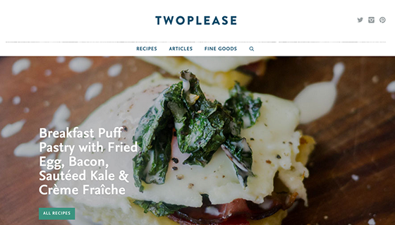
Two Please shows off tempting recipes with luscious photos and some great type: FF Nexus Serif and Sans, both ported over on a license from FontFont, and Brandon Grotesque in the header navigation. (From November 15.)
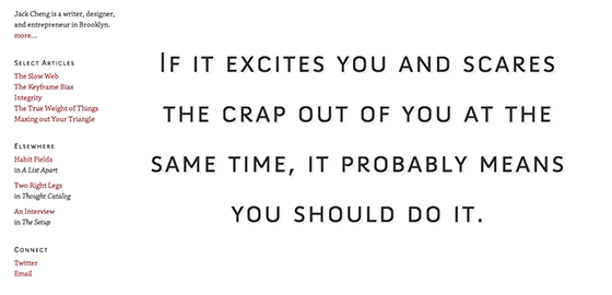
The website of writer Jack Cheng showcases Chaparral in the body text and Anivers SC in headings. (From February 22.)
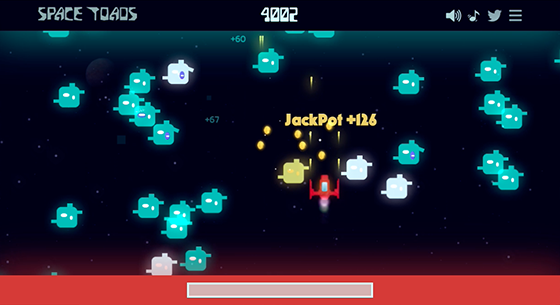
The arcade-inspired Space Toads game uses Typekit fonts throughout the site and in gameplay: Xenara for most of the text on the website, wildcard BD Geminis, and look closely for Mostra Nuova and Peachy Keen. (From September 27.)
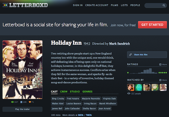
Made for film buffs, Letterboxd uses Abril Text for most of the copy, with Proxima Nova and Freight Sans for navigational text and tags. (From September 13.)
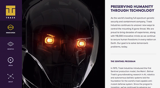
A teaser for the upcoming X-Men movie, the Trask Industries website displays headings in Futura PT, with text in Proxima Nova. (From August 16.)
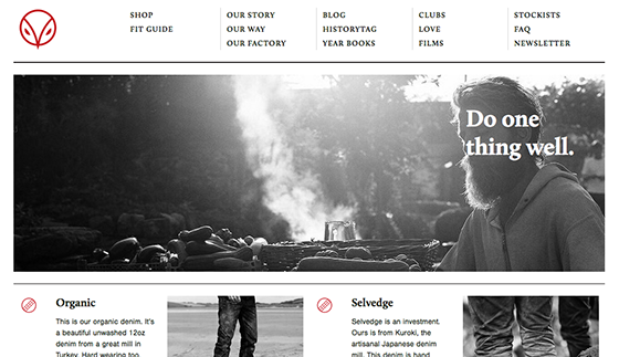
Hiut Denim continues a legacy of denim work that’s lasted for three decades—and their website demonstrates a careful, understated personality, with Calluna in the headings and Nimbus Sans a sans-serif counterpart for body text. (From June 27.)
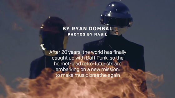
Fantastic and loud scrolling visuals reinforce the edgy energy of FF Spinoza and Colfax in Pitchfork’s feature story on Daft Punk. (From June 7.)
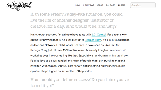
The impressive interviews on oneminutewith.com feature insightful questions and solid type choices, with body text in Proxima Nova and interview questions offset in Quatro Slab. (From April 5.)
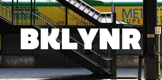
BKLYNR showcases Quatro in a big, bold title format, with body text set in Proxima Nova. (From March 22.)
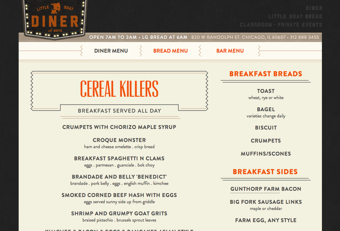
Little Goat Diner’s charming illustrated and animated splash screens are a clever prelude to their numerous and extensive menus, set in Brandon Grotesque. (From January 11.)
If you’ve seen Typekit on a site you like, please share in the comments. We’ll be back with more in 2014; have a happy New Year!
2 Responses
Comments are closed.
http://www.snoutit.com
Great collection!