From Slavophile to Typophile: The cultural journeys of Paul D. Hunt
Paul D. Hunt joined Adobe as a typeface designer in 2009, but his path to San Jose has been anything but typical. Valedictorian of his high school graduating class of 25 (just down the road from a famous Route 66 landmark), Paul was well on his way to a high-powered career in international business. But he fell in love with language, then type, somewhere along the way. And the rest, as they say, is history.
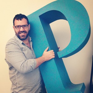
How did you make your debut on Planet Earth?
I was born in Winslow, Arizona (from the popular Eagles’ song). I wasn’t born on the corner, though—I was born in the hospital! I grew up in a rural town called Joseph City and went to public school there. With just 1,200 people in the town, there weren’t many opportunities to do much of anything interesting, but when there were, I tried to maximize them. For example, when our school briefly offered some satellite courses through UW in foreign languages, I took that opportunity to start to learn Russian.
Aside from the incredibly easy task of learning Russian, what else did you do for fun growing up?
I was involved in dancing, in the form of clogging. My younger sister and I did it for many years throughout my youth. I worked at the school auditorium doing light and sound and stagehand stuff. I was in choir, and I did a little bit of acting in community productions. Our show choir did Oliver! and I played the villain, Bill Sykes, when I was a senior (probably because I was the only one who could grow a beard and pull the whole thing off).
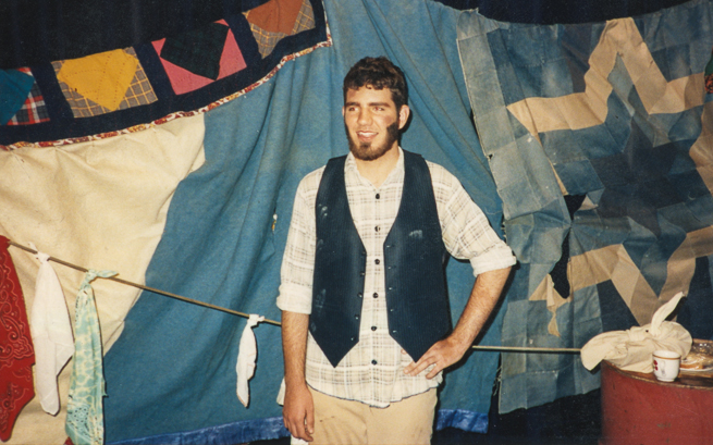
In 1995 as Dickensian villain Bill Sykes in his high school’s presentation of Oliver!
So how did you transition from aspiring clog dancer and super-villain to type designer?
I was always interested in language and culture—and later, design—and how these things all come together. I wanted to continue with dance and studying Russian—part of the reason that I chose to attend Brigham Young University was because they have very good language programs and an international folk dance ensemble. In the summer of 2000, I was part of a team that toured around elementary schools in Utah doing all kinds of dance—Ukrainian, Hungarian, Polish, French Canadian, Israeli, Bulgarian—a lot of Eastern European stuff, which is what I like most. Bulgarian rhythms, costumes, and music always make me excited. That’s my favorite, just because it’s so energetic and completely different from [what people usually] think of European folk dancing.
So you had a kind of Lord of the Dance thing going on for awhile?
I actually took some Irish dancing classes right around the time Riverdance was popular. I can do some jigs and reels—well, I used to be able to… You get out of practice, but when I was dancing two to three hours a day, I was in the best shape of my life!
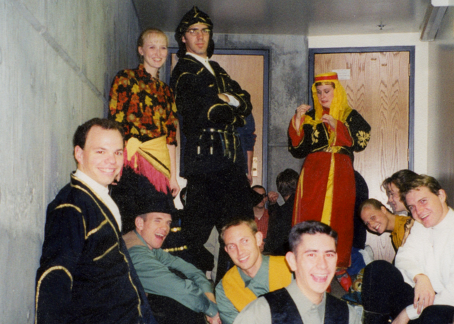
In Turkish costume performing as part of BYU’s International Folk Dance Ensemble, 1999
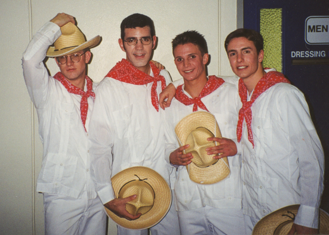
In Mexican costume to dance La Bamba in BYU’s Christmas Around the World, 1999.
But, seriously… What were you going to do with the rest of your life?
I was getting my degree in international studies—I thought I wanted to pursue an international MBA in grad school—but I realized that I would rather do something creative. I finished my last couple of courses of independent study and started working for the Winslow Mail, a newspaper not far from my hometown. They hired me because they needed someone who knew how to use a Mac. (It’s kind of a small town.) I was working mainly on advertising design and the aspect that interested me most was the typography. I started looking more closely at fonts.
And then, I found Typophile.
And then, you were hooked?
At the time, the Typophile forums were very active with people who were typographers or type designers, just all different kinds of people who were involved in type. I could go there, ask questions, and pick people’s brains. I started playing around with modifying fonts and learning font software. I taught myself how to do some OpenType programming because I found that intriguing. I say I taught myself, but I asked a lot of questions on Typophile. People like John Hudson and Adam Twardoch were always ready to provide answers, so I learned that way.
How did your brain-picking lead to your first gig in type design?
From Typophile, I got an internship with P22 type foundry. Rich Kegler was looking for someone who could intern for a couple of months to help them do the initial launch of the Lanston Type Library. They wanted to do it in OpenType, and my little experience I had came in handy. Rich posted [on Typophile], and I replied. Within a week, I was out of Arizona and into Buffalo. That was supposed to be three months, but I ended up working for them for about three years.
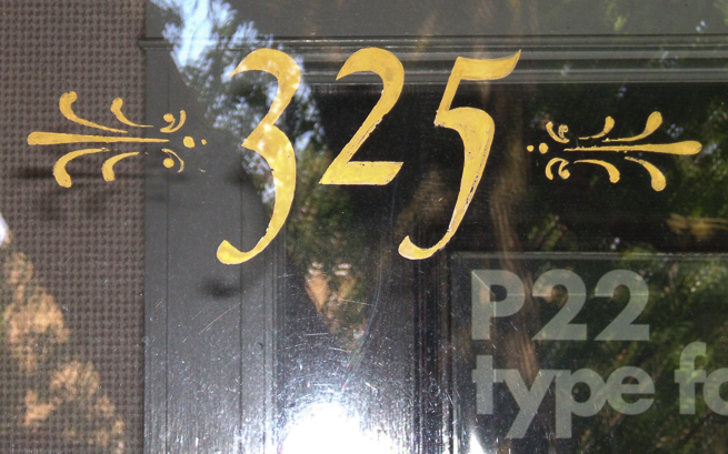
Found lettering on the door of P22’s old office at 325 Elmwood Ave., Buffalo, NY.
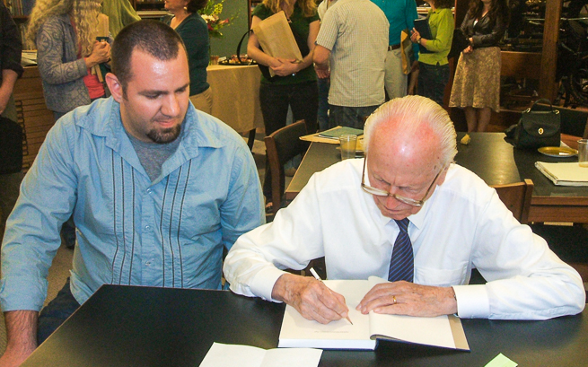
Paul with Professor Hermann Zapf at RIT in Rochester, New York, in 2007.
How did you end up furthering your typographic education?
After being at P22 for a while, I felt like I had learned everything I could from that experience. I wanted to hone my craft and develop some of my original type concepts, so I decided to do the MA Typeface Design (MATD) at the University of Reading in the UK. I have always been fascinated with non-Latin scripts, and, since Reading has such a strong emphasis in that, it was a big influence on my focus and why I wanted to go there.
I went to Reading in the fall of 2007 for a yearlong program. My favorite part of the Reading MATD was being able to experiment with my own ideas. It’s kind of a playground where you start to develop your skills—looking at type, evaluating design. I was particularly grateful for the guidance I got from people like Gerry Leonidas, Fiona Ross, and Gerard Unger. They were invaluable guides to help me start thinking about different aspects of type and designing type.
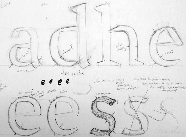
Early sketch of Grandia, Paul’s typeface project for his MATD year at Reading.
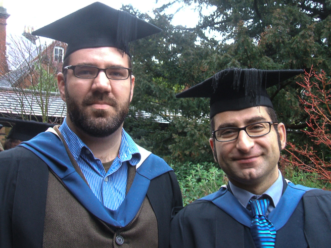
On graduation day in 2008 with Reading’s MATD Course Director, Gerry Leonidas.
For your MATD project at Reading, you designed the Latin typeface Grandia, and Gandhara, its Devanagari companion. Since you were already mad about Russian and Cyrillic, what made you choose to develop an Indic script, and that one in particular?
I’m an Indophile, too! When I was at BYU, I fell in love with the food, and they actually had several festivals at this Krishna temple in South Fork, Utah. They would have music and dancing—all that stuff that I like—and the pageantry. Then you would get involved in things like the throwing of the colors for Holi. I fell in love with Indian culture, the cinema… I love all that stuff.
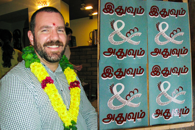
Paul the Indophile and his silkscreened lettering project during TypeCamp India 2009.
If you look at the writing systems, they are so beautiful and interesting, the way they work graphically, their complexity. I chose Devanagari mainly because of its ties to classical culture—it’s kind of the major writing system for Sanskrit. Think of how our languages all come from the Proto-Indo-European language—part of the concept of my MA project was designing a typeface that would work for Latin and Greek and Devanagari.
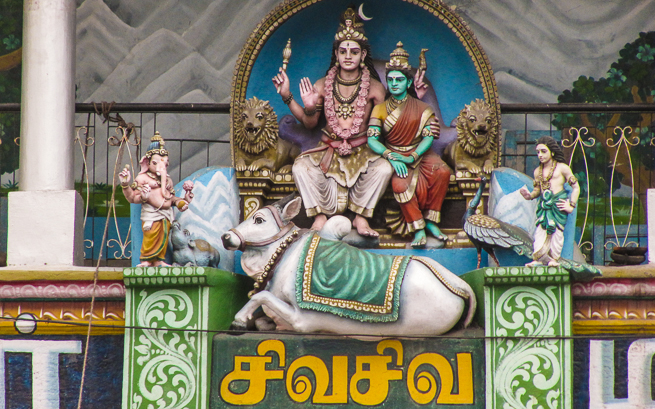
Ornate statuary and lettering captured Paul’s heart during TypeCamp India 2009.
How exactly did you find your way to San Jose?
When I was done [at Reading], I worked for Dalton Maag for three months. It was good, but it was during a weird time when the British Pound was losing value against the dollar because of the economic crisis. I felt I couldn’t pay off my student loans in American dollars if that trend continued.
At the same time, I was offered a position at Adobe, so that consideration went into my decision [to come back to the US]. I had always viewed Adobe as being on the cutting edge of type, at least in terms of technology, and I appreciated and admired the high quality of their work. I was hired as part of the new college graduate hire program, so I got lucky in that regard!
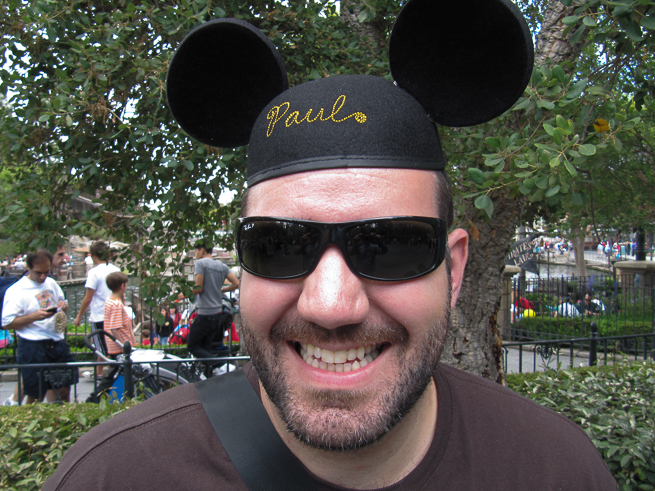
Paul celebrating his birthday in 2009 at the happiest place on Earth.
Paul D. Hunt is, among other things at Adobe, the designer of Source Sans and Source Code, Adobe’s first open source type families. He’s currently busy spearheading a project to develop fonts for the top ten languages used in India while enjoying life in the supremely culturally diverse San Francisco Bay Area. The adventure continues…