Sites We Like: Fuzzco, Cultivated Wit, & I Shot Him
Design studio websites are reliably interesting for us, since they frequently want to pack a lot of character into the space while maintaining a wholly-functional work portfolio. It’s easy to mix up signal and noise with those priorities at stake, but here are a few studio sites that get it right.

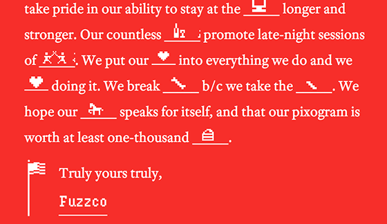
With an energetic crew based in Charleston, South Carolina, the Fuzzco studio website shows a lot of personality—not to mention a lot of great type. Proxima Nova and Adobe Text are used for most of the body text and headings, but Droid Serif and Hydrophila Iced both make appearances as well. It’s a lot of fonts, but all are used with just the right amount of restraint.

Cultivated Wit is the studio of three former employees of The Onion, who have harnessed their penchant for humor and unleashed it upon all manner of web projects. Their selected web fonts are attractive and lean towards the conventional, which is all the better for tongue-in-cheek statements. Alternate Gothic No. 2 D appears in many headings, with Brandon Grotesque on broad display as well. FF Tisa appears on the blog and in other longer blurbs throughout the site.

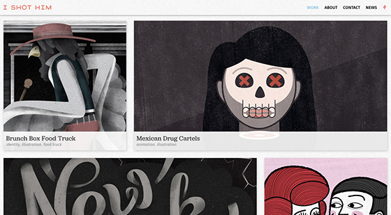
I Shot Him is a design studio based in one of San Francisco’s sunnier microclimates. The type on their website does a great job of sturdily accompanying the stunning graphics, with Jubilat for most of the heading text and Gesta in place as a friendly, distinctive sans-serif body font. You’ll also see a few samples of lovely Signalist from Mika Melvas.
That’s it for this week; share sites you like in the comments!
One Response
Comments are closed.
We’ve just redesigned the Frequency site using Jubilat and Azo Sans from Typekit.
http://www.frequency.ie