Sites We Like: Destroy Today, Stuntbox, and Be Good Not Bad
Personal websites offer a tricky challenge, even for professional designers—you want your personality and skill to shine through, but you don’t want to make visitors feel like they’re stuck in the middle of a sales pitch. We think these designers do a great job achieving this balance.

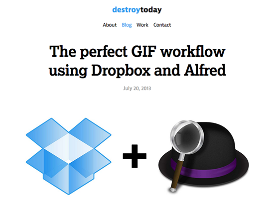
The project of designer and developer Jonnie Hallman, Destroy Today is off to a leaping start, having fixed its name to several impressive projects within the past year. The web portfolio is refreshingly simple and easy to peruse, with body text set in JAF Bernina Sans and headings in Lexia.

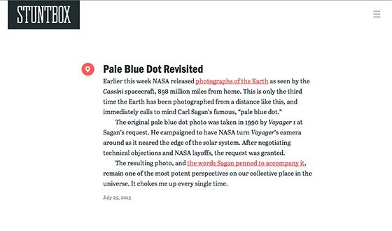
Stuntbox features the written insights and points of contact for designer and strategist David Sleight—who, among many accomplishments, must be credited for some excellent typographic choices for his blog. Abril Text gives the long-form entries a journalistic feel, which is reinforced by Franklin Gothic URW Condensed in the headlines. Pleasurable reading, all around.

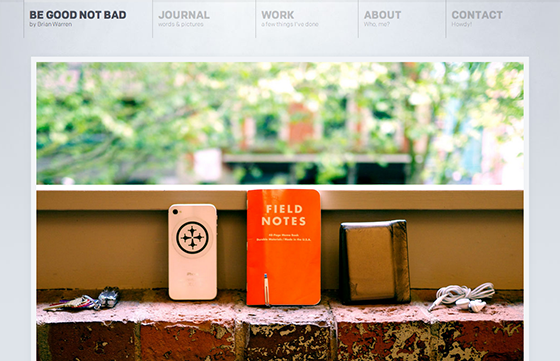
Passion for meaningful work shines through on Be Good Not Bad, the personal website of designer Brian Warren. Colfax is featured as the typeface for the copy throughout, and Brian notes in a blog post that this was very intentional: “Big lovely fonts just sitting there begging to be read. That’s my hope anyway!” We’d say it worked out nicely.
That’s it for this week’s sites; share sites you like in the comments!
2 Responses
Comments are closed.
You might like my site, http://devinhalladay.com! I recently redesigned it and the type is set in Chaparral Pro and Ratio — the two have proven to be a perfect pair.
We recently built the website for push.conference 2013 in munich. The site uses Ratio Display, a beautiful sans serif font.