Sites We Like: Jonathan Suh, Adam Gillitt, Geri Coady, and Christopher Clark
When you’re a designer on the web, your portfolio site is the first and best chance you get to demonstrate your talent. Of course, we think it’s even better if you also take the opportunity to show off your refined taste for typography. This week, we’ll look at a few portfolio sites that accomplish both of these.

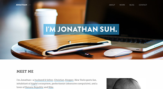
Jonathan Suh creates a delicate, light aesthetic for his homepage with generous line spacing and white framing around his Museo Slab headings and body text in Adelle. The medium-gray shade of the body text also contributes to the light feel—and contrasts neatly with the black headings.

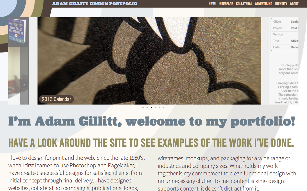
In addition to neatly organizing his portfolio across themed collections, Adam Gillitt’s homepage also shows adept use of three very different typefaces. Headings are in Jubilat and Nimbus Sans Condensed, while body text appears in Source Sans Pro. Each of these typefaces has a distinctive personality and energy level, but they work together nicely here—helped by the attractive color scheme and attention to layout details.

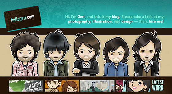
Illustrator and designer Geri Coady presents us with a clean, appealing portfolio site, incorporating many of her illustrations into the design for an especially charming experience. For type, she features CamingoDos, whose neatly legible forms appear in an approachable bold style for headings.

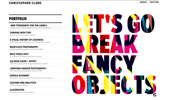
Christopher Clark makes impressive use of three flavors of Proxima Nova on his engaging site, employing Proxima Nova Extra Condensed and Proxima Nova SC OSF Condensed in addition to the regular version of this popular typeface. His portfolio samples are also a delight to browse through.
That’s it for this week; share sites you like in the comments!