Sites We Like: Erik Marinovich, seanwes, and Distil Copywriting
We’re celebrating the art of language and letters in this week’s sites we like.

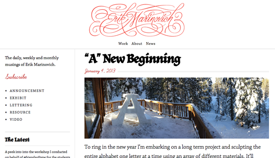
Leading with a homepage that attractively displays a gallery of his recent projects, Erik Marinovich‘s website keeps the focus on his beautiful lettering work, but does not disappoint when it comes to web type. Chaparral brings light, deliberate form to the main body text, while JAF Herb, a distinctively approachable blackletter, adds its blocky but stylish character to headers. Learning Curve adds a perfect flourish of color and swirl.

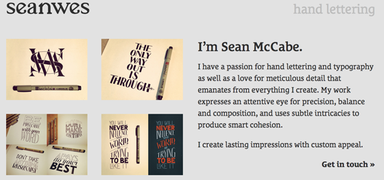
Sean McCabe‘s website employs Le Monde Courrier STD throughout, its relaxed but orderly shape establishing a friendly, conversational tone for his neatly-organized lettering portfolio. The resulting feel is as close to a personal tour of his lovely lettering projects as we could ask for from behind a screen.
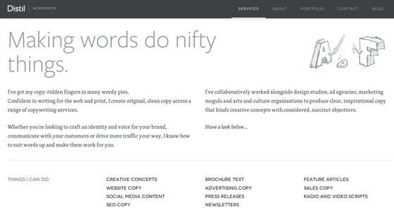
“The right words in the right order can do great things,” opens the Distil Copywriting webpage. We think there’s also something to be said for the right words in the right typeface, and Distil nails this as well, pairing fresh Freight Sans with subtle Skolar on this well-paced site.
That’s all for this week; share sites that you like in the comments!
