Sites we like: Brand New Conference, It’s numbered, and LBVD
Big type, small type, and playful type in this week’s sites we like.

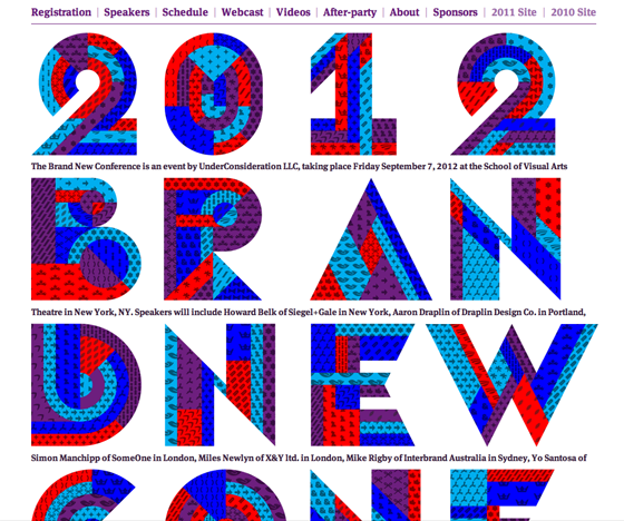
We’re proud to be returning as sponsors to the 2012 Brand New Conference, but we can’t help but like the site, too. Patchwork lettering pairs up with FF Meta Serif and Proxima Nova Small Caps for a playful presentation. Small caps fonts are great for setting small, tight navigation like you see here.

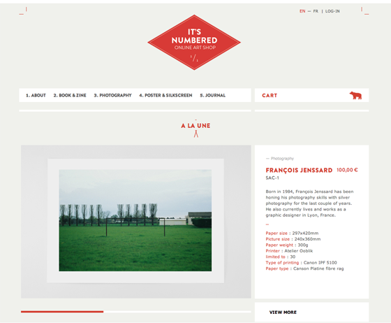
It’s numbered is a non-profit selling limited editions of art prints. Brandon Grotesque shows off its small side with tiny, punchy headings. Remember to add a touch of letter-spacing when setting headings in all caps.

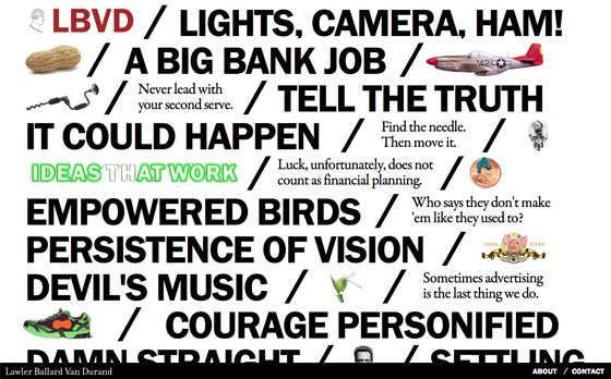
And LBVD goes big with extra large Franklin Gothic URW and Garamond Premier. A nice reminder that good type can steal the show if the copy is right. Pay extra attention to punctuation and spacing details when setting type that’s very, very big.
That’s it for this week; share sites that you like in the comments.
One Response
Comments are closed.
Great examples of web typography, inspiring, thank you!