Your favorite fonts
It’s been just two weeks since we released favorites on the Typekit website, but one thing is already clear: you have great taste. Here, in descending order, are the most popular fonts from the Typekit library, based on the number of people who have marked them as a favorite.

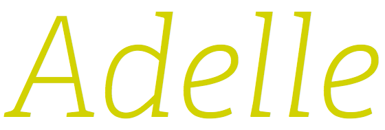
#1: Adelle

#2: Futura PT

#3: Museo Slab

#4: Proxima Nova

#5: Museo Sans

#6: FF Meta Serif

#7: Freight Sans

#8: FF Meta

#9: Chaparral

#10: FF Tisa

#11: Myriad

#12: Museo

#13: Raleway

#14: League Gothic

#15: FacitWeb

#16: Jubilat

#17: Skolar

#18: Nimbus Sans

#19: Minion

#20: Franklin Gothic URW

#21: Atrament

#22: Adobe Garamond

#23: Brandon Grotesque

#24: Omnes

#25: FF Dagny
10 Responses
Comments are closed.
Fully expected Proxima Nova to be top! Saying that, Adelle isn’t much of a surprise…
I knew Museo Slab had to be up there because I keep seeing it everywhere in place of Rockwell.
The combination of Myriad and Minion does not leave much to be desired, so it’s no surprise that they’re in the list. I really, really miss TheSansMono(Condensed) for Listings to go with them, though…
Ironically, you didn’t use typekit here, but took pictures of the fonts.
No irony at all. The blog is designed such that the home page features many blog posts, most of which include type samples. But loading dozens (or more) fonts on a particular page is bad practice, as it will lead to performance problems.
The samples are screenshots from Firefox on a Mac, so they represent actual font rendering.
By “ironically”, you mean “sensibly”, I suppose. 🙂 Writing an article on fonts shouldn’t require you to rewrite your HTML headers!
haha nice article i love playing around with fonts, some of the replies gave me a laught too 🙂
I think some of the finest fonts are listed here. I am personally going to use few present here in the list. Loved the Blod Omnes, it is pretty simple & impressive!
Mandy said in response to Jacob Singh’s comment:
“But loading dozens (or more) fonts on a particular page is bad practice, as it will lead to performance problems.”
The sample page for, say the font “Jubilat”, has fourteen fonts loading. And that’s not counting the fonts loading in the surrounding page. If that presents no performance problem, then perhaps future blog posts could be limited to a number similar to that – say twenty or so? In short, I say “balderdash”.
“The samples are screenshots from Firefox on a Mac, so they represent actual font rendering.”
A few things about this:
Singh was quite right about Typekit’s using images instead of native browser “HTML text” to display the fonts. That the source is a screen shot from an actual browser is irrelevant – screen shots are images.
I think it would be good to label the screenshots AS screenshots. (By platform and browser.) I think potential customers would find it not only informative, but fairly compelling, because the fonts look darned good in Firefox on Mac. But that’s in Firefox on Mac.
While Singh’s comment unwisely leaned on the word “ironical” in a failed effort to make a point quickly, I think it was an attempt to say that if Typekit were to feature new fonts without using images, and were to simply trust the visitor’s browsers to render the featured fonts in whatever way they will, it could very well mean creating a poor first impression, not a compelling one.
Mac being a minority platform – the odds today are that the font would most probably not look as visually pleasing as the “Firefox on Mac” image Typekit is presenting with it’s best platform and browser “foot” forward.
Is it mere “sales puffery”, or misrepresentation?
Me, I lean towards the puffery side.
Richard, thanks as always for your thoughts.
There’s a line from Tommy Boy about sticking your head somewhere that I think applies here. What you’re essentially asking us to do with the samples in this post is provide detailed information about how these typefaces render across different browsers and operating systems. A guarantee of sorts, that we’re telling the truth.
Of course we recognize that information about how exactly fonts render in different environments is valuable. That’s why every font page on Typekit has browser samples, and it’s why we teach our audience about the technology behind type rendering and font production. It’s why we dedicate ourselves to talking with individual customers every day about any question or concern they may have.
Typekit customers trust us, and we would never betray that trust. With this post, and with others like it, we’re not going to lead with a guarantee. We’re going to say what we mean to say — that these fonts are our customers’ favorites, plain and simple.
Re: the performance issues Mandy mentioned, our blog posts aren’t always shown individually. A few font files, multiplied by a few posts, is a lot of kilobytes loaded when someone visits our blog (vs. an individual post). And images show up in RSS readers, too. Believe me, not having to cut images for these blog posts would be wonderful! I look forward to the day when these technological constraints are lifted.