About face: Caflisch Script
Today’s About Face was written by Tiffany Wardle, a typographer and graphic designer currently living and working in San Jose, California.

In today’s installment for About Face I hope you will join me in admiring the much underused Caflisch Script. Caflisch is a casual chancery originally designed in 1993 by Robert Slimbach and based upon the handwriting of Swiss typographer Max Caflisch.

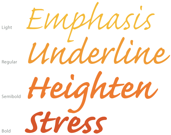
Four weights, from light to bold.
A well-designed sans or a serif typeface can usually fulfill all kinds of basic typographic tasks. On the other hand, Caflisch — a contemporary take on a calligraphic writing style — must be used more sparingly and with practiced restraint. This means not using Caflisch in long paragraphs of running text like you might find in a book. However, because of its large x-height and low contrast — used in tandem with the right line length and line-height — you can get away with shorter paragraphs to add some varied typographic color to your design. And besides, why would you want to use it at small sizes? You’d lose all of the beautiful detail!

Notice how the a leads into the r, or the d to the s.
Caflisch is a script designed by someone who practices calligraphy and understands the natural flow of the hand. The connections are all natural and properly articulated. There are no sudden switches in direction or unnecessary and conflicting swashes.

Even the exit strokes in such letters as the y and p fade as if the pen were lifted off of the paper.
Using a script it is not unlike using spices: you just need to know when to put the shaker down. The key is to choose companion typefaces that don’t compete for attention.

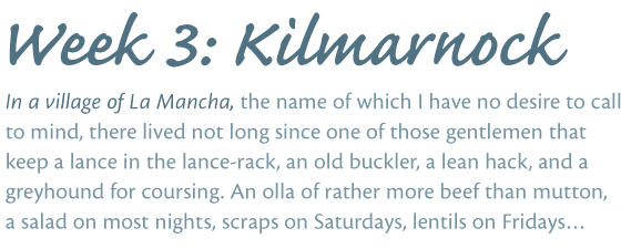
Caflisch Semibold and Cronos Caption Regular and Italic
For instance, I could easily see Caflisch paired with Cronos and used for effect as the jaunty, devil-may-care handwriting style of an online journal for someone who is well-travelled and knows a thing or two about packing light.

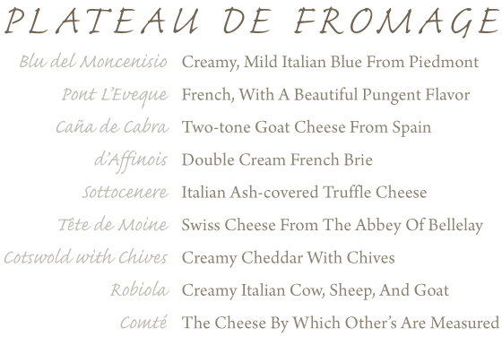
Caflisch Light and Regular and Arno Regular
Or perhaps paired with Arno Pro for an online daily menu of a punctilious, un-pretentious chef de cuisine at the corner bistro with that amazing plateau de fromage and melt-in-your-mouth pâte brisée.

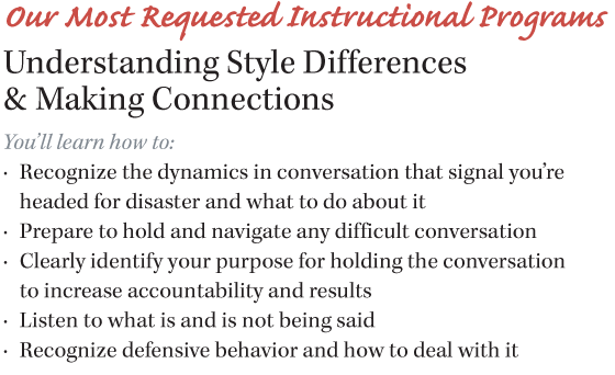
Caflisch Bold and Kepler Bold, Regular, and Italic
Even paired with Kepler to add a bit of approachable, descriptive character to a business’s online annual report, monthly newsletter, or portfolio review.
Finally, with the trend for historic pastiche, I think Caflisch has been a missed opportunity to recall the days of yore when people cared about their handwriting. I see Caflisch located dead center in the sweet spot between school girl casual and uptight Spencerian — a friendly and informative script.

Type. Typography. Design. History. Travel. Music. Movies. Food. Friends. Family. Love. Not always in this order. @typegirl
3 Responses
Comments are closed.
Very nice article. I look forward to the day when browsers support OpenType and Caflisch Script can be used in its full glory.
Wrong accent on “après”.
Thank you, Hubert. I’ll provide a new image.