Sites we like: Allied Works Architecture, Design.org, and MCA Chicago
Space, a stream, and art in this weeks sites we like.

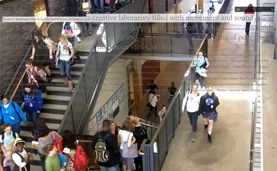
Allied Works Architecture evokes a sense of space with Calluna and a clever hover treatment. Calluna’s light weight is delicate but sturdy, a perfect pairing for the airy, structured environments. Be sure to hover over a title to reveal a video of the space beneath it.

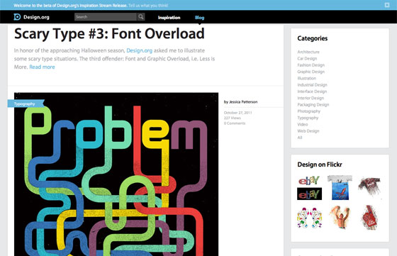
Design.org uses Myriad for both headings and paragraphs, showing off its flexibility. At large sizes, Myriad’s humanist touches are confident and friendly; at small sizes, those same details recede and the overall feel is pleasantly neutral. An excellent choice for a design that lets the images stand out.

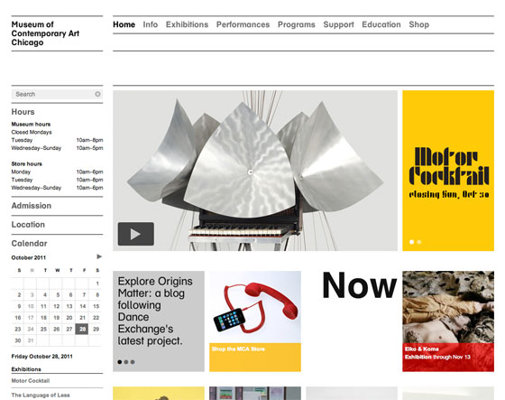
The Museum of Contemporary Art in Chicago uses a custom version of FF Schulbuch in a strong grid layout. FF Schulbuch feels modern without being cold, warming up the minimal design. (Interested in using a custom font for your site? Learn more.)
That’s all for this week; share sites that you like in the comments!
3 Responses
Comments are closed.
This is interesting.
The Allied Works site has a a really nice concept behind it but I’m not 100% convinced that it works. The implementation is a bit jittery and (for my eyes) the contrast of the text over the photos is a little hard to make out. Cool idea though!
Gordon, I was thinking the same thing. It’s almost hidden text which I think could subconciously put people off.