About face: FF Basic Gothic

In this latest installment of About Face we look at a sleeper sans serif, FF Basic Gothic, by Hannes von Döhren and Livius F. Dietzel. I’m calling this one a sleeper because it’s so simple that it’s easy to miss, but take a closer look and you will find the magic. As the name implies, FF Basic Gothic is a reductive sans serif that aims to include only the most necessary strokes. But despite that minimalism, FF Basic Gothic comes off with a playful wink.

FF Basic Gothic is pretty straightforward, but a few characters give it a nice bump in personality.
While seemingly simple and straightforward, there’s a touch of whimsy sitting just beneath the surface. Look at the little curled tail on the lowercase “a.” It comes up just a smudge too far, as if to say “you’re not the boss of me!” Similarly, the crossbar on the lowercase “t” sits high like an old man’s pants, and the descenders on the lowercase “j” and “y” hang lower than needed, like when you lazily dip your toes in the water from the edge of a pool.
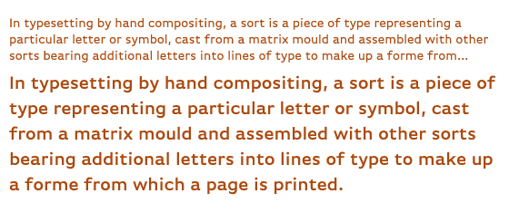
FF Basic Gothic is well suited for body copy. (source text)
All of that character doesn’t overwhelm when FF Basic Gothic is used at text sizes, but it does add a small quality of delightful informality to the text.
FF Basic Gothic is a sturdy and legible sans serif, following comfortably in Verdana’s well worn footsteps. And like Verdana, it has a healthy x-height and is just a touch on the wide side, both of which add up to more body for each letter. That extra body really shines at text sizes.
When used large, those features come to the forefront. Basic Gothic works well as a nice headline choice too, with weights ranging from light and delicate to big and chunky.
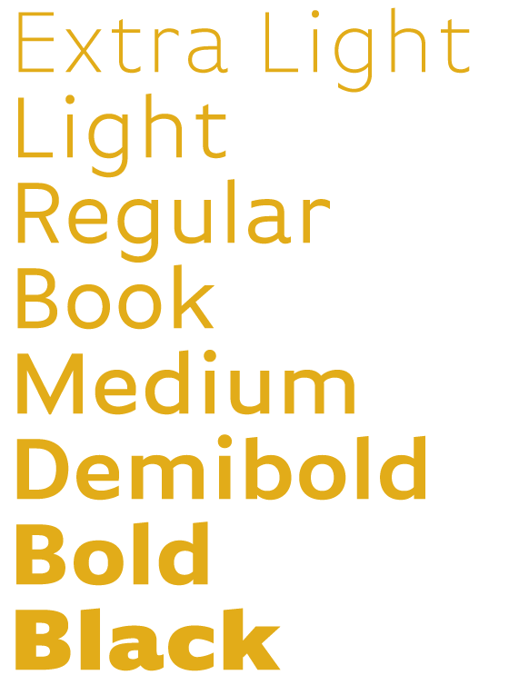
And because FF Basic Gothic is versatile enough, you can easily combine different weights and styles for headlines and text.
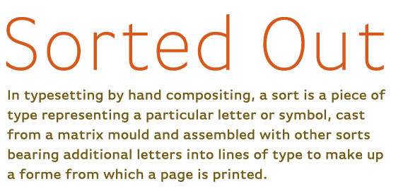
FF Basic Gothic, paired with FF Basic Gothic!
If you’re looking for more variation, you’ll find FF Basic Gothic stands up to most anything you can throw at it. Try a script with some flourish like Bistro Script, or something slightly condensed, like FF Meta Serif.
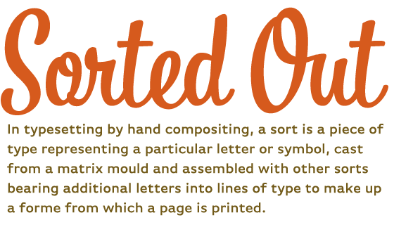
Bistro Script for the headline and FF Basic Gothic for the text.
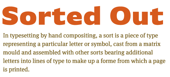
FF Basic Gothic for the headline and FF Meta Serif for the text.
FF Basic Gothic is a bit of an anomaly. While most sans serifs can feel forced in running copy, FF Basic Gothic holds its own, never feeling too obtrusive or subtle. It has a knack for just feeling good — no small feat for a humble sans serif.