Domus Titling from Just Another Foundry

Today we’re pleased to welcome Just Another Foundry’s brand new Domus Titling to the Typekit library, design by Shoko Mugikura and Typekit’s own Tim Ahrens. Sporting seven weights with classical Roman proportions and an uppercase-only character set, this sans-serif typeface looks best big — and we make sure it renders well at large sizes, too. Here are some suggestions for text faces with which to pair it.
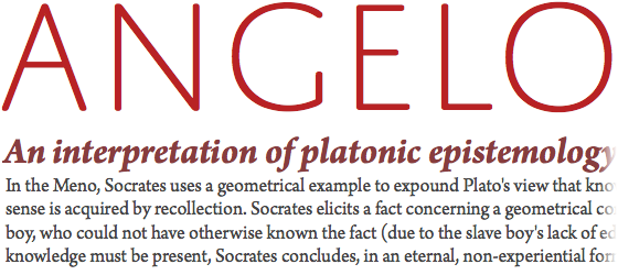
Suggested pairing: Domus with Arno

Top to bottom: Domus Titling Extra Light, Arno Pro Bold Italic, Arno Pro Regular
Adobe’s Arno comes from the same Renaissance bloodline as Domus, crafted in the tradition of early Venetian and Aldine book typefaces. Its capital proportions are strikingly similar to those of Domus; its lowercase feels meant to be — a classic fit. Yet because these two families are both young (the elder, Arno, just four years old), the combination feels decidedly contemporary.
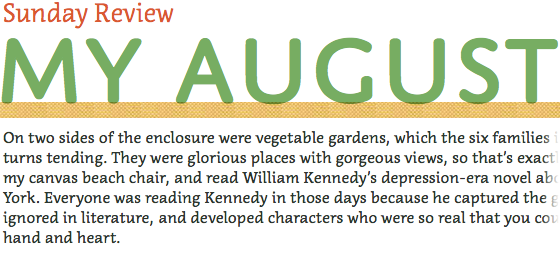
Suggested pairing: Domus with Rooney

Top to bottom: Domus Titling Bold, Rooney Bold Italic (left), Rooney Regular
Jan Fromm’s likeable Rooney, a serifed family of six weights (each with an italic) is another good fit for Domus — but not because of its proportions or historical roots. Rooney and Domus share a roundedness of form (look at their terminals, and Rooney’s serifs) and also have a similar energy and mass in their joints. They make a vibrant pair.
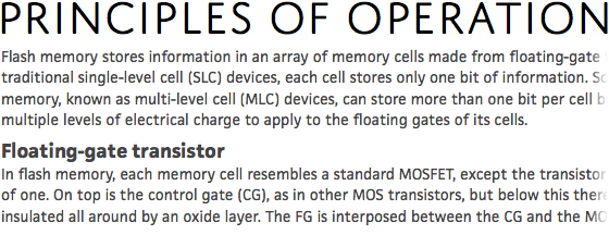
Suggested pairing: Domus with Acuta

Top to bottom: Acuta Thin, Domus Titling Medium, Acuta Light
Pairing Anatoletype’s Acuta with Domus is an exercise in controlling contrast. Done right, clarity of communication and an agile narrative pace await. Pay close attention to the effects that specific typesetting decisions can have on this particular combination. Try different weights and sizes of each face, and note how white space also affects the relationship.
Suggested pairing: Domus with FacitWeb

Top to bottom: Domus Titling Light, FacitWeb Regular, FacitWeb Bold, FacitWeb Regular
Finally, JAF’s own FacitWeb makes an excellent text face for Domus, though the reason why is difficult to articulate. Chalk it up to the old adage that typefaces from the same designer often have an intangible compatibility. A solid web text face on its own, and meant for exactly that purpose, FacitWeb has a reliable made-for-display ally in Domus.
Domus Titling is available in the Personal Library and higher. Sign up or upgrade today to try it out. If you’ve already upgraded, enjoy your new fonts!
4 Responses
Comments are closed.
A fantastically designed typeface – a great (and most welcomed) addition to the font library.
Great font!
—–
It’s really awesome you are doing the pairing suggestions with new font announcements.
It would be extra super great if that information was also on the font pages themselves, or there was a link to the announcement post.
Stay tuned 🙂
Just wanted to say I am lovng this series, as a web designer developer coming from more of a software development background, this sort of guidance on typography and design is huge. Please continue this series.