Sites we like: McSweeney’s, Marshall McLuhan Speaks, Nizo, Co.Design, 8 Faces, and Alfred
Old and new media collide in a super-sized Sites We Like!
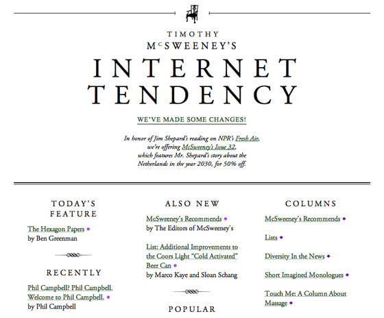
McSweeney’s built an indie publishing empire around their nearly strict use of Garamond, and now their Internet Tendency smacks of all the same bookish austerity too with Adobe Garamond Pro, one of the hardest working book typefaces in show business.
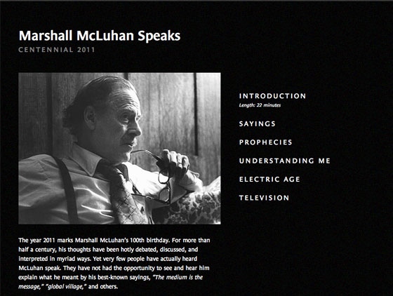
Marshall McLuhan remains controversial in his theories on communication and media, fueling much discourse and debate. To celebrate the year of his 100th birthday, Marshall McLuhan Speaks shares a wealth of video appearances and interviews. The use of Le Monde Sans, a lineal typeface derived from serifed proportions, is a beautifully understated choice.
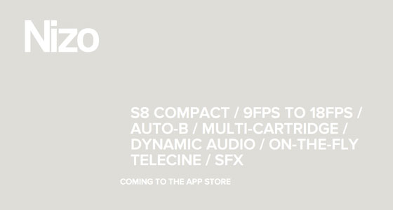
Nizo! It’s an app! It’s a Super 8 camera! It’s unreleased! It’s also a website with a secret, so be sure to scroll all the way down. Proxima Nova perfectly complements the stark landscape and machinery with its simple, friendly geometry.
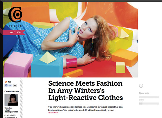
Fast Company’s design blog Co.Design aims to bridge that illusive “fuzzy border between design and business”, and what better way to do so than with the clean geometric curves of Museo and sturdy base of Museo Slab.
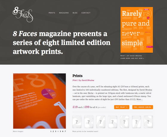
8 Faces Magazine hit the scene late last year with a bang: interviews with type designers and creative folks alike on their thoughts on type and typography. The magazine’s content is wonderful, and so is their site set in the modern workhorse FF Meta Serif.
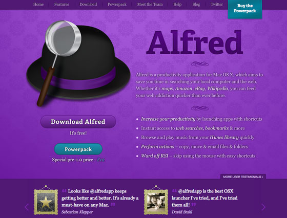
Alfred is a lightweight productivity and launcher application for Mac OS X. Their use of Adelle for beefy and eye-catching headlines adds a flavor of authority.
Stay tuned for more sites we like next week!
4 Responses
Comments are closed.
(hmmm I thought I posted this first time)….
After starting with Chaparral Pro and then trying out Kulturista, now I’m using Adelle Web for my NoSQL and poligylot persistence blog: http://nosql.mypopescu.com.
Meanwhile I was looking for some sans serif fonts that are similar in form to Kulturista and Adelle–all I could find so far was Nudista and Purista, but I’ll keep searching.
Adobe Garamond Pro is easily one of my favorite fonts. Matched with Helvetica, you can create beautiful, easy-on-the-eyes print media.
That top one has the right idea, but it seems Adobe Garamond is too ‘dazzling’ on my screen. Painful to read. Have they tried Premier Pro? Might work better.
I like Co. Design. I like the picture, very beautiful.