New and updated fonts from Mark Simonson, including alternates, small caps, and Proxima Nova Soft

New members of the Proxima Nova superfamily.
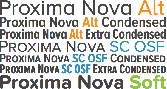
Proxima Nova, one of the most popular and versatile type families on the web, is now even better: forty-two weights and styles of alternate characters (see also: condensed, extra condensed), forty-two weights and styles of small caps and oldstyle figures (aka, lowercase numbers, see also: condensed, extra condensed), and a brand new rounded version, Proxima Nova Soft (update: now Proxima Soft), are now available in Typekit’s library.

Proxima Nova Condensed (gray), Alt Condensed (orange), and SC OSF Condensed (blue).
Above, note the alternate lowercase a, l, y, and capital G, as well as the more natural mid-sentence feel of lowercase numbers. Web browsers are only beginning to explore proper CSS support for OpenType features, but today you can reliably use Proxima Nova’s small caps, lowercase numbers, and alternate characters by adding two fonts to the same kit. For example, if Proxima Nova and Proxima Nova Alt are in your kit, you can access both styles of lowercase a.

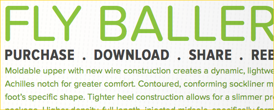
Proxima Nova Soft Regular (green) with Proxima Nova Condensed Bold (gray).
Take the edge off with Proxima Nova Soft, a rounded version of Proxima Nova. Its subtle strokes strike a smart balance between “friendly” and “sporty,” while its structure retains Proxima Nova’s familiar dignity and rhythm. Try pairing it with other members of the Proxima Nova family.
Other new fonts include Goldenbook, Grad SC OSF, and Mostra Nuova Alts A, B, C, and D. And finally, many of Mark Simonson’s fonts have been updated with additional glyphs, as well as vertical metrics and rendering improvements. Just republish your kits to receive the latest files.
One Response
Comments are closed.
Still the very best font designer around. Thanks for the updates!