Sites we like: Paul Shaw Letter Design, CSS3 Speed Test, FFFFALLBACK, and more
So many great sites to like this week, we can barely fit them all in.
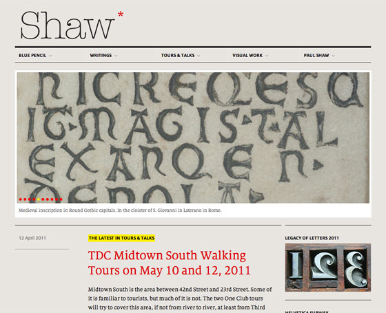
Paul Shaw is a designer and design historian and author of Helvetica and the New York City Subway System. FF Milo and FF Milo Serif (both available from FontShop) make a great pair. I’m especially smitten with FF Milo’s compact style and large x-height. Refresh the page a few times to see the logo typeface shift — a nice, lyrical touch for an otherwise understated design.

Trent Walton returns with a CSS3 Speed Test that, perhaps not surprisingly, also happens to be lovingly designed. Proxima Nova picks up a carefully placed drop shadow and accompanies Tamarillo for a vintage look. A related article in Smashing Magazine demonstrates how using CSS3 for design elements saves you production time — and makes your site load faster. (As if you needed further convincing that CSS3 is awesome.)
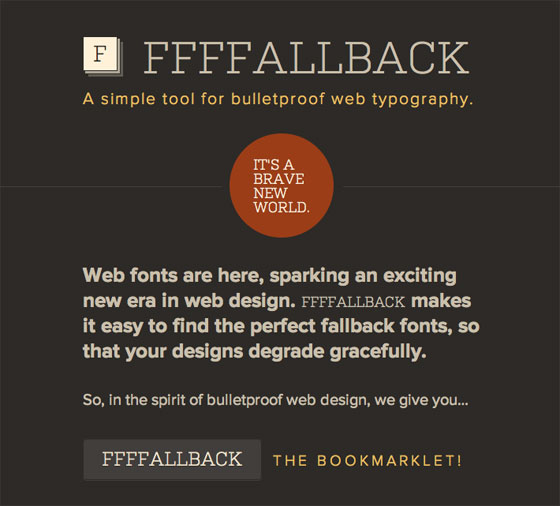
FFFFALLBACK grew out of Josh Brewer’s previous article on choosing fallback fonts. The handy tool allows you to quickly overlay a fallback font over your web font, so you can accurately adjust the fallback scenario. Kulturista lends its handsome serifs to the effort, while Proxima Nova plays a supporting role.
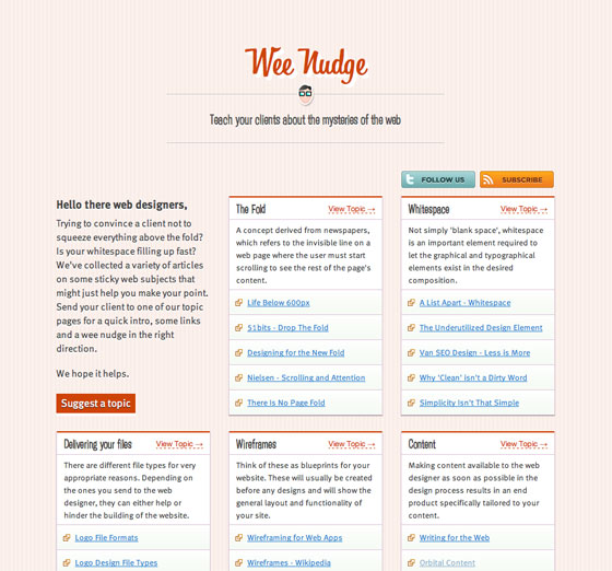
WeeNudge uses Bistro Script, Hooligan, and FF Meta to teach your clients about the web. The card design lends itself naturally to a responsive design, while small, white drop shadows lift the links off the patterned background, giving them just a hint of dimension. Nicely done (and the content is sure to come in handy, too).
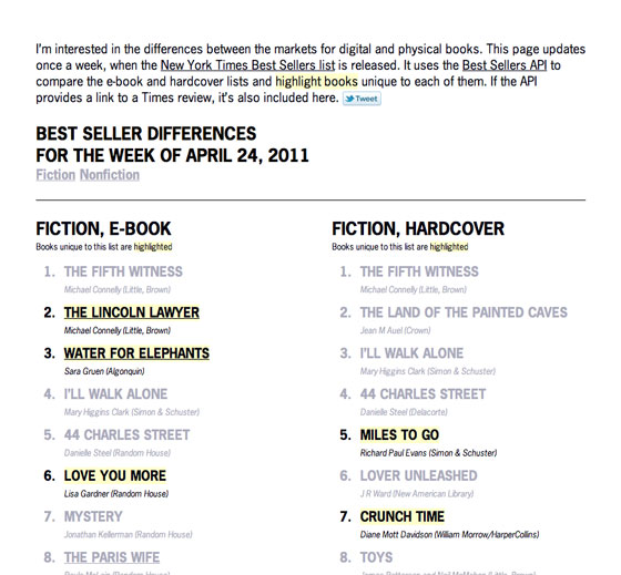
Finally, Robin Sloan whipped up a quick tool for comparing the markets for digital and print books. Best Seller Differences is appropriately typeset in Adobe’s News Gothic and neatly demonstrates how a very simple design can use great type to communicate. One font, two columns, and minimal color add up to a page that evokes the broadsheet without feeling stale.
That’s all for this week; share sites that you like in the comments.
2 Responses
Comments are closed.
We used Netto Web and Proxima Nova. So much better than stale old Arialvica
Check out http://www.harmonizr.com. We combined Meta Web Pro, Belle, and Myriad Pro Condensed and also used font events to trigger the animations. Let me know what you guys think!