Sites we like: Do Lectures, Géraldine Crosset, and Two Paperdolls
An inspiring conference, a lovely portfolio, and a new job in this week’s sites we like.

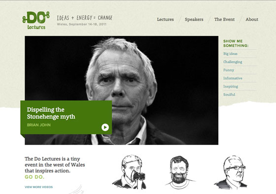
The Do Lectures is a tiny event in Wales that inspires action. Rooney Web’s soft serifs are warm and inviting, and complement the hand drawn illustrations. Proxima Nova contributes its round, open shapes to complete the look.

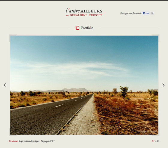
Géraldine Crosset is an amateur photographer inspired by day-to-day life in Africa and elsewhere. Garamond Premier Pro accompanies a subdued color palette and simple picture frame to create a classy portfolio.

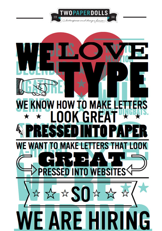
Finally, Two Paperdolls is hiring, and they want you to know that they love type. Vinyl, Aviano Slab, Poplar, and the aptly named Cowboyslang combine to showcase their passion, and with luck, inspire an interaction designer to join their ranks. Perhaps that’s you?
As ever, share sites that you like in the comments.
3 Responses
Comments are closed.
I like the design of the 2 paper dolls site but the navigation on the left is kind of janky. I still don’t really understand what it is supposed to do. Sometimes I click it and the type moves, other times it just sits there. Appearance 9, usability 2.
Maybe I am missing something?
Viewed it in Safari XP and FF4 XP(It’s all I GOT AT WORK)
@jamesvec The “1 color” and “2 color” buttons on the 2 Paper Dolls site aren’t really for navigation, they just reveal or hide the layer of black type. It’s a reference to 1 color and 2 color offset printing processes.
Thank you for the mention of Brian John’s wonderful Do Lecture — and for sharing Do with your readers in general. I have enjoyed Do for some time now and their site is one that I often recommend. Jim Melfi, Founder, VideoTalks.org.