Sites we like: Adaptive Path, Method & Craft, and mattwie.be
The craft of design manifests itself in three beautiful sites we like.

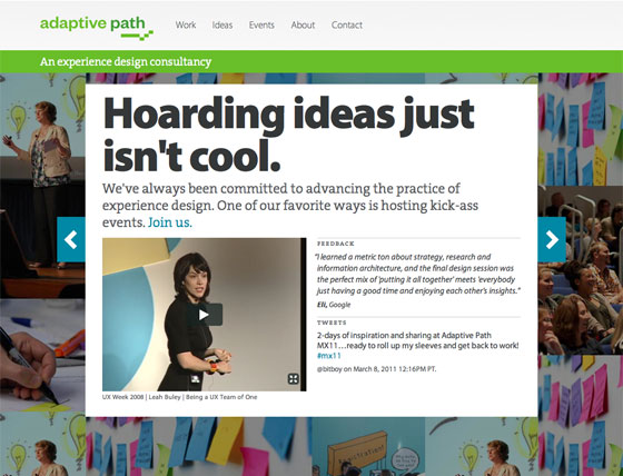
Our close friends at Adaptive Path are celebrating their tenth anniversary with a handsome new site design. Myriad lends the savvy copywriting an air of informal authority and expertly complements TheSerif’s roman letterforms.

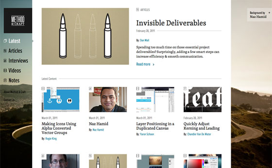
Method & Craft tells the stories behind the design — who made it, how they did it, and the techniques they developed along their career. Skolar’s academic, but accessible design makes for a perfect environment for the smart, encouraging writing, while Proxima Nova Extra Condensed shows off its efficiency on small metadata text.

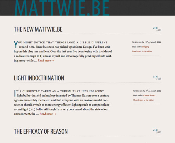
The new mattwie.be is reader centric with a responsive design that limits distractions; be sure to read Matt’s take on the redesign process. The result pairs Myriad Condensed with Minion in a minimal but classy design. Minion Caption looks especially nice when set all caps in the comments — a good reminder that fonts designed for captions often work well for other kinds of text at small sizes.
That’s all for this week! As always, share sites that you like in the comments.