Case Study: Getting Hardboiled with CSS3 2D Transforms
This is part of a series of guest posts covering tips and tricks for working with CSS. These techniques, along with web fonts, make rich interactive sites achievable with simple and accessible standards-based markup and CSS. Today’s guest post was written by Andy Clarke, author of Hardboiled Web Design.
In this example we’ll use CSS3 two-dimensional transforms to add realism to a row of hardboiled private detectives’ business cards.

There are a number of transform properties we can use, including:
translate: moves an element horizontally and verticallyskew: distorts an element horizontally and vertically (not covered in this article)rotate: rotates an elementscale: increases or decreases the size of an element
The basic syntax for transforms is simple:
transform: transform type(value);
There’s no getting away from the fact that CSS transforms are an emerging standard. But there’s already widespread support for them in contemporary browsers; Firefox, Google Chrome, Opera, and Safari have all implemented transforms using vendor-specific prefixes and Microsoft is soon to follow. For the transforms we’ll be covering in just a minute, we’ll need vendor-specific prefixes for Mozilla, Microsoft, Opera, and WebKit, followed by the W3C’s official transforms syntax. (From now on, I’ll use only the W3C’s official transforms syntax. I’ll leave it up to you to add the corresponding vendor-specific prefixes.)
.vcard {
  -webkit-transform: translateY(90px);
  -moz-transform: translateY(90px);
  -ms-transform: translateY(90px);
  -o-transform: translateY(90px);
  transform: translateY(90px);
}
Quite a fistful I know, but necessary, because these vendor-specific prefixes allow each browser maker to perfect their implementations as the standard develops. Two scripts make Hardboiled Web Design possible. First, selectivizr enables CSS3 selectors in older versions of Internet Explorer. Then, Modernizr tests a browser’s ability to render CSS3 two-dimensional transforms and adds class attribute values of csstransforms or no-csstransforms to the HTML element, depending on the result.
Setting up the HTML
Here we have four microformat hCards, each with its own set of values to describe a detective’s contact information. These act as styling hooks and enable our users to extract the data from each hCard more easily:
  The Fat Man
  Private Investigation
  $50 a day plus expenses. By appointment only
  Dial: M for Murder


  Nick Jefferies
  Private eye
  WA6-0089


  Shoes Clues
  Finding the footprints they leave


  Hartless Dick
  Private investigations
  Dial #333 for a quick fix
Laying out the hCards
Let’s start by writing styles that will be common to every card. We’ll float each one to the left and give them identical dimensions:
.vcard {
  float: left;
  width: 300px;
  height: 195px;
}
Our next task is add individual background images to each card. But how? Remember there are no id attributes anywhere in our HTML?
The :nth-of-type pseudo-element selector targets an element based on its type and position in the document. Want to target the first, second, third, or fourth card, no matter where they appear in the document order? Not a problem. This makes :nth-of-type pseudo-element selectors one of CSS’s best-kept secrets:
.vcard:nth-of-type(1) {
  background-image: url(c01.jpg);
}

.vcard:nth-of-type(2) {
  background-image: url(c02.jpg);
}

.vcard:nth-of-type(3) {
  background-image: url(c03.jpg);
}

.vcard:nth-of-type(4) {
  background-image: url(c04.jpg);
}
As we only want the background images to show and not the HTML text, indent every element inside those cards to move them off-screen:
.vcard * {
  text-indent: -9999px;
}
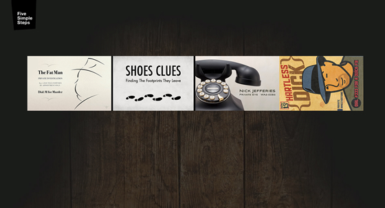
The best way to learn transforms is to see them in action, so we’ll use scale, translate (move), rotate, and a combination of all three to adjust the size, position, and rotation of each card.
Transform ‘scale’
When we use the scale property, we make elements appear larger or smaller. By how much and on what axis is determined by a scaling factor, which can range between 0.99 and 0.01 to make an element smaller, or 1.01 and above to make it larger. A scaling factor of 1 maintains the intrinsic size of an element. You can scale elements along the horizontal (X) or vertical (Y) axis, or a combination of the two. Other elements remain unaware of a new size and so don’t reflow around it.
To vary the size of several hardboiled cards, we’ll scale them in two dimensions using the combined scale property. Scale the first card down to 80% (.8):
.csstransforms .vcard:nth-of-type(1) {
  transform: scale(.8);
}
Next, increase the size of the second and third cards by 10% (1.1):
.csstransforms .vcard:nth-of-type(3),
.csstransforms .vcard:nth-of-type(4) {
  transform: scale(1.1);
}
Transform ‘translate’
Moving elements with translate behaves in a similar way to relative positioning, where an element is offset visually but keeps its position in the document’s normal flow; translate moves elements on the x- and y-axes. We can specify how far they move by using pixels, ems, or percentages that are relative to the size of the element. We’ll translate each card along both the horizontal (X) and vertical (Y) axis:
.csstransforms .vcard:nth-of-type(1) {
  transform: scale(.8) translateY(90px);
}

.csstransforms .vcard:nth-of-type(2) {
  transform: translate(150px, 60px);
}

.csstransforms .vcard:nth-of-type(3) {
  transform: scale(1.1) translate(144px, 55px);
}
Look carefully and you’ll notice that in that last example, we combined two transform values into a single declaration. To set multiple values, string them together and separate each with a space. A browser applies these transforms in order — reading from the left.
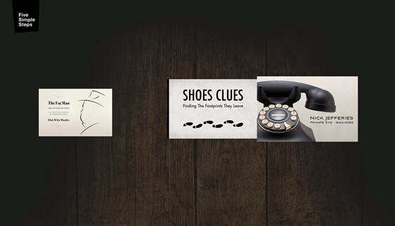
The space you see between the first and second cards is a perfect spot into which we can position the fourth and final card.
Transform ‘rotate’
We can rotate an element between 0 and 360 degrees (clockwise) and even use negative values to rotate an element counterclockwise. The syntax is quick to learn. First, declare the rotate value, then the angle inside parentheses. The fourth card’s artwork has a portrait orientation whereas all others are landscape. Fix this by rotating that errant card ninety degrees clockwise (90deg), scale it by 10% (1.1) and finally move it into position by translating it down 20px and left 630px:
.csstransforms .vcard:nth-of-type(4) {
  transform: scale(1.1) rotate(90deg) translate(20px, 630px);
}

Embracing the natural differences between browsers
No two browsers are the same, so to make the most from emerging technologies such as HTML5 and CSS3, we need to banish the notion that websites should look and be experienced exactly the same in every browser. We should design around browser differences instead of hacking around them. That will likely mean that designs will look different — sometimes very different — across browsers.
To make this simple alternative, adjust each card’s margins to float them into a simple grid.
.no-csstransforms .vcard {
  margin: 0 20px 20px 0;
}
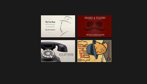
How adventurous your alternatives are depends on you, your clients, and the project you’re working on. Be under no illusion though: CSS3 selectors and properties give us the power to create designs that are tailored to browsers of all capabilities. With this variety comes new opportunities to show our creative skills and new opportunities for business. It’s time to grab those opportunities with both hands.

Author of Hardboiled Web Design, Andy Clarke is a seasoned brand steward, a fancy pixel wrangler, and no mean hand at code. A triple talent. The bastard.
14 Responses
Comments are closed.
Great article. And I’d recommend Hardboiked Web Design as a must-read: a truly inspiring book.
Interesting that this appeared on the Typekit blog today, as I’ve spent most of the day trying to get rotation transforms working with elements styled with @font-face fonts. Seems that characters get rendered with jagged offsets.
Unfortunately, non-horizontal type rendering can be unpredictable.
See also: the rotation part of the post we just published on CSS properties that affect type rendering.
Thanks. You’re latest post managed to summarise what I was talking about much more effectively than my meagre description!
I used translate for this pure css-slideshow: http://www.designmadeingermany.de
Css3 rocks so much for people like me without any javascript-knowledge.
I’m really looking forward to giving this a try. (I’m excited to purchase the book, Hardboiled Web Design, too.)
Martin, The CSS slideshow you created is beautiful. Fantastic job!
Nice article, unfortunately I haven’t been able to find a working demo?
@Scarf*oo: You’ll find the working demo here.
http://hardboiledwebdesign.com/demo/2011-01-26/index.html
I love the concept of working with browser differences. A better way of thinking, it seems.
Absolutely spectacular stuff. CSS3 makes me really excited about web design again. Andy is a genius and I can’t wait for me copy of Hardboiled to finally arrive in the mail!
Great Article!
Just one simple question: is there a specific reason why you avoided
ids, and used:nth-of-type()(apart from showing how to use it)?I would have used ids to increase page speed and performance, as
idare more efficient.Nice one. However anyone who really wants to know their way around transforms etc. should definitely try to understand the transformation matrix.
I know it’s maths, but since the CSS engine transforms it all into matrices anyway, I think it could benefit the performance to simply write matrices (matrix3d() matrix2d()). Want to successfully change transformations via JavaScript? Yep, you then need matrices too 😉
Gosh, I recently read a nice article explaining matrices with reference to CSS. Can’t find it anymore :-S
“That will likely mean that designs will look different — sometimes very different — across browsers.”
That is exactly the reason why these technologies are not ready to be used for production websites. No web developer in their right mind is going to build a different layout for every browser on the market. It’s just not possible. For experimental sites it’s fine, but for a site that that needs to work everywhere and be built in a reasonable amount of time I would say steer clear. The reason Flash and now jQuery did so well is that they are consistent across browsers. Building a separate site for each browser leads to madness.
I disagree; Andy points out that your mileage with these approaches may vary, depending on the circumstances. But in many cases, users of older browsers won’t even realize they are missing anything. So long as the site is built such that older browsers still have access to all the content and can transact as needed, it’s not necessary for a site to look or feel exactly the same everywhere.