Sites we like: Galpin Industries, Octophant, and Drawn
The year’s final sites we like features three unique and carefully crafted sites.

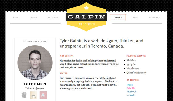
Galpin Industries is the home of designer and entrepreneur Tyler Galpin. Sporting FF Tisa for body text, Skolar for small, all caps subheadings, and FF Meta for spry headlines, the design is athletic and pleasingly competitive.

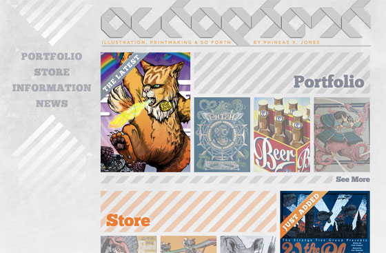
Illustrator and printmaker Phineas X. Jones hangs his hat at Octophant. Headlines set in Chunk from the League of Movable Type develop an embossed, stone-like feel on hover, thanks to a well-placed text-shadow.

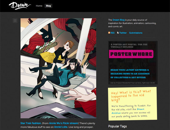
The Drawn Blog provides inspiration for illustration, animation, cartooning, and comic art. Museo and Museo Sans make for excellent body text, while FF Providence Sans comes in handy for the post-it note in the sidebar.
That’s all! We’ll be back with more sites to share in the new year.
2 Responses
Comments are closed.
Great sites! I’m wondering why the Drawn blog doesn’t show its Typekit fonts in Chrome, but the Gilpin’s site does. I’m running Chrome 8.0.552 on OS X, and when I visit the Drawn blog, the post-it note is in a plain serif. It was only when I visited the site in Safari that I saw all the Typekit fonts. But Gilp.in matches in Chrome and Safari. Any ideas?
I should add that Octophant.us also displays without Typekit fonts in Chrome.