Featured site: Twitter 2010: Year in Review
Of the many “best of” lists that you’ll see this month, perhaps no other captures the zeitgeist as effectively as Twitter’s Year in Review. From celebrities (Justin Bieber, Kate Middleton) to movies (Harry Potter & the Deathly Hallows, Inception), and from technology (Google Android, Apple iPad) to global news events (the gulf oil spill, Cablegate), Twitter has been at our fingertips throughout 2010, and will almost certainly continue to be so into the new year.
Happily, the Twitter team have gathered this year’s highs and lows into a fascinating record for you to wax nostalgic over now and in the future.

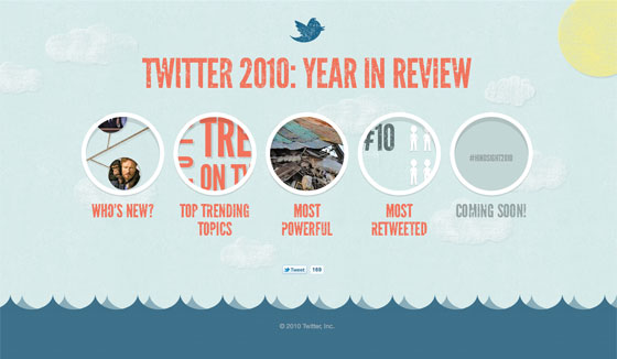
The home page of Twitter 2010: Year in Review.
Twitter 2010: Year in Review features Twitter’s newest members, including Queen Noor and the White House Press secretary, plus Conan O’Brien, Bill Gates, and others; the years top trending topics, demonstrating the global love for fútbol, with the World Cup, vuvuzelas, and Pulpo Paul taking three of the top ten slots; the most powerful tweets of 2010, in a Big Picture-esque treatment, with photos and brief notes putting the tweets into context; plus the year’s most retweeted tweets, in which Stephen Colbert wins Twitter. All lovingly designed and illustrated, and featuring Proxima Nova, League Gothic, and FF Meta Serif with Typekit.

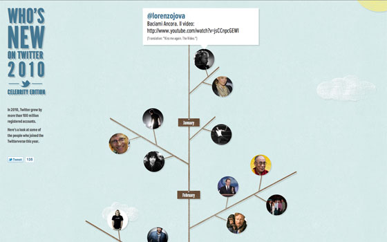
The Who’s New page makes a festive holiday tree from Twitter’s newest celebrities.

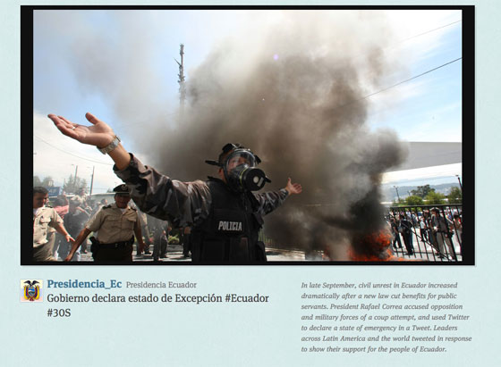
The most powerful tweets of 2010, with photos and contextual notes.
If viewed in a WebKit-based browser (either Chrome or Safari), you may notice that League Gothic’s typically clean lines have been attractively marred with dirt and scratches. A wee bit of CSS handles that effect, while maintaining the text’s native accessibility:
h1 {
  -webkit-mask-image: url(http://yearinreview.twitter.com/img/text-mask.png);
}
The -webkit-mask-image property uses an image to mask the element underneath it. In this case, a speckled and splattered png masks out parts of the text, giving it a worn, ramshackle look. Most importantly, it does this in a way that avoids using image replacement for the text, and degrades gracefully in non-WebKit browsers. When paired with the sunny color palette and Twitter’s signature blue sky, the grunge effectively captures the year itself: we leave 2010 a bit battered and perhaps worse for wear, but we still love Kanye West.
2 Responses
Comments are closed.
I guess one can say, no one has deftly captured the sentiments of the popular majority, more than twitter has. To see a topic or name in TT means there is some sort of revelatory news about them at this minute. Quite a fascinating tool it is!
That League Gothic & FF Meta Serif combo gets me every time.