Type study: A layered text shadow
This is the first in a series of guest posts covering tips and tricks for working with fonts on the web. Today’s guest post was written by Ryan Essmaker of Designing Monsters.
The redesign of Designing Monsters was heavily inspired by traditional newspaper layouts. The narrow column width, large headline text (in League Gothic), and serif body text (FF Tisa) all pay homage to classic newsprint.

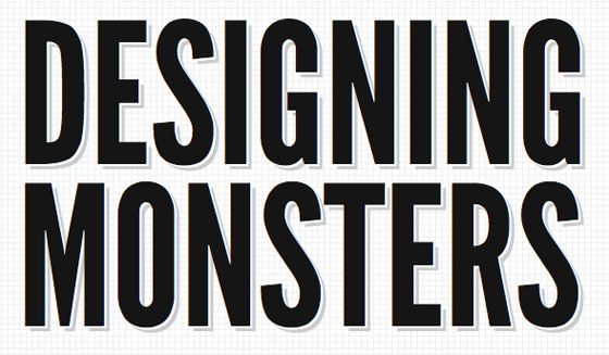
The header on Designing Monsters.
The header and quote at the bottom of the site are set apart by a text shadow. This gives it a three-dimensional feel and emulates offset printing mishaps occasionally seen in newspapers.
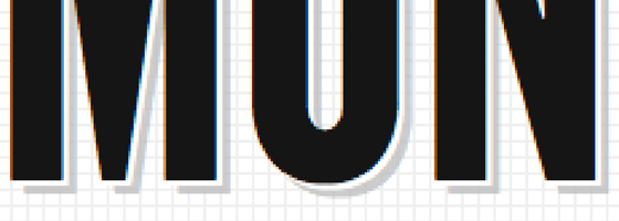
To accomplish this I used the CSS3 text-shadow property. Actually, I used it twice: a white shadow sits atop a larger gray shadow:
h1 {
  text-shadow: 2px 2px 0 #fff,
  5px 5px 0 #bbb;
  }

A close-up of the two shadows in place.
In the text-shadow syntax, the first value is the horizontal offset, while the second value is the vertical offset. Offsets can be positive or negative. (You can use a negative offset to create the inset type effect that all the cool kids are using these days).
The third value sets the blur of the shadow. Blurs can get out of hand quickly, so use with caution. I chose not to blur the shadows in this case.
The fourth and final value is color. You could also use RGBA colors to set the opacity of the text-shadow, like so:
h1 {
  text-shadow: 2px 2px 0 rgba(255, 255, 255, 1),
  5px 5px 0 rgba(187, 187, 187, .75);
  }
In this case, the gray shadow is set at .75 (or 75% opaque) which would allow the background to bleed through a bit.
If you choose this method, be sure to set an RGB fallback color for browsers that don’t support RGBA. Older browsers will use the RGB value and ignore RGBA.
h1 {
  text-shadow: 2px 2px 0 rgb(255, 255, 255),
  5px 5px 0 rgb(187, 187, 187);
  text-shadow: 2px 2px 0 rgba(255, 255, 255, 1),
  5px 5px 0 rgba(187, 187, 187, .75);
  }
Text-shadow is supported in Safari 1.1+, Chrome 2+, Firefox 3.1+, and Opera 9.5+. Unfortunately, Internet Explorer does not yet support text-shadow, even in the new IE9 beta. But the nice thing about text-shadow is that it doesn’t affect the layout so it degrades nicely in less capable browsers. Enjoy!

Ryan Essmaker is the founder of Designing Monsters, a small design studio. He’s a sucker for good typography and well-written markup. In his spare time you can find him with camera in hand or strumming on the ole six-string.
9 Responses
Comments are closed.
Ryan, thanks for the article! I had one question about your RGB fallback. I had always made the assumption that every browser that supports text-shadow also supports rgba, but your article indicates that is not the case. Do you know which browsers support text-shadow but not rgba?
RGBA is supported in Safari 3.2+, Chrome 3+, Firefox 3+, and Opera 10+ (and IE9 beta). So, older versions of Safari, Chrome, Firefox, and Opera support
text-shadowbut not RGBA.Mandy, thanks so much! I assumed they were added at the same time, now I know better!
@Doug: Most but not all. If I remember correctly Safari 2 (and down) doesn’t support RGBA but does support text-shadow. I believe Opera 9.5 is the other one.
Don’t you mean “75% opaque”, or “25% transparent”? With that value, you’ll see 75% of the gray, and 25% of the color underneath.
Yes, you are correct! Thanks for the catch. Fixed now 🙂
Thanks for catching that.
Beautiful redesign, great job!
Sweet, I didnt realise you could double-up text-shadow. Nice