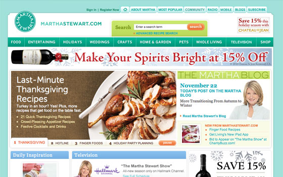
Featured site: Martha Stewart
One way in which Typekit is making the web a better place is by providing solutions that are more accessible than those of yore. Gone are fussy image and Flash replacement techniques; with broad support for @font-face and Typekit’s easy set up, you can use real fonts in less time, and your site will be more accessible as a result.

The home page of marthastewart.com, now with Typekit.
Martha Stewart is the latest site to make the switch, having recently dropped Flash on their homepage in favor of Typekit. Museo Sans adorns the home page feature block, lending a clean, contemporary air to the page overall. Better yet, the designers, developers, and content editors behind the site now have a much more proficient workflow. Typekit takes care of delivering the fonts everywhere, so they can get back to work.
5 Responses
Comments are closed.
I would imagine they were hoping to use Archer, since all of their publications use that for their identity. 🙂
@raymond
Well, an outfit like Martha Stewart can certainly afford to have a custom web version of Archer made for online.
A market in the making, I’m sure. And one which couldn’t exist as little as a year and half ago.
I wonder why they aren’t using it for text as well as headlines?
@richard very good point.
@Richard
If I recall correctly, Archer was commissioned by Martha Stewart Magazine in the first place.
By their own words H&FJ are preparing their faces for web use (read: hinting).