Sites we like: Posterous, Luke Dorny, and Confab 2011
Today’s sites are all about the conversation — in blogs and in person.

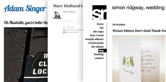
Posterous makes it easy to install Typekit on your blog. Three great examples show what you can do: Adam Singer uses Lobster for headline text; Marc Hedlund wisely pairs Museo Slab headings with Museo Sans text, and Simon Ridgway uses Droid Serif across titles and text for a unified look.

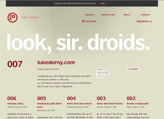
Luke Dorny goes all FF Dagny all the time with a personal site that uses just one font and few colors but manages to convey a compelling, clear hierarchy. FF Dagny’s range of weights and flexibility at both large and small sizes comes in handy. Hover over the navigation at the top while using a WebKit-based browser (Safari or Chrome) for some nifty animation effects.

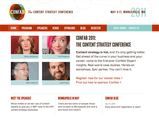
Content strategy is hot, and Confab 2011 is even hotter with Proxima Nova and League Gothic. League Gothic’s straight, condensed shape contrasts nicely with Proxima Nova’s curves, and both look their best in the bright color palette.
Share sites that you like in the comments!
2 Responses
Comments are closed.
Why thank you, Mandy. I’m truly honoured. Love your type service!!!
Hey Mandy, thanks for featuring one of my designs (Confab)! Glad you like the type combo. Me too!