New Web Fonts for Garamond Premier Pro
We’re happy to announce that earlier today, Typekit released 16 additional fonts of Garamond Premier Pro (Text and Caption). As you might recall from Christopher Slye’s post back in September, we went out and asked customers what fonts they wanted for the web. We heard some great feedback and thank everyone who chimed in.
Based on what we heard, we decided on a two-pronged approach for additional releases — to offer new families with just a few fonts and to extend certain families to include more weights. Our next web font release will include some new families for you to play with, but our first priority was to extend the offering for Garamond Premier Pro to include two more optical size ranges, Text (Regular) and Caption, for a total of 16 additional fonts. Our initial release included only the ten Display size fonts.
For a more detailed overview of optical sizes, we suggest you go back to our previous post focused on optical sizes. The short story on optical sizes is that Display is intended to be used at large sizes (typically 19–72 point) while Text (Regular) and Caption are to be used at small sizes (typically about 10–13 point for Text and about 6–8 point for Caption). It’s important to note that the recommended size ranges are for use in print, and the recommendations do not always carry over to on-screen viewing. We suggest that you experiment with the optical sizes available on Typekit to see what works best for your web page design.
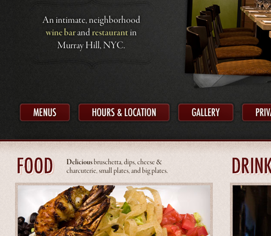
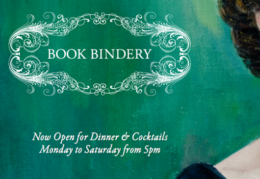
Below are two screen shots from two sites using Garamond Premier Pro on Typekit. To view the actual websites, just click on the images.


3 Responses
Comments are closed.
YES! beautiful. thank you.
I’m only an amateur website designer–I do sites for two non-profit groups of which I am a member–but I am elated at the availability of web fonts and the new OpenType font features which will be supported in css3.
The big problem, of course, is download time. I have 6 MB DSL service. Even at that speed, which is higher than most of the viewers of my websites have, there is a noticeable download time if I use Typekit’s full glyph set of Adobe Garamond, and things like ligatures, small caps, alternate styles, etc., are apparently not available with the more abbreviated glyph set also available on Typekit.
Has any consideration been given to language-specific glyph sets that include more typographical features, but are smaller than the full glyph set by virtue of omitting foreign language glyphs? (Few English writers need or want Greek, Hebrew, Arabic, etc. glyphs, and the reverse is likely also true.)
I understand that creating such glyph sets by language or language group is more work for Typekit and the font vendors such as Adobe, but it would be one way of making wider typographical features available on the web until connection speeds increase to the point where downloading a full glyph complement can be done with no noticeable time lag.
Hi John. That would certainly be useful, and it’s something we’ve discussed with Typekit in the past. I suggest that you, and any other Typekit user who is interested in more subsetting options, write to Typekit and make a feature request. I will certainly pass it on to them, but direct customer feedback is always good — and I know that Typekit is always glad to get it.
Subsetting OpenType fonts can be tricky, because it can disrupt layout features. In other words, removing some glyphs from the font can break the relationship between glyph IDs in the font tables which store the feature instructions and other information. However, it’s theoretically easier to do that along clear boundaries, such as between Latin and Greek scripts, because there is often less feature interaction across those boundaries; e.g. there is usually no kerning between Latin and Greek glyphs. Still, it’s not always as easy at it seems.