Illustrator Memories from Greg Thompson
Thanks to Greg Thompson, a Type Network foundry partner, for sharing memories of Illustrator. Check out the rest of the series here.
What is your earliest memory of using Adobe Illustrator?
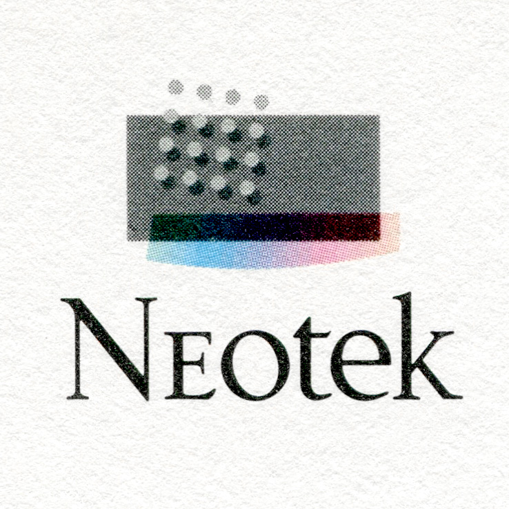
Chicago, 1988. I used Illustrator to design a logo on a Macintosh SE with a 512 by 342-pixel monochrome screen. Output was provided by the only service bureau in Chicago at the time, Infocomm, and they had a Linotronic with a PostScript RIP. Internet was just a gleam in a few peoples’ eyes, so at first I dropped off disks for output, but then they set up a bulletin board for uploads. Even with my 300-baud modem, it saved a lot of time driving downtown with a disk.
Although everything was monochromatic, the printed logo was four-color process.
I created the polychromed element “manually” in Illustrator by drawing adjacent, narrow areas and assigning percentages of black fill from 5% to 100% to make gradations in the shape of the curved bar.
Then, in a single Illustrator document, I duplicated the logo to create four instances along with alignment targets; one each for C, M, Y, and K. The colored bar didn’t have black, so it wasn’t rotated, which produced a 45° dot screen for the grays.

Yellow rotated 45° which produced a zero° dot screen / Magenta rotated 15° / Cyan rotated -15° (Image courtesy of Greg Thompson)
The printing company was given film negatives, which they used to produce a color proof consisting of the blacks on a white board with C, M, and Y each on their own clear film overlays. I was excited to see the first color proof because I had been looking at monochromes until then. The letters were based on Goudy and I drew a weight somewhere between Regular and Medium. I didn’t attempt rich blacks for the type because of the small finished size on stationery and promotional print materials.
How did Illustrator impact your career path as a type designer?
I learned how to draw with vectors in Adobe Illustrator, which gave me a head start when I started using Fontographer in 1988.
How did your relationship to Illustrator change over the years?
When I started using Illustrator, it was extremely limiting compared to the traditional drawing techniques I had been using for years by then. It was slower, and I had to peer into a tiny working space on a monochrome screen; I had to look at low-res, small, monochrome paper proofs from my desktop printer, and my health suffered from the toxic fumes rising from fresh laser prints. Efficient and “proper” use of beziers imposed a new kind of characteristic to the forms I could create, because using large numbers of anchors was clearly inimical to the new way of working. The infrastructure to support working digitally was hit or miss compared to the mature services for traditional graphic design. But I imagined the benefits of this new way of working, and the reality exceeds my early expectations.
How do you use Illustrator in your work today?
Today I use Illustrator as my drawing tool—whether creating patterns, designing furniture, parts for my motorcycles, or architectural plans. I explore new type designs first as pencil roughs on paper, and then in Illustrator; drawing letters over a single horizontal grid of base, x-height, ascender, and descender lines. Later I import outlines into a font editor.
What do you think Illustrator’s biggest type-related legacy has been?
Super-sharp, crisp typographic and graphic images are now ubiquitous, and geographic location is irrelevant as a collaboration factor.