New fonts from Three Islands Press & Jamie Clarke
Introducing Three Islands Press and Jamie Clarke Type, two independent foundries producing decorative and script fonts — and now in the Typekit library. We hope you enjoy working with these fonts as much as we have!
Three Islands Press
Brian Willson has been designing typefaces for over 20 years, and is known for his historical focus. Text is instantly imbued with character when it is set in one of his typefaces, and most of them are even modeled on real historic figures — for example, Old Man Eloquent is modeled after the handwriting of John Quincy Adams. Accompanying these in the collection are map fonts like Antiquarian Scribe and the fun and casual Marydale.
Now available on Typekit for both web and sync:
American Scribe
Antiquarian
Antiquarian Scribe
Attic Antique
Broadsheet
Emily Austin
Lamar Pen
Texas Hero
Marydale
Old Man Eloquent

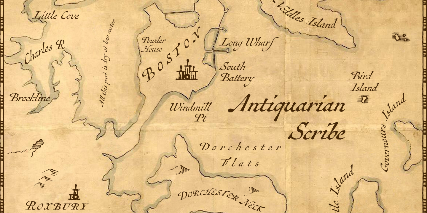
Antiquarian Scribe, based on an 18th-century atlas.

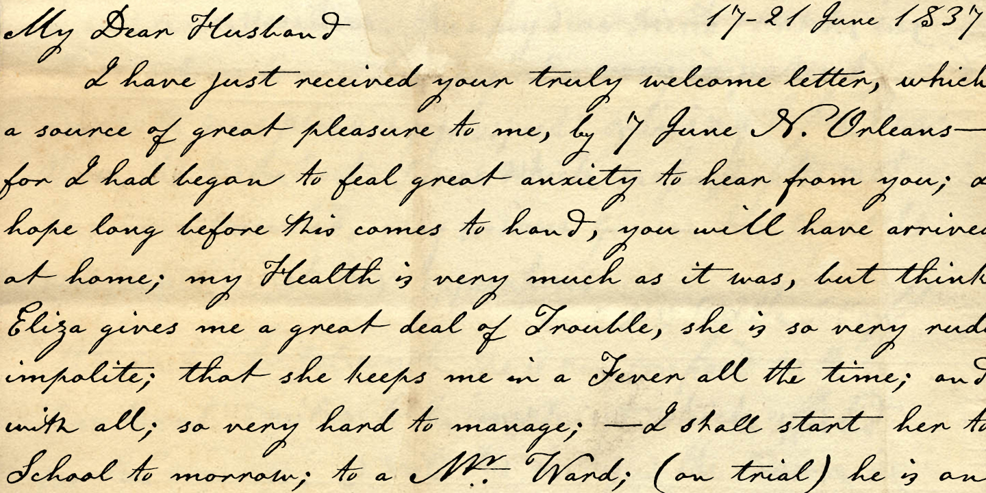
Emily Austin, based on the handwriting of one of Texas’s early colonists. Specimens by Brian Willson.
Jamie Clarke Type
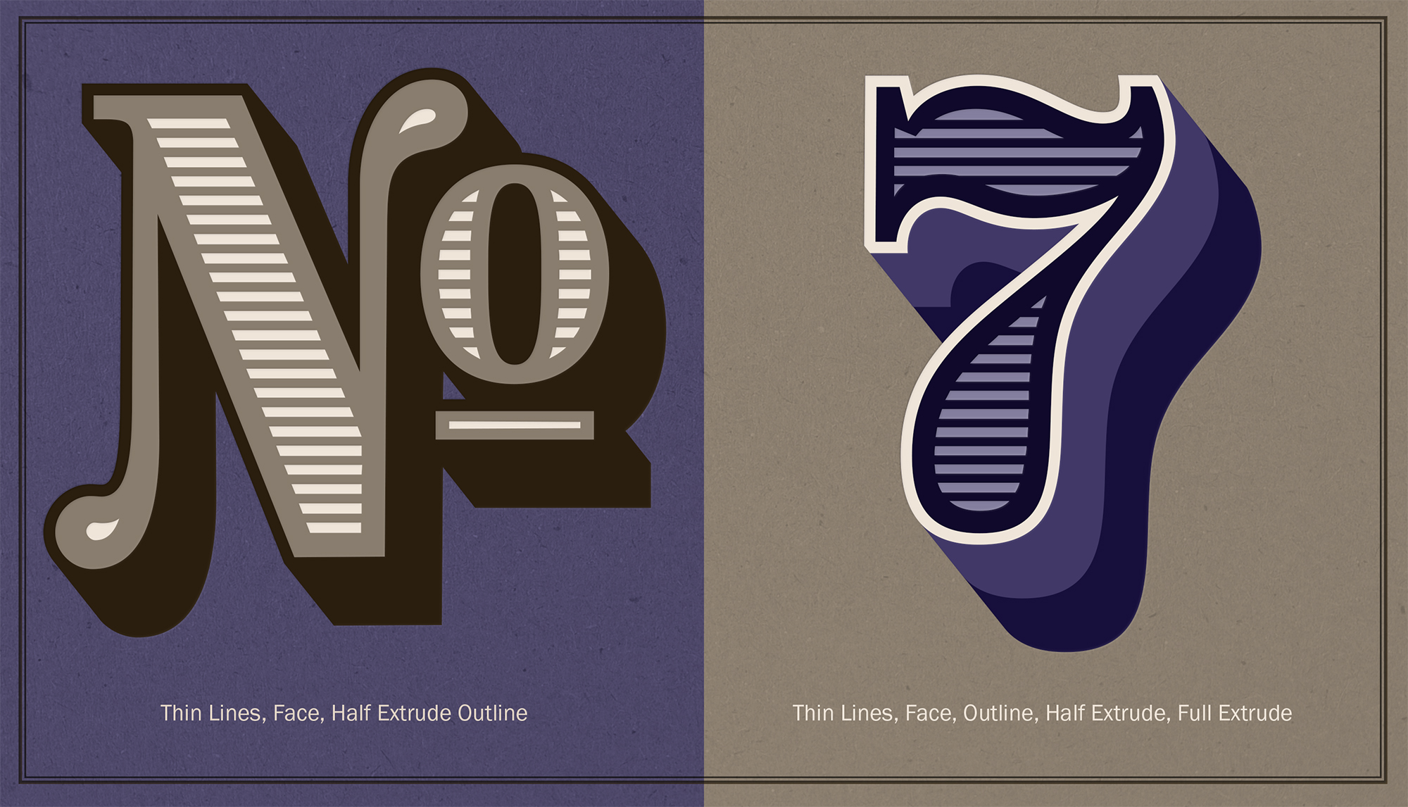
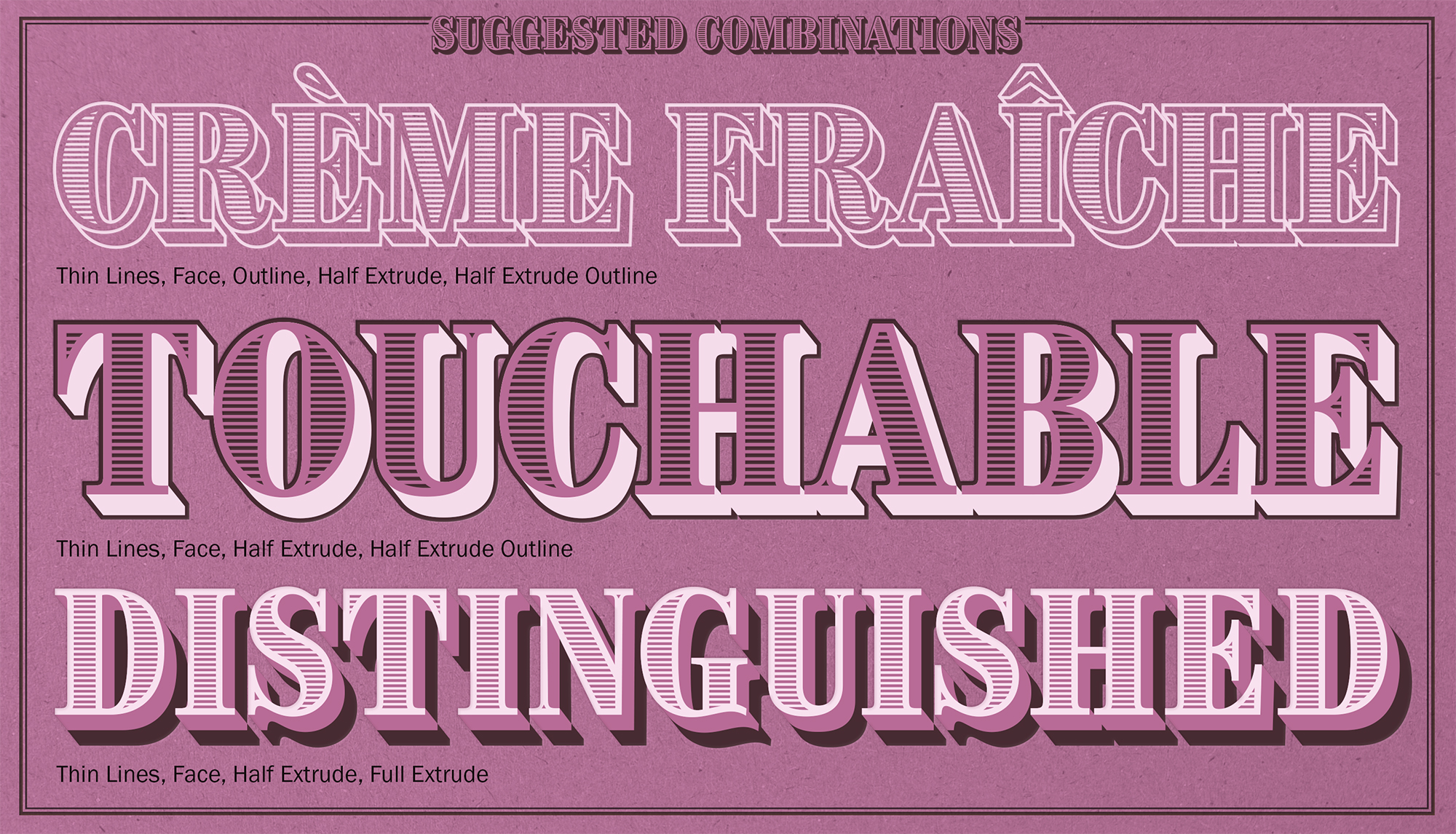
Brim Narrow is a layered display face, which Jamie Clarke originally started designing for a logotype. Inspired by wood type and chromatic type from the 1800s, Brim can be layered to create endless combinations using the various styles and color. Jamie has done some of the work for you — along with the eight styles that make up the Brim family, there are also three combined families which layer some of the styles. Last week, Jamie was featured on I Love Typography; read their article to find out more about his design process and the traditional wood type that inspired him.
Now available on Typekit for both web and sync:
Brim Narrow
Brim Narrow Combined 1
Brim Narrow Combined 2
Brim Narrow Combined 3


Brim specimens by Jamie Clarke.
2 Responses
Comments are closed.
Very impressive fonts. I especially like the 18th-century-like style, this will be able to give my work a much more authentic feel.
Nice fonts. Thank you.