New fonts on Typekit from Typofonderie
We are thrilled to introduce new additions to our library from Typofonderie, a partner since Typekit’s launch in 2009. Originally a showcase of founder Jean François Porchez’s type designs, Typofonderie has more recently added work from other designers, like Xavier Dupré. Along with type design, Jean François has an illustrious teaching background and will continue to bring type expertise to the world with Type@Paris this summer, a course we’re proud to sponsor.
The Ardoise and Mislab complete families are new to Typekit. All of the Typofonderie families we offer have been newly optimized — we’ve also introduced new additions to the Le Monde family (Journal Std 2, Sans Std 2, Livre Std and Livre Classic), Parisine family (Office and Gris as well as Parisine Plus Gris), and Anisette (Std Petite 2).
Ardoise
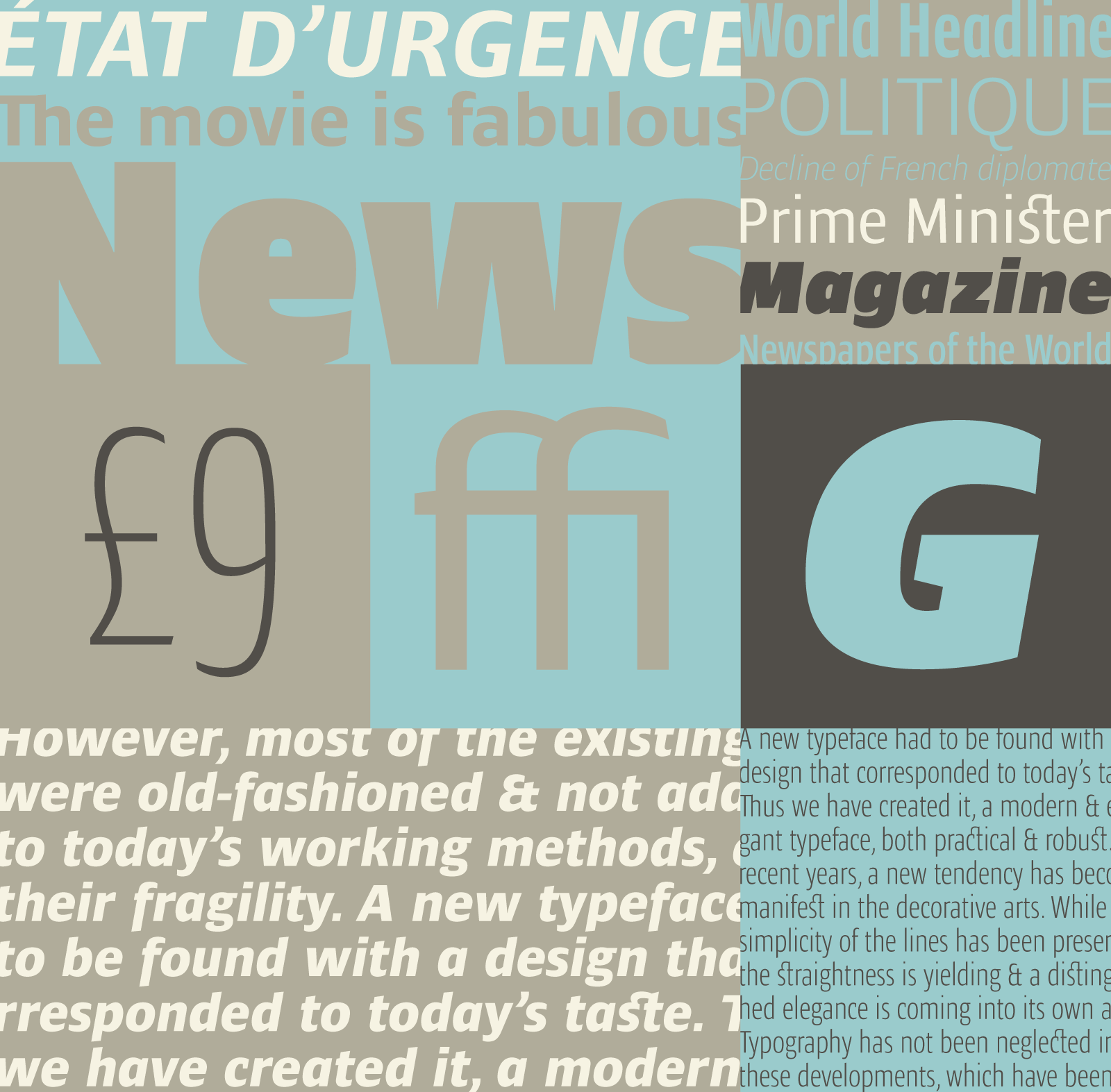
All specimens by Typofonderie — see more on their Tumblr.
Ardoise was developed for publications, but its straightforward forms and high x-height make it very well suited to any layout. Even in the most condensed widths and heavy weights, the typeface maintains legibility and consistency. Its proportions are shared by the Le Monde family, designed by Porchez for the premier French newspaper. There are plenty of weights and styles available to create effective combinations.
Mislab
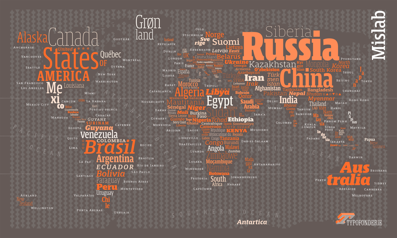
Designed by Xavier Dupré, Mislab succeeds in its role as a robust display face while also maintaining delicate features. Though the uppercase letters maintain strong serifs, most of the lowercase letters — notably the a, c, e and s — are left with sans serif endings. Even the x, a perfect candidate for symmetrical slabs, is treated in a fluid way with one of the terminals ending in a curve. The typeface has an impressive number of weights and styles, well suited for display use.
All the Typofonderie faces are available for use on the web. If you don’t have a Typekit subscription, it’s free to try out and take a look around.
6 Responses
Comments are closed.
Would love to see more typefaces available for print! :/
I’m delighted by Andoise and the fact that “Its proportions are shared by the Le Monde family, designed by Porchez for the premier French newspaper,” suggest that it’d be marvelous for print books. Unfortunately, the web page says it is “available for web” only. A quick check seems to indicate that’s true of the entire Le Monde family of fonts.
Is there any chance that policy might change?
Hi Michael, thanks for your comment! We are always looking to add more fonts for desktop sync, but at the moment these are only for web. In the meantime you can purchase them for print directly from Typofonderie.com.
What are Adobe’s precise use policies? Are ebooks released through outlets such as Amazon’s Kindle and Apple’s iBookstore considered web use (since they are digital) or print/cloud use (since they’re in books)?
Going one step further. Is a fixed-layout ebook that mimics an print edition consider web use or cloud use?
—-
I have one suggestion you might want to pass along, something that’d help those of us who layout books. Typekit lets us search based on a set of properties, but there are situations where a book needs to fit a certain length requirement that isn’t being met by the current font. What we are looking for isn’t quite weight, width, or contrast. Trying font after font can be time-consuming.
It’d be great if there were a numeric scheme that described how economical a font was at using space on a line. If a 200-page book needed to be reduced to 180 pages, we could look for a font that’s 10% more efficient.
Adobe could test a range of fonts, assign a value of 100 to those in the middle, and classify the rest based on that. One with a rating of 80 would be 20% more economical than one rated 100 and one rated 120 would be 20% less efficient that the one rated 100.
I realize that text varies, and that any such scheme wouldn’t be perfect. But a loose indication based on a common body text size would be a time-saver and would make Typekit even more useful.
Michael – you may find this document helpful: http://help.typekit.com/customer/portal/articles/1341590-typekit-font-licensing. To answer your question, Typekit web fonts can only be added to a web application that is viewable on a browser. Thank you for your suggestion, I will pass that along to the team.
I would love to see more for print too!