The Adobe Originals Silver Anniversary Story: A typographic revolution begins
This is the first in a series of articles from Tamye Riggs, a longtime lover of type who is working with us to celebrate the twenty-fifth anniversary of the Adobe Originals type program. This post sets the scene, taking us back to the very early days of digital typography.
Typography is the art and technique of arranging type in order to make the language it forms most appealing to transparent learning and recognition.
—Excerpted from Wikipedia’s entry on Typography
The history of typography is a long and storied affair. Since the eleventh-century invention of movable type in East Asia and the Gutenberg revolution in mid-fifteenth-century Europe, constant innovations have been made, with various methods of typesetting and printing falling in and out of favor.
In the mid-twentieth century, a scant few decades before the beginning of the Adobe story, the time-honored methods of setting text with metal and wood type gave way to the “cold type” era. Typographers keyed copy on dedicated computerized input terminals, which interfaced with a companion imaging component. Using a variety of media, ranging from glass disks to film strips, phototypesetting machines projected characters onto photo-sensitive paper or film, which was developed with photo chemicals. The exposed galleys were used in pasteup or film makeup. Some machines, such as the Compugraphic Editwriter series, were designed mainly for setting text and smaller heads, with a size range of 6–72 points in the higher-end models.
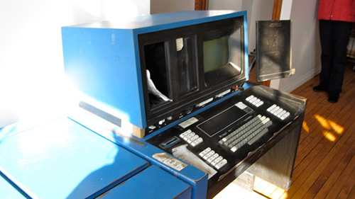
Compugraphic EditWriter phototypesetting machine. Source: thedesignspace.net. License: Creative Commons. https://creativecommons.org/licenses/by/2.0/ No changes made.
Other cold type machines, like the Visual Graphics Corporation Photo Typositor, were geared to crafting hand-tuned display type at much larger sizes, a few words at a time. The Typositor offered refined kerning and spacing capabilities, as well as distortion options (especially handy during advertising’s psychedelic era).
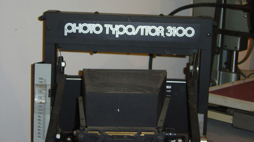
The VGC Photo Typositor 3100, part of the collection at the Museum of Printing in North Andover, Massachusetts.
Although phototypesetting had its limitations, the introduction of these systems marked a dramatic turning point for the graphic arts. According to Adobe Type’s David Lemon, phototypesetting helped lay the groundwork for today’s digital type. The technology introduced fully scaleable fonts—an impossibility with physical type—and brought computers into the process of typesetting. Computerization allowed for controlling placement of the phototype images, making justification and kerning a much easier proposition. This was a boon to an industry used to working within the rigid constraints of metal and wood type.
From the 1950s through the mid-1980s, setting type remained a highly specialized skill, with operators trained in the use of one or more proprietary phototypesetting systems. It took a great deal of time to learn to use a given typesetter, as each manufacturer implemented its own unique coding scheme. By the mid-1970s, there were dozens of different phototype systems vying for market share, from manufacturers like Compugraphic, Mergenthaler/Linotype, Alphatype, Photon, and Autologic. These machines were expensive and most had a large footprint. The higher-end systems were usually found at large type houses and print shops, or at major corporations fortunate enough to have in-house print production studios.
When an art director needed type set, he marked up copy and sent it out to a type house. Type came back in raw galley form, and, if no corrections were needed (a relative rarity), pasteup artists would position the galleys on boards along with other components of a print job. Type was often “knifed” with a razor-sharp X-acto to achieve a better copy fit and optical appearance, or to make last-minute corrections to lines of tiny text, one character at a time.
Ad borders were built with border tape or painstakingly inked by hand with ruling pen and T-square. Headlines were sometimes made on the fly using press type (or “rub down” lettering) — also expensive, fragile, and tedious to work with. Photos and line art were sent out to yet another specialty shop to be prepped for printing. And then there was the black art of stripping.…
Back in the cold type days, typesetting, image production, and everything else related to publishing were expensive and time-consuming practices. There was no such thing as DIY, unless, perhaps, one was making punk band flyers with press type and an IBM Selectric.
All that was about to change.
In 1978, Charles “Chuck” Geschke was heading up the newly-formed Imaging Sciences Laboratory at the Xerox Palo Alto Research Center (PARC). Seeking fresh ideas from outside the company, he interviewed John Warnock for a chief scientist position at the new lab. Both mathematicians and family men who refereed soccer games, the two got along famously, and Geschke quickly brought Warnock on board. “John was the best hiring decision I ever made,” he said.
From day one, Warnock and Geschke shared an ambitious vision: they wanted to make an impact and change the world through their work. While both men had the drive to pursue this dream, they soon became stifled by corporate politics and processes.
Warnock led a Xerox PARC team in the development of two groundbreaking concepts—JaM and Interpress—which incorporated raster graphics and bitmapped fonts. The Interpress page description language (PDL) was embraced as Xerox’s internal proprietary printing standard, but, in spite of Warnock and Geschke’s enthusiastic lobbying, the company had no interest in refining and releasing Interpress as a commercial product.
Frustrated, Warnock and Geschke decided to make a go of it on their own. They left Xerox and formed Adobe Systems in 1982, setting up shop in Mountain View. Their initial business plan entailed building turnkey publishing systems—typesetting equipment, printers, software, and anything else deemed necessary for an efficient workflow. The goal was to sell these packages to Fortune 500 companies so they could move their production in house.
“We were proposing to solve problems in an entirely new way.”
—John Warnock and Chuck Geschke, Adobe co-founders
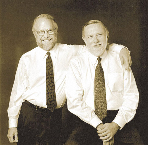
John Warnock and Chuck Geschke
When pitching their idea, Warnock and Geschke encountered some pushback from peers. Digital Equipment Corporation vice president Gordon Bell, one of Geschke’s grad school teachers, encouraged the entrepreneurs to focus on software innovation. Apple Computer founder Steve Jobs did likewise; his company already had the Macintosh in development and was working with Canon on what would become the LaserWriter. All Jobs needed was software that would tie his hardware together.
That software turned out to be PostScript, the device-independent page description language developed by Adobe. PostScript was a world-changing technology for a number of reasons. PostScript rendered scaleable type on-the-fly from outlines made up of bezier curves. Warnock and Geschke brought even more to the table, typographically speaking, with the hinting technology they incorporated into PostScript. As the first laser printers were low-resolution devices, hints were necessary to improve type’s appearance on the page, particularly at small sizes. PostScript’s hinting eliminated the need to build hand-tuned bitmaps for every single style and size of a typeface. But PostScript’s biggest impact on publishing would be its most liberating element—computers and printers from different manufacturers would be able to talk to each other. The era of proprietary typesetting systems and font libraries could finally come to an end.
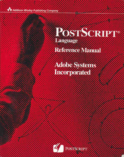
The PostScript Language Reference Manual, also known as the “red book”.
Rather than take on the headaches of manufacturing, selling, and fulfilling hardware, Warnock and Geschke decided to channel their energies into perfecting their software. In December 1983, Warnock and Geschke signed an agreement with Jobs to license PostScript to Apple — just a month before the Macintosh was to debut, elevated in the public eye by the infamous Ridley Scott-directed 1984 television spot and its Orwellian overtones. With the magical combination of the Mac GUI, Adobe PostScript’s type- and image-handling capabilities, and the LaserWriter’s crisp 300 dpi output to plain paper and built-in AppleTalk networking scheme, the world of publishing was about to be turned on its ear.
Life got decidedly more interesting when computing visionary Paul Brainerd formed the Aldus Corporation in Seattle, where the company released Pagemaker for the Macintosh in 1985. (A PC version came along a year later.) Brainerd, who is credited with coining the term “desktop publishing,” or DTP, pounded another giant nail in the coffin of traditional publishing. Pagemaker was rapidly adopted, combining with the Mac/Laserwriter/PostScript triple-threat to became the de facto standard for DTP.
While DTP and device-independent page layout were beautiful things, early incarnations lacked typographic variety. When the first LaserWriter was introduced, it came with two important type families — Helvetica and Times Roman — licensed from Linotype and converted to PostScript in four styles each. Rounding out the initial 13-font set of PostScript fonts were Courier (also in four styles) and Symbol — a type library insufficient to meet even the most basic of creative standards. Meanwhile, the masses were becoming ever more discerning about their typographic choices.
More type, and better type
Warnock and Geschke had recognized early on that great type was critical to the ongoing success of personal publishing. Coming off a time when large corporations cloned fonts relentlessly, Adobe’s co-founders were determined to do the right thing in expanding the PostScript type library. In the first half of 1984, Adobe negotiated an agreement with the International Typeface Corporation (ITC) to include their fonts in future iterations of PostScript.
That summer, they hired renowned typographer Sumner Stone as Adobe’s first director of typography. It was this decision that paved the way for Adobe to become not only a legitimate distributor of other companies’ typefaces, but a powerhouse type foundry in its own right.

Sumner Stone, Adobe’s first Director of Typography.
Up next: The birth of the Adobe Originals program. We’ll be sharing loads of insight from our recent conversations with star members of the original Adobe type team—Sumner Stone, Robert Slimbach, Carol Twombly, and Fred Brady—along with a surprise guest or two. You won’t want to miss the next chapter in our Adobe Originals anniversary series!
Keep up with the Adobe Originals celebration via RSS by bookmarking this series.
2 Responses
Comments are closed.
Interesting story, looking forward for the second part.
Frankly, I am very happy with all Adobe products, high-quality products and good support and service its maximum. Unlike other products that are very bad in his support. Love Adobe.