The Right Type of Brand
I recently answered a question on Quora about why we selected FF Tisa as the typeface for Medium. It wasn’t a decision we made lightly. Type is an integral part of your brand’s personality, and will impact your overall design. Here’s how we made the decision.
Focusing on brand development
We needed to identify the essential qualities of Medium to begin establishing the elementary building blocks—including typefaces—that would become the Medium brand identity. The questions we asked were basic in nature, and our goal was simply to learn and understand the product we’d built, and to reduce the anxiety a lot of us were feeling around decision-making.
What are the values of the Medium brand?
Initially we did a ‘data dump’ of all those unfiltered thoughts, ideas and desires that the team had, sharing ideas, product improvements, feedback, and suggestions. With that information at hand, we condensed what we had into product statements, highlighting the values, strengths, and focus areas of the Medium brand, and targeting how we wanted it to be received by our audience.
FF Tisa, displayed here in italic, was eventually selected as the typeface for Medium.
Through iteration we eventually refined the statements down to the six guiding principles of the Medium brand:
- Quality first
- Interest over Social
- Appropriate over Consistent
- Direction over Choice
- Evolving over Finalized
- Networked over Controlled
We now had values we could reference to validate our decisions. It allowed us to make progress with confidence.
Who is Medium for?
To identify Medium’s core audiences, we gathered even more information from our internal collections, continued discussions internally, and harnessed the feedback from our early adopters—from whom we gratefully received many suggestions for improvement each day.
We distilled this down into four personas to encourage ourselves to view the product through ‘their’ eyes, running through user flows, mock-ups, and prototypes several times to highlight the subtle differences in each user case. We built an understanding of what works well and what doesn’t for each persona—which allowed us to address how to empower each ‘type’ of user on Medium and, secondly, to identify priorities on our roadmap.
How do we want Medium to be perceived?
We believe the brand should always support and enhance its content, and the minimal amount of chrome and embellishment used throughout Medium’s interface shows how this principle became a reality. We studied several other major brands whose visual qualities ranged from lighthearted and playful to serious and refined, and used this information to design Medium’s minimal brand presence with the appropriate personality.
Selecting a typeface
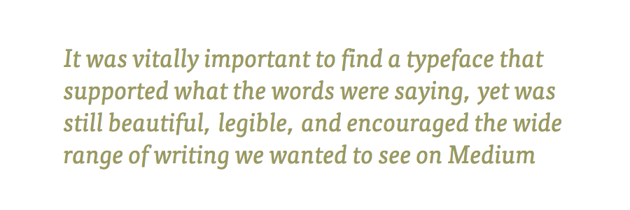
Considering that the Medium product is built on the words of others, the typeface was a fundamental component of the brand aesthetic. It was vitally important to find a typeface that supported what the words were saying, yet was still beautiful, legible, and encouraged the wide range of writing we wanted to see on Medium—not just opinion pieces.
This type critique meant our existing typeface, FF Meta serif, came under some scrutiny along with a small collection of perhaps four typefaces that we used when exploring and prototyping Medium, prior to launch. We reviewed each typeface in different environments and in different contexts to establish the right fit for Medium.
We compared articles in multiple typefaces that had a broad spectrum of overlapping qualities.
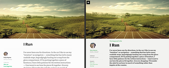
Type comparison between FF Meta Serif and FF Tisa.
Comparing the high-quality shortlist of typefaces against each other, rather than throwing in, say, Comic Sans, allowed us to assess the presentation of each, and validate and justify those against our ideal brand direction.
In a direct comparison of FF Tisa and FF Meta Serif, we found FF Meta Serif was a little too formal and authoritative, making the words feel declarative, factual, and slightly more opinionated in presentation than we felt necessary. FF Tisa, however, still contained the positive aspects of FF Meta Serif, happily accommodating an opinionated piece, but with a touch more understatement than its predecessor. It is softer in presentation, with slightly more relaxed terminals, descenders, and tails, more consistency in stroke weight, and a touch more tracking. These factors contribute towards making the typeface appear more inviting, approachable, and supportive of storytelling.
This is definitely an example of content-led design—a typeface that accommodates multiple article types and styles while aiming to minimize the conflict of its presentation with the context of the article.
It helps that FF Tisa looks beautiful, too.