Sites we like: Stuff & Nonsense, New Adventures, and Mule Design
Design studios in San Francisco and North Wales and a conference in Nottingham in this week’s sites we like.

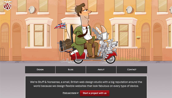
Stuff & Nonsense relaunches with a fashionably flexible design appropriately featuring P22 Underground (originally designed for the London Underground system in 1916). Subtle text shadows help FF Tisa stand out from the background.

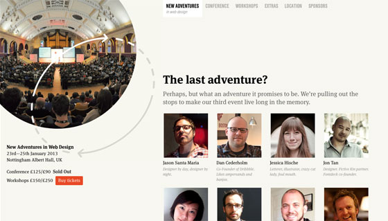
Also delightfully responsive, the New Adventures In Web Design conference pairs FF Meta Serif with Nimbus Sans Condensed. The latter’s efficiency makes it perfect for navigation where space is at a premium.

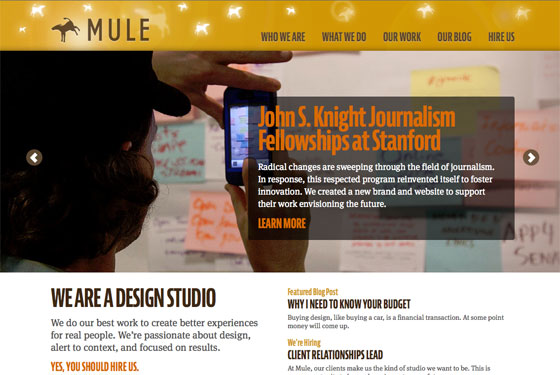
And hot on the heels of the release of JAF Bernini Sans, Mule Design Studio puts it to work on their new site. The compressed weight of Bernina (the softer and curvier member of the Bernini family) is especially lovely when set bold and all caps.
That’s all for this week! Share sites that you like in the comments.
One Response
Comments are closed.
We just made this site using Le Monde Journal.
http://www.architecturenorway.no
Le Monde Journal is great for reading on screen.