TypeCon2012: MKE SHIFT
This is a brief summary of my experiences as an attendee at this year’s TypeCon in Milwaukee.
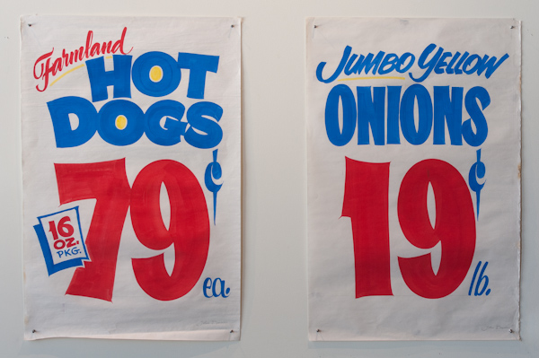
My arrival to Milwaukee on Wednesday night was followed by immediate degustation of Milwaukee brats and beer; which is a promising start for any type conference. It is a great idea to start the main conference with a keynote in the evening because it gives people a chance to do some sightseeing and squeeze in some type-related activities before the events kick off. One such pre-conference event was an exhibition in the offices of Hanson Dodge Creative. The exhibit, “Today’s Special – John Downer”, featured hand-lettered grocery store signs. I wish grocery stores would all sell their lettuce, hot dogs and onions like that.

Hand-lettered signs by John Downer
The remaining conference days were mostly spent sitting in a dark, carpeted, and slightly-too-air-conditioned room – made up for by an excellent selection of speakers and presentation topics, ranging from historical research to problem-solving in contemporary type design projects. In my opinion, the balance between serious research projects, and more light-hearted topics worked out very well. I especially enjoyed the brief “Type in 20” presentations, which allowed for topics that normally would not find their way to a conference; and also kept the variety quite high.
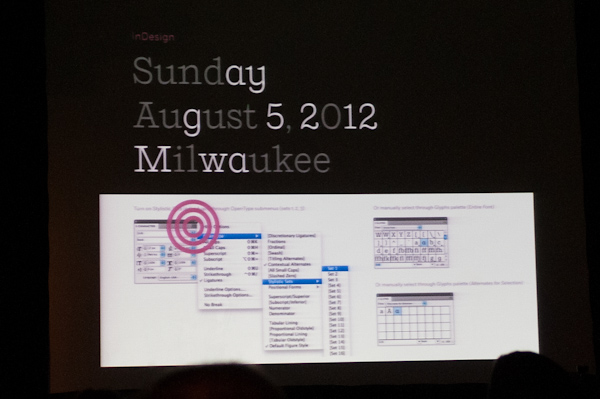
One interesting presentation was given by Jeremy Mickel, who talked about the challenges of alternate characters. While it is easy for a type designer to include any number of alternate glyphs into fonts today, it is sometimes difficult to access those alternates as a user. Although many OpenType features exist, he expressed dissatisfaction with the implementation in current layout software; such as Adobe InDesign. I think it is encouraging to hear that this has come to be something to talk about at a conference; and will serve as an inspiration for suggestions to make to the InDesign team.

The point of critique.
The Hamilton Wood Type and Printing Museum (a Wisconsin landmark) of course was also involved in the conference; providing insight to printing with wood type during the coffee breaks, and selling beautiful sample prints. Some attendees were lucky enough to visit the museum itself, an experience that Miguel Sousa will write about in a future posting.
I thoroughly enjoyed TypeCon Milwaukee; the only thing I could criticize is that there was no mention of Morris Fuller-Benton, a Milwaukee native. On the other hand, there were so many enjoyable and great moments, that could make me forget the designer of Bank Gothic and Hobo for a while. It was great to meet friends, to make new contacts and just enjoy the great atmosphere – thank you SOTA for doing a great job with TypeCon!