About Face: Urbana
Today’s About Face was written by Nick Cox, a front-end developer and designer from Seattle, Washington.

In type, as in wine, there is some beautiful and industry-changing work coming out of Latin America today. Foundries such as Sudtipos and Emtype have been springing up and drawing attention to themselves with some of the more interesting and beautiful serifs, sans serifs, and script faces of the year last year.
Colombian designer César Puertas is adding to the designers that have put Latin America on the map with Urbana, a font inspired by the city of Bogotá. Designed primarily as a display face, Urbana doubles as a readable and practical font for short to medium length texts. While many of the recent releases from South America in particular have demonstrated the famed passion and flair of the culture, Urbana remains a sturdy and sensible family, while retaining a good bit of personality.

The cut and carved style of Urbana.
Most notable among Urbana’s features is the cut and carved style of its glyphs. This is an aesthetic nod to the days of letterpress printing, in which a counterpunch was made to create the negative space (or counters) of the letters into a punch. The punch, in turn, created the copper matrix into which molten metal was poured to create the lines of type that would eventually be inked and printed. In Urbana, the counters of many of the glyphs reference this era, exhibiting a tension between, for example, the curve of the outside of the bowl of the lowercase b, and the sharp corner inside the counter. This technique is carried over into other aspects of the letter anatomy, such as the ascender, also illustrated by the lowercase b.
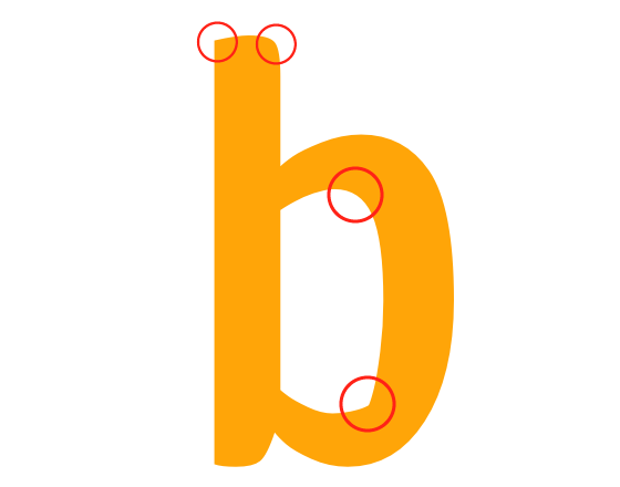
Urbana’s lowercase b demonstrates the interplay of corner and curve in Urbana’s glyphs.
Also noteworthy is Urbana’s versatility. Though Urbana was designed for use at titling sizes, it performs admirably as a text face. Further, the family is quite large, with four weights ranging from light to bold with matching italics. Provided you’re not setting type for extended reading, Urbana is an all-around sound choice.
Urbana’s rendering capability is another trait that makes it a solid bet for a vast array of typographic needs. If you’ve been following type on the web for the past two years or so, you know the heartbreak of finding a beautiful font, only to realize that it is mangled by Internet Explorer. Urbana is an excellent antidote to this problem. As you can see in the screenshot below, Urbana looks good even less forgiving rendering environments, like IE6 for Windows XP.
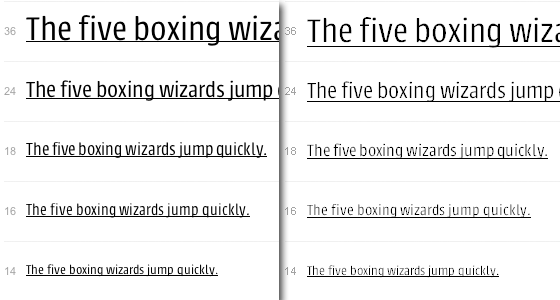
Urbana holds its own in IE6 (right), rendering close to as well as it does in Safari (left).
And again as in wine, a typeface’s qualities can be paired with that of its companions to create a sensually rich experience. Take, for example, Urbana and Abril Text. Type Together’s Abril, like Urbana, boasts several details that are honed into beautiful subtleties when used at text sizes. In this pair, the slabs of Abril Text evoke the sharp eges of Urbana’s clean cut side, and Abril’s lovely curves (on the terminal of the r, for example) bring out Urbana’s voluptuousness.
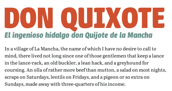
Abril Text’s slabs and curves echo the sharp and round aspects of Urbana. (source text)
Urbana’s inherent contrast works well when specific aspects of the overall appearance are teased out by other typefaces. Take, for example, Le Monde Courrier’s generous counters. These glyphs (note the lowercase e, in particular) have an open air about them that distinguishes them from Urbana’s tight counters. When brought together, the tension between Le Monde Courrier’s loose spacing and Urbana’s relatively condensed width create a serious tone that is not without its playful side.
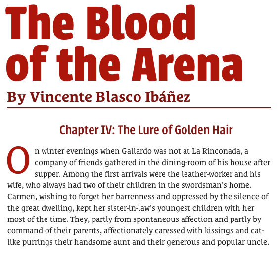
Counter contrast: Urbana paired with Le Monde Courrier. (source text)
But it is with similarly curvy faces that Urbana really lets its hair down. In the 900 weight, Urbana’s curves and corners are at their most prominent, and when set with a rounded sans like Proxima Nova Soft, the carefree lightness is evident, and both faces bounce off one another in childlike, romper room delight.
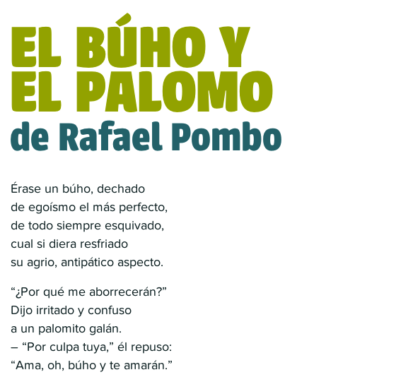
Playful delight: a children’s poem in Urbana and Proxima Nova Soft. (source text)
Similar fun can be had when Urbana calls Bello out to play. When softened by a large size and subtle CSS3 text effects, Urbana is all the more curvy, and Bello’s lively script and moderate stroke contrast bring even more motion to the table.
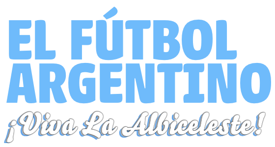
Curves in motion: Urbana paired with Bello Script.
But Urbana isn’t all fun and games. Consider using it as a text face with a smart and bookish titling face like Chaparral. This classic serif can whip Urbana into shape, and it suddenly behaves itself, showing its functionality via solid readability and compact efficiency.
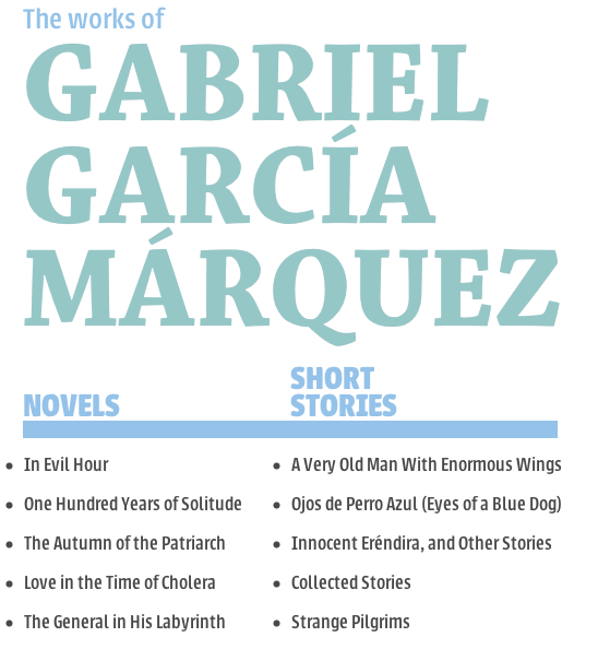
Urbana, when paired with Chaparral, shows its serious side (source text)
Urbana is also quite handy alongside an elegant and more calligraphic serif like Athelas. In this duet, Urbana can cover short sprints of utilitarian text like lists, subheads, and short paragraphs, and Athelas beautifully expresses longer texts and titles. When set small, Urbana has a much more rounded look, which contrasts with Athelas’s more angular features, but finds a companion in the serifed beauty’s more curvaceous italic.
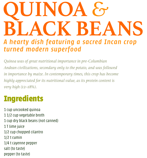
Who says Urbana can’t do text? Athelas helps Urbana demonstrate its utility
In all, Urbana is a solid bet for charming headlines, boisterous pairings, or sensible bits of shorter text. Its excellent rendering and wide range of weights and styles make it a strong contender in the hunt for practical all-around faces. And while it can be talked into behaving well, there are faces that can bring out its lively side. With all these qualities, Urbana is one of the region’s most useful and respectable typefaces.

Nick Cox is a front-end developer and designer from Seattle, WA. He writes about web fonts and web typography at Everyday Type and @everydaytype. He is currently developing Archtype, a typographic reference for the iPhone.
3 Responses
Comments are closed.
Hi Nick
Nice post; but I think you’ve used Le Monde Courier (not Journal) in the sample.
Actually, that was a mistake by his editor (who evidently needs an editor sometimes, too). Fixed now!
Nice font, nice post!