Type study: Is anyone paying attention?
Type study is an ongoing series of guest posts about typography (and related disciplines) on the web. In this article, Pictory’s Laura Brunow Miner shows us how to use smart editorial to keep the focus of a distracted reader.
I don’t have a formal design education, but I’ve found common sense and psychology go a long way when designing for readers on the web (or anywhere else). In my eight years of publication design I’ve learned that the basics of editorial structure come down to pretending your reader has a short attention span. (They do.) A scattered reader might not be your ideal consumer, but it’s your most likely one — and understanding that can help you turn an occasional reader into a regular one.
Basics of editorial structure
Remember that thing I said about short attention spans? Or did you skim that part? No judgment. Everybody skims, so it’s the job of the designer to make it easy for a reader to dive back in at any point.
Maybe you don’t think this is necessary. Maybe you think, “If I make my content good enough, people will read it.” But think back to the television series Arrested Development. Remember how they subverted the classic “scenes from the next” and “previously on” segments into funny, non sequitur gags? Instead of, say, catching the viewer up or pulling them into the plot? This was fine for the rabid fans (and later, DVD viewers) but alienated anyone who tried to pop in for an episode. And it’s one of the reasons that a fantastic show was cancelled.
It’s easy for content creators, who spend their time immersed in a topic or publication, to lose sight of what it’s like for someone just discovering their work. That’s why focusing on specific strategies can be helpful. In magazine speak, we call the time-honored ways of catching reader attention “points of entry.” I’ll share a few of them here:
The headline is king
Your headline or title is your first chance to gain someone’s attention, and usually has the highest priority in a design hierarchy. This could mean that it’s in the top left, largest, or in the boldest font; in general, you just want to lasso the reader’s eye with your headline. If you’ve got budget for an illustrator, even better.
Beyond the design of the headline, you should also consider wording. You’ll want to try to accurately and concisely sum up your content, but it’s also helpful to imply a conflict (actual or metaphorical), contradiction, question, or other intrigue in your wording. For example: “New Life in the Face of Destruction” or “A Violent, Beautiful City.” (Note: There’s a difference between intrigue and sensationalism, and while inflammatory or accusatory headlines get a lot of short term attention, they undermine your integrity in the long run.)
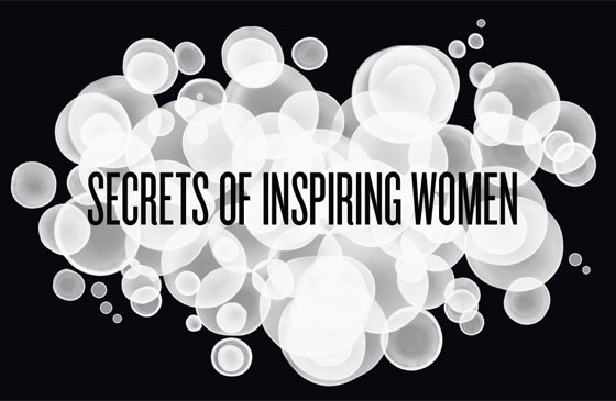
Headline from a Pictory showcase. The word “secret” in a headline is an overused but effective method of gaining reader attention.
Decks for supporting information
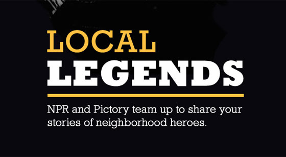
A deck is a line that appears directly after your headline, and with a hierarchy generally lesser than the headline but greater than the body copy; it’s an optional opportunity to fill in your reader on the nuts and bolts of the content. The reason the deck is a high visual priority is that you’re a lot more likely to nab a skimmer with an informative one-sentence summary of the piece than any length of body copy. For example, the Pictory showcase headline “The One Who Got Away” needed no further explanation: it’s intriguing, relatable, describes the content, and has a bonus benefit of being a common phrase that people search for. But a title like “Local Legends” benefits from the supportive deck of “NPR and Pictory team up to share your stories of neighborhood heroes”; the latter helps clarify the intent of the photo essay.
Decks help people skimming your site understand your content at a glance and land on content that interests them.
Subheads, pull quotes, and image captions, oh my!
Subheads, or titles for each paragraph like the one directly above, don’t just summarize and break up blocks of content, they also act as another potential landing strip for your skimming reader. Pull quotes, or oversized repeats of a sentence or two of interesting content, do the same. A pullquote could be a similar size or even bigger than your deck (sometimes even dramatically large in a gorgeous font like LTC Bodoni), but should be tucked into the middle of your piece rather than at the beginning. This placement helps keep the deck higher up in visual priority.
Your reader may not think he is interested in your main topic, but may find something grabbing in a word or phrase in the subhead or pullquote. Similarly, it may seem unnecessary to caption a photo if it’s in support of your article, but this offers another point of entry into your topic from another direction.
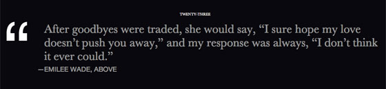
Pullquotes aren’t just good for the reader — they’re also a fun way for the editor to share her favorite gems from a piece.
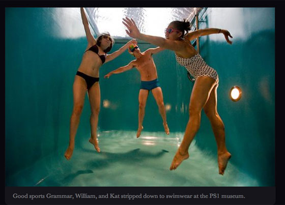
Image captions, like the one you’re reading, offer the reader quick, satisfying insight into what they’re looking at, without them having to re-read or search body paragraphs for the relevance.
Social media FTW
Designers of print magazines have to think about newsstand draw. Those of us with online publications have to think about pulling people in through social media. Many publications use Tumblr to showcase bite-sized pieces of a larger work, Twitter as an unofficial RSS feed of latest content, and Facebook to engage in interaction with the readers. In any of these cases, using the same rules as in headlines (implied conflict or a question) is a good way to grab attention.
Sharing bite-sized pieces through Twitter and Tumblr is a great way to support your publication’s main content.
It’s difficult to be objective about your own work, and impossible to see content you’ve put a lot of time into with fresh eyes. But putting care into your points of entry can help someone who is new to the content stay focused — and maybe even lead to loyal new readers.

Editor, designer, and photography lover, Laura Brunow Miner is founder of Pictory and Phoot Camp.
4 Responses
Comments are closed.
Great article. I don’t have a formal design background either, and had no idea that those little blurbs were called “the deck.”
I’m not convinced about the effectiveness of pullquotes on the web, though, given that you often have to scroll to see them. Visually they can wind up distractions that compete for your attention, along with flash ads and Facebook social plugins. It’s like, I’m sold, I’m invested in the content because I’m scrolling. Why is another entry point necessary in that context?
In a magazine, they work great at grabbing your attention as you’re flipping pages. On the web .. I’m not so sure.
I think that all depends on your layout, the content, and what you put in the pullquote!
@Laura I really enjoyed this article, it totally sums up my feeling towards a lot of web content these days. Coming from a magazine background myself (I’m assuming your publication experience is in print) I was baffled to see the lack of editorial design applied to web content. I still think there are more things we as web designers can learn from magazine design though, I wrote a little about it just the other week: http://8gramgorilla.com/lessons-from-magazine-design/
@Charles Though you make a good point, there are many examples where pullquotes appear above the fold, and what of magazine/blog homepages where there are plenty of articles listed beneath each other? In those cases I just skim a few sentences (and headline, of course) from each article and pull quotes sure do make my job easier.
Fantastic post Laura!! Took away so much from this read….have actually changed the captioning design on my blog to match what you’ve shown. Much classier look….
And the idea of decks? Brilliance…