Type study: Stereo-typography
This is part of a series of guest posts on web typography. Today’s post was written by Dan Mall of Big Spaceship.
Choosing a typeface is an art. It requires a sense of taste, style, genius, and dumb luck.
But it’s also a science. We can apply logic and history in a way that points us in the right direction and deters us from poor choices. The right typeface can inspire interfaces, but what inspires those typographic decisions in the first place?
Enter stereo-typography, the art of using stereotypes to inform your type choices. Designing with stereotypes makes those initial choices a bit easier. Big = loud. Small = quiet. Smooth = elegant. Irregular = experimental. Look for typefaces whose letterforms embody a characteristic you’d like to subconsciously communicate.
Let’s look at a few examples:
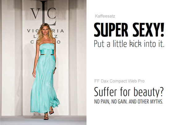
Photo by jsrcyclist
Looking for a fashion-inspired typeface? Find one that exemplifies the qualities of a typical runway model: tall, thin, and sassy. Faces like Ronnia Condensed, Kaffeesatz, or FF Dax Compact could be the right fit.
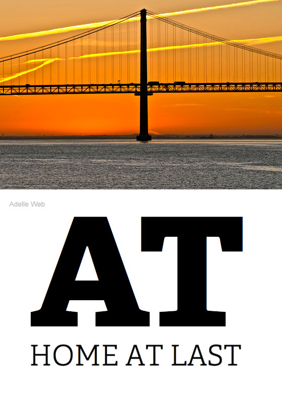
Photo by F H Mira
The Industrial Revolution produced a wonderful array of metalwork—strong and sturdy architecture designed to be functional, but which can’t help but be beautiful, too. For workhorse headlines, check out slab serifs Chunk, Adelle, Kulturista, and Quatro Slab.
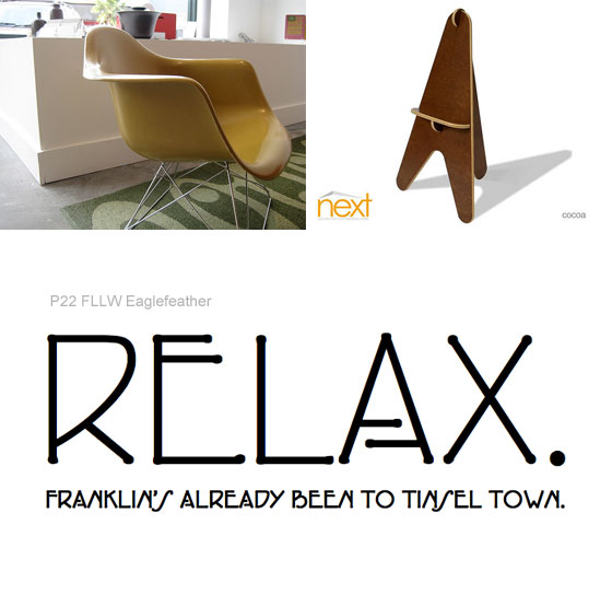
Photos by Urban Jacksonville and *NEXT* design for your modern home
Postmodern furniture fans: listen up. Postmodern forms that are self-supporting and ergonomic need copy—and typography—that complement. Look no further than P22 FLLW Eaglefeather and Galette.
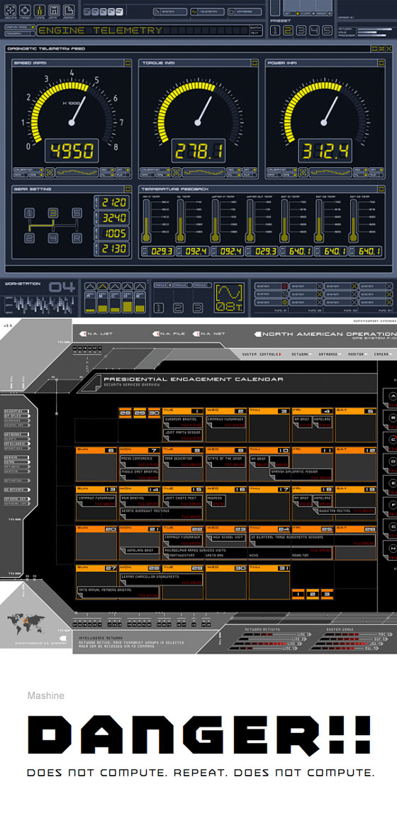
The work of Mark Coleran
Website from the future? That HUD for your robot web app? Play up those angular and hard edges with Mashine, Purista, and BD Brick.
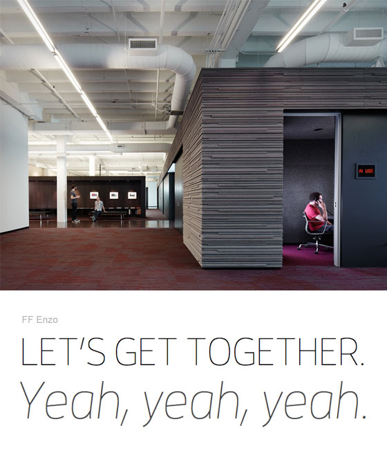
The 37signals office in Chicago
Want that grassroots, on-the-ground, crowdsourced, honest feeling? Avoid bold and black weights; opt for thin and light weights with large open counters and tall x-heights (they often feel more informal). Check out Raleway, FF Enzo Web, and P22 Underground Thin.
Stereotype-ography is a great way to reinforce the art direction of what you’re designing. While we have yet to find the magic formula for finding the perfect typeface, stereotype-ography is a really useful part of the equation. No matter what the context, there’s a typeface for the situation. It’s up to you to find it.
3 Responses
Comments are closed.
This was a fun article to read, but I will raise a thought … out of my pure interest and infatuation with Art Nouveau.
It’s intriguing that P22 FLLW Eaglefeather and Galette are used in the Next Modern Home furniture example, given that those fonts are in the Art Nouveau style and the furniture looks to be more in the Mid-Century Modern style. For this era perhaps fonts like Aviano Slab, Brevia, or something Swiss would work more appropriately.
Art Nouveau is very unique and its fonts are historically used in more decorative, flowing, curvy contexts. Although, it is a curious adventure to explore other contexts where Art Nouveau fonts might be a good fit.
This article certainly got me exploring the Typekit library!
@Justin: you’ve got me there. My embarrassing lack of knowledge and ignorance of furniture and art history rears it’s ugly head. Thanks for the save, and great suggestions!
Ah, ain’t no thing.