A web standards holiday card from Typekit
The holiday season is upon us, and at Typekit we’re celebrating the best way we know how: with fonts and web standards. This year, we’ve made you a holiday card on the web using HTML, CSS, JavaScript, and fonts from Typekit. Go check it out in your favorite standards-compliant browser. (It works best in Chrome or Safari, but degrades gracefully in other browsers.)
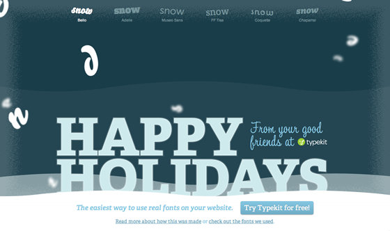
Let’s set the scene: you’re peering through a frosty window out onto a snowy landscape of rolling hills. A holiday message set in icy Adelle Web and Tamarillo sits nestled atop the snow drifts. Meanwhile, snowflake letters fall from the sky in your choice of Bello, Adelle, Museo Sans, FF Tisa, Coquette, or Chaparral.
Head on over and play with the Typekit holiday card for yourself. If you’re interested in how we built it, read on for the details.
Progressive enhancement with CSS3
Although CSS3 isn’t yet finalized, browsers have already implemented significant parts of it. We used some CSS3 features in our holiday card to enrich the experience for newer browsers; older browsers will ignore these CSS3 properties and degrade gracefully. (Many of these CSS3 properties need to be used in conjunction with vendor prefixes like -moz- and -webkit-, but in some of the examples below, we’ve omitted them for brevity.)
Here’s a few bits of CSS3 that we put to use in our holiday card:
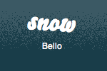
transform and the :nth-of-type pseudo-class: For the tilted, alternating snow links at the top of the page, we used the CSS3 transform property in conjunction with the :nth-of-type pseudo-class. The transform property allows us to apply transform functions to an element (in this case, we used rotate). The :nth-of-type pseudo-class allows us to select the elements in a sequence that match a pattern (such as all even numbered list items). We used these together to apply alternating rotation to the even and odd numbered snow links:
#snow-links li .snow-text {
  transform: rotate(-4deg);
}
#snow-links li:nth-of-type(2n+1) .snow-text {
  transform: rotate(4deg);
}
In browsers that don’t support either the rotate CSS transform function or the :nth-of-type pseudo-class, the snow menu degrades gracefully to a series of horizontal links. Still usable, if a bit less fun.
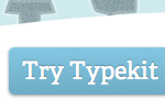
CSS gradients, text-shadow, border-radius, and box-shadow: Once, a good-looking custom button required an image. But today, we can style an attractive custom button using only CSS.
For our button at the bottom of the page, a CSS linear gradient provides a three-dimensional feel, while a subtle text-shadow gives the text (set in Adelle Web) a slightly inset appearance. Finally, the border-radius property rounds the corners, and the box-shadow property lifts the button off the page slightly. Here’s an example of these properties in action on our button:
#promo a {
  background: #84c7e3;
  background: -moz-linear-gradient(0% 100% 90deg, #6facc5, #84c7e3);
  background: -webkit-gradient(linear, 0% 0%, 0% 100%, from(#84c7e3), to(#6facc5));
  border-radius: 5px;
  box-shadow: 0 1px 3px #999;
  color: #fff;
  padding: 10px 12px 6px;
  text-decoration: none;
  text-shadow: 0 -1px 1px rgba(0, 0, 0, 0.25);
}
In browsers that don’t support these properties, our button degrades to a flat blue rectangle: less beautiful but still clickable.

-webkit-text-stroke and RGBA color values: To emphasize the icy nature of our title text, we used the WebKit-only -webkit-text-stroke CSS property. While it isn’t currently a part of any CSS3 working draft, text-stroke was implemented by the WebKit team as a way to add a colored stroke on text outlines. A similar text-ouline property in the CSS3 Text Working Draft has failed to gain broad support and is in danger of being cut. Luckily, while the web standards process plays out, we can make use of the property in WebKit-based browsers like Safari and Chrome. Other browsers will simply ignore it.
In combination with -webkit-text-stroke, we used an RGBA color value to specify a color that’s partially transparent. As a result, the text looks as if it’s encased in a thin layer of ice. Here’s an example of the CSS used:
#titles h1 {
  -webkit-text-stroke: 5px rgba(255, 255, 255, 0.2);
}

border-image: To create the frosty look around the edge of our scene, we used the CSS3 border-image property. This property slices up and stretches or repeats an image, which then fills the corners and sides of a box’s border. For browsers that don’t support border-image, our CSS falls back to a transparent border instead. We lose some of the visual effect, but the background images and color palette still convey an icy feeling. The CSS looks something like this:
#scene {
  border-image: url("frosted-border.png") 75 repeat;
  border: 75px solid transparent;
}
Progressive loading with multiple kits and font events
Because it serves as a font showcase, our holiday card uses quite a few different Typekit fonts: ten fonts from seven different families, to be precise. That’s a lot of font data to download. In order to avoid a long delay before we render anything on the page, we’ve split the fonts into two separate kits.

The first kit is included in the and loads with the page. It includes all of the fonts that are used in the “Happy Holidays” message and footer (three variations of Adelle Web). As soon as the first kit finishes downloading, we use JavaScript font event callbacks to fade in this text. In the same callback, we also begin loading the second kit. The second kit contains all of the fonts used for making snow. When the second kit finishes loading, we use font events to fade in the snow menu and start making snow.
We also make use of the Typekit API to load information about each of the fonts in our second kit. The API returns JSON data, which we use to dynamically create the snow menu at the top of the page. If we add an additional font to the kit, another menu option will appear automatically. Since we didn’t hard-code the fonts into the page, it makes it easier for us to change our mind later on.
Animated snowflakes with CSS3 and JavaScript
In order to lend some motion, depth, and interactivity to our holiday card, we added animated letter snowflakes set in the font of your choice. The snowflakes animate with the jQuery JavaScript library, along with some help from jQuery.path (for animation along bezier curves) and the rotate and text-shadow jQuery cssHooks (to add jQuery support for those CSS3 properties).
Our snowflakes begin their life as a paragraph of text about Typekit. When the page loads, we use the handy Lettering.js to break the paragraph up into spans containing individual letters and numbers. One by one, these letters are then animated down the page in random bezier curves while randomly changing their rotation. If a browser doesn’t support the rotate CSS transform, it is simply ignored, and the flakes remain upright. Once a character reaches the bottom of the page, it is hidden and recycled for later use.

To create the illusion of depth, we dynamically set the font-size, z-index, and blur radius of the text-shadow for each snowflake using JavaScript. Snowflakes in the foreground are bigger, have a higher z-index, and are less blurry than flakes in the background. In order to make individual snowflakes appear blurry, we move the actual character off-screen using the CSS text-indent property, and then shift the text-shadow an equal amount in the opposite direction to keep the shadow in the original position. Here’s some example CSS for creating a foreground and background snowflake:
.snowflake.foreground {
  font-size: 100px;
  z-index: 100;
  text-indent: -9999px;
  text-shadow: 9999px 0 2px #fff;
}
.snowflake.background {
  font-size: 20px;
  z-index: 20;
  text-indent: -9999px;
  text-shadow: 9999px 0 25px #fff;
}
The text-shadow cssHook for jQuery allows us to detect browsers that don’t support text-shadow. For these browsers, we don’t set text-indent or text-shadow, and instead fall back to opacity in order to help convey depth.
And that’s it! From all of us at Typekit, we wish you a very merry holiday season and a happy new year.
5 Responses
Comments are closed.
Thanks for the explanation–especially about using 2 kits! I’m always pushing the limits on my kits and never thought to try that. Woot!
Here’s my Typekit holiday greetings: http://azzcatdesign.com/_HOLIDAY/happy_holidays_2010.html
This is quite a festive card, and as elaborate as it first sounded, the way you described the process makes it feasible for me to adapt it into my site.
Wonderful! Very impressed by the complexity of the technology (css3, jquery), but presented simplistically and in a fun way. Thanks for sharing your process.
This year, I designed a card with use of only HTML5, jquery, css3, and typekit: http://enews.andover.edu/email/1210_HolidayCard/d/card/
Happy Holidays and Merry Christmas!!
Cool, thanks for sharing and Happy Holidays!
Really nice!! .. and thanks for the explanation