Adobe fonts, now with improved metrics and rendering
In keeping with our strategy of constantly iterating and improving our font library, we have updated the following Adobe fonts to have more consistent cross-platform vertical metrics: Adobe Garamond Pro, Bickham Script Pro, Caflisch Script Pro, Chaparral Pro (including Caption, Subhead, and Display), Cronos Pro (including Caption and Display), Garamond Premier Pro Display, Hypatia Sans Pro, News Gothic Std, Poplar Std, Rosewood Std (and Fill), Trajan Pro 3, and Voluta Script Pro. Because this may cause slight positioning changes in some designs, we’re not rolling out these changes automatically; you’ll need to republish your kits to see them.
And, in case you missed our tweet a few weeks ago, Myriad Pro (including Condensed and Semi Condensed) and Minion Pro (including Caption, Condensed Subhead, and Condensed Display) have also been updated.
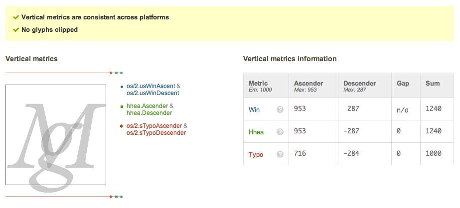
We’ve spent a lot of time researching vertical metrics and CSS, and it’s really paying off. Our Partner Tools analyze each font’s unique vertical metrics measurements and then show how those measurements will be interpreted by web browsers:

Typekit’s metrics tools screen, available to our foundry partners.
Additionally, the tools provide recommended metrics measurements, so designers and foundries know how to adjust their fonts. Many thanks to the good folks at Adobe for doing just that — and more, as some fonts have received subtle rendering improvements, too! Republish your kits to get the newest and best versions of these typefaces.
4 Responses
Comments are closed.
Great news. I’m still hoping we’ll see Myriad Condensed get some proper italics real soon. The browser-synthesized equivalents kinda stink.
Have you updated the Browser Samples for these fonts?
They should be up-to-date. If you see one that’s not, or if you notice a problem with one of the screenshots, you can let us know using the link below any browser sample.
Chaparral is great rendered on screen.