Typekit now serves more font weights and styles to Internet Explorer
Update: The latest information on using weights and styles in IE 6-8 can be found in this newer post. We’ve now made it possible to use all weights and styles of a single family in old versions of Internet Explorer.
When we first built Typekit, our research showed that Internet Explorer had serious limitations when it came to handling multiple fonts from a single font family; as a result, we served just one font per family to IE.
But that often meant that when IE was called upon to display a bold or italic style, it would synthesize that style by thickening or slanting the glyphs of the family’s normal font, instead of using the actual bold or italic font. The difference between actual and synthetic styles can be significant:

Adobe Text Pro italic in Internet Explorer 8
We’re continually investigating how browsers support web fonts, and we’ve recently confirmed that in many cases IE can in fact use up to four fonts from a given family. As a result, we can now serve IE up to four of the fonts you’ve enabled for each of the families in your kits. This allows you to use more real styles in IE instead of relying on synthetic ones. To see these improvements applied to existing kits, just republish them via the Kit Editor.
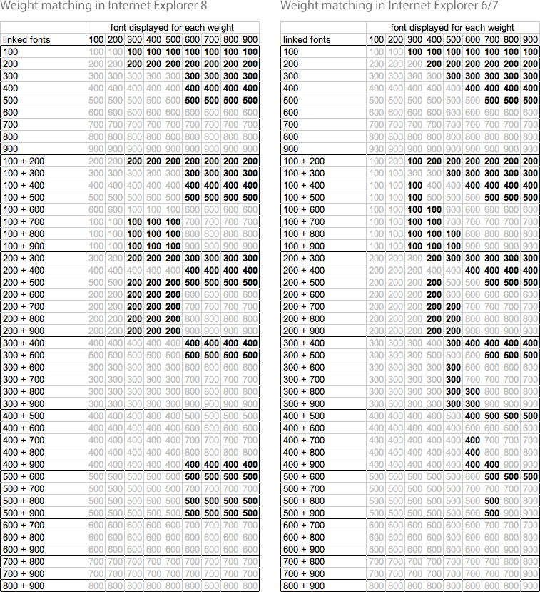
Note: if you’ve enabled more than four fonts for a given family, we’ll serve all of them as usual to other browsers but will choose which four to serve to IE based on IE’s own weight matching algorithm. If your pages use weights and styles other than those we’ve served, IE will use the closest match from the available fonts. The following tables of results (click to see full sized) from our research show which of a family’s fonts IE will display when your pages use various weights (the table columns), given each combination of defined weights (the table rows). When a weight is shown in bold in this table, that means a synthesized weight will be displayed.
That looks pretty complicated — and this is just for IE! Not surprisingly, we’ve observed other browsers behave differently. That’s why our next improvement will be an addition to the Kit Editor showing you which of a family’s fonts will be used in which situations and in which browsers. This will help you make informed decisions about how to optimize your kits.
5 Responses
Comments are closed.

As usual, Thanks!
I cannot say enough good things about Typekit. 🙂
I know it’s way early but have you been testing IE9 yet? Is it going to have the same issues as above or did micros**t get it right for the 1st time?
We’re working on IE9 support. Details to come.
We need to get beyond the “only two weights at a time” limitation, selected via “normal” and “bold” weight settings. This means being able to include a range of weights in a Typekit kit AND being able to reliably select which weight you want (i.e. more than two options) across common browsers. Seems like that goal is still a long way off?
“IE was called upon to display a bold or italic style, it would synthesize that style by thickening or slanting the glyphs”
Unless I’m misreading your chart (and I very well maybe) you still haven’t solved for this. You now allow users to specify normal and light weights from the same family in IE8. While handy, it still doesn’t fix the issue with bolding. Light and normal as a differentiator is not the same as normal and bold.
That said, I like your service, and understand the difficulties with browsers and font-rendering, look forward to updates in the future so I can bill and use on client projects.