Illustrator Memories from Brian Willson
Thanks to Brian Willson of Three Islands Press for sharing memories (and artwork) of Illustrator. Check out the rest of the series here.
From Journalist to Type Designer: How Adobe Illustrator Helped Transform My Career
My father was a university professor, a technology nut, and an early Macintosh owner. In fact, his love of his new Mac Plus prompted him to surprise me with one of my own—not a cheap gift back in 1987. At the time an underpaid newspaper reporter, I somehow managed also to outfit myself with a LaserWriter, a copy of Aldus PageMaker, a few PostScript fonts, and the gumption to start a desktop publishing business on the side.
 Didn’t take long for me to learn to wield a mouse, all the while staring at a diminutive black-and-white screen. After tiring of twiddling my thumbs as those twin floppy drives whirred, I saved up $1,200 to buy a big ol’ 20mb hard disk. (Woo-hoo!) But after designing a few (then-)fancy newsletters for a local nonprofit, I soon identified a problem—jaggies. Jaggies everywhere. The one ingredient I lacked was a way to make art that would output cleanly at 300 dpi.
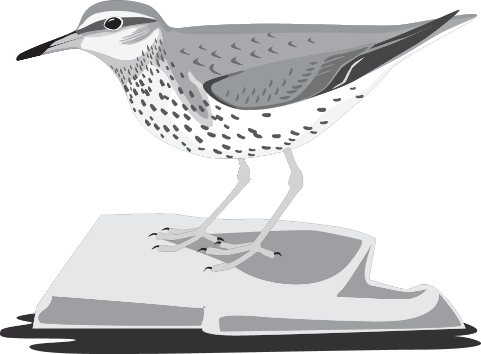
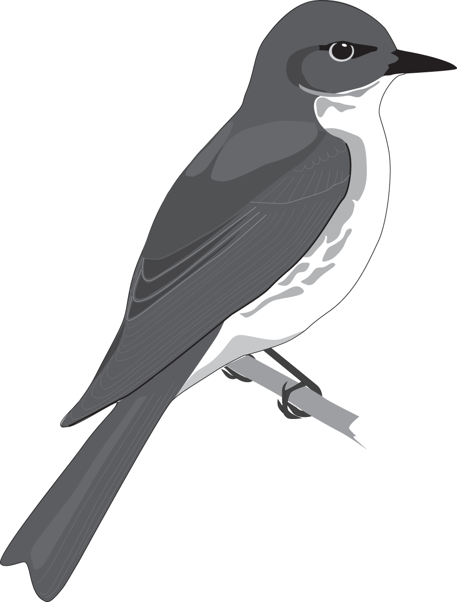
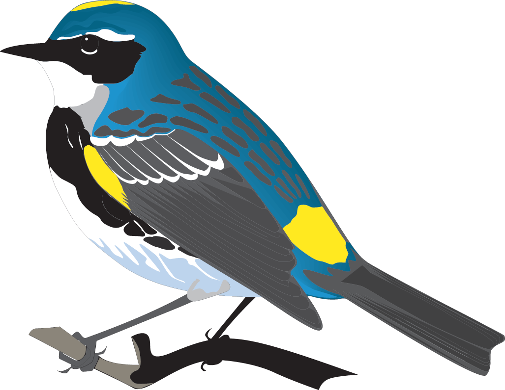
I’d heard of Aldus FreeHand but, as fate would have it, this was about the time Illustrator 88 came out. So I took the plunge. Oh, how well I recall first fiddling with Illustrator’s vector tools, figuring out how to pull a smooth curve. Being something of an avid birder, I practiced by making drawings of wild birds.
 Before long, thanks to my new Mac expertise, I left the newspaper job for a position helping a trade magazine convert to digital publishing. I also helped create high-res illustrations—maps, mainly. Using Illustrator, I traced thousands of miles of coastline, all the while honing my vector-graphics skills.
About this time my dad was looking for an easy way to add a logo to envelopes and letters and such, and he asked if I might add it as a character in a font. He knew of an application that could do this, called Fontographer—so I invested in an Aldus program, after all.
The logo job was a success. (All he needed was a stylized delta, which I put, of course, in the “D” slot.) And with that, the seed had been planted in my brain.
 I’d taken to studying the fonts I’d licensed from the Adobe Type Library—Goudy, Gill Sans—but doubted I’d ever learn to design such a thing. Although I’ve got something of an eye for balance, I had no formal design training, nor so much as a whit of knowledge of traditional type design. But the art director at the magazine had really cool hand-lettering, so one day I asked if I could try to make a font based on her hand.
Lacking any guidelines on how to do such a thing, I concocted my own method:
- Scan each hand-done letter of the alphabet as big as possible;
- Hand-trace each letter in Illustrator (whose vector tools I knew much better than Fontographer’s);
- Export each resulting outline as a PostScript file;
- Import each outline file into the proper Fontographer slot;
- In Fontographer, size and tweak and kern and generate the font.
 Hundreds of tedious hours later, I’d finally done it. I’d designed my first font. I gave it three weights: Regular and Bold and Black. I named it after the art director, Marydale. The year was 1993.
Out of curiosity more than anything, I posted a partial copy of Marydale as shareware on CompuServe and AOL, promising to send all three weights to anyone who mailed me a $10 check. Much to my astonishment, checks began to arrive—a lot of ’em. I guess that’s all the incentive I needed, because by the end of the year, I’d designed two more fonts, Attic Antique and Treefrog. My methods were the same: scan, trace in Illustrator, polish off in Fontographer.
 The rest is kind of a whirlwind. Distributors soon came a-knockin’. I abandoned the shareware distribution method (not an easy task, by the way). My little company, Three Islands Press, became known as 3IP, and I became known for designing type instead of reporting news.
In 1997 I made a font called Professor, modeled after my father’s legible cursive hand. Professor was a top seller for a few years there—a fact that Dad got a real kick out of in the years before he died.
Not until about ten years ago did I ditch my original method of font design—scan, trace in Illustrator, polish off in Fontographer. Since most of my stuff is based on tangible materials, I hadn’t found a good reason to make a switch. But growing support of OpenType eventually convinced me to move over to FontLab Studio. And, in a peculiar irony, Adobe Photoshop’s improved vector-graphics tools prompted me to substitute it for Illustrator in my type-design process.
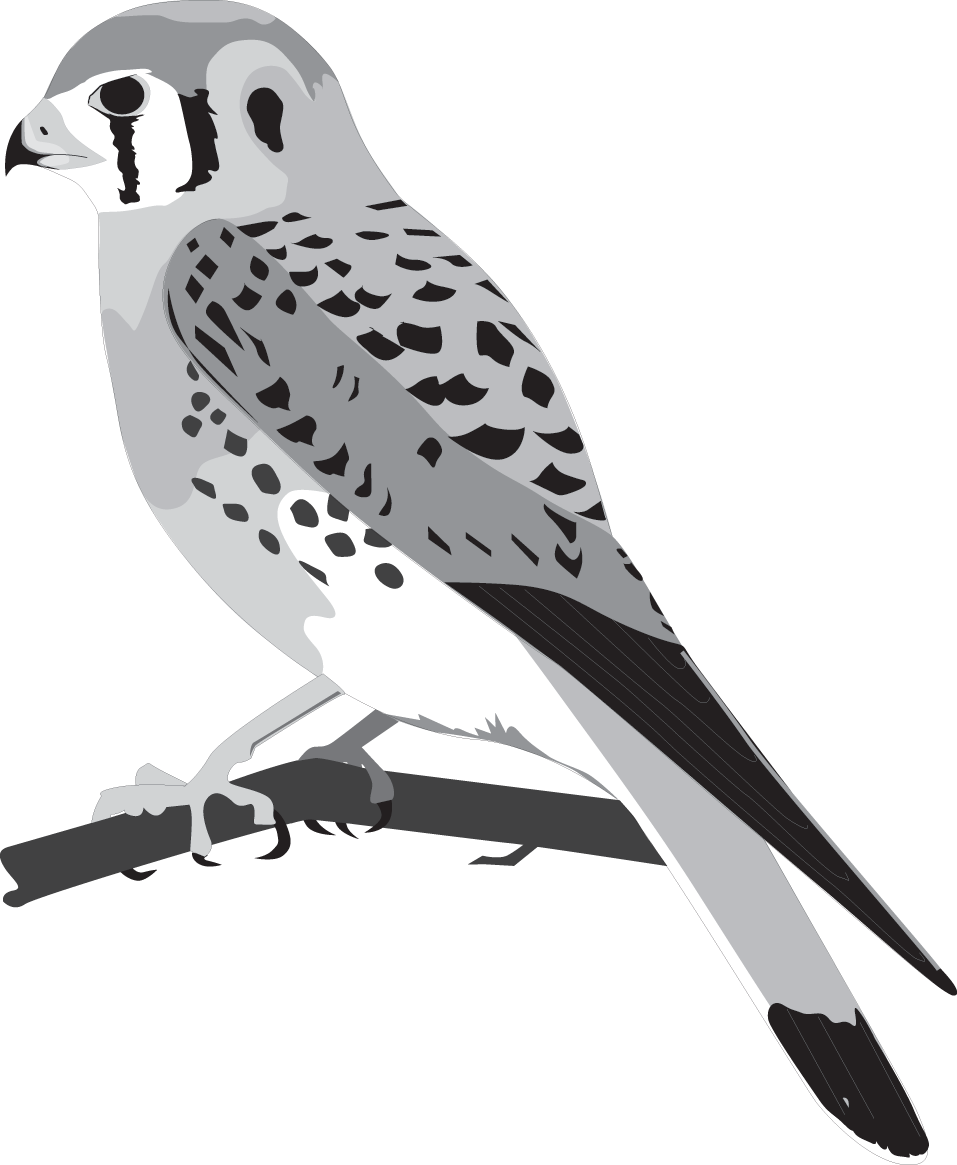 I still use Illustrator, just not as often. And I sometimes think about drawing more wild birds.
—Brian Willson
P.S. I released my fourth font, Texas Hero, in 1994. I made this replication of mid-18th-century penmanship chiefly because I’d been looking for such a thing but could find one anywhere. Well, it proved popular enough that I’ve made dozens of other old pen fonts—to the point that it’s become 3IP’s clear-cut niche. And in an age when cursive handwriting seems doomed to extinction, I’m happy to say I’m something of an expert in deciphering old penmanship. But by making it easy just to type simulated script via a keyboard, am I actually contributing to the demise of handwriting?
P.P.S. Incidentally, I still do a little writing—notably, Three Islands Press is publisher of my first novel, Lydia. It’s about a guy who falls in love with a ghost. The protagonist is, of course, a type designer.
Very Impressive! Thanks for letting me read it!