Women designers on Typekit: A few highlights for International Women’s Day
Most people read words without giving the typeface — and its designer — a second thought. We are not those people. And when we think about type designers, we know that there aren’t as many women represented as there could be.
So if you’re looking for a subtle way to support women in a historically male-dominated field, here’s just a sampling of the typefaces they’ve been responsible for. Use them in honor of International Women’s Day if you like, though we suspect they’ll look great all year round.
For fantastic display headings
Milka from Lettersoup (based on design by Milka Peikova)
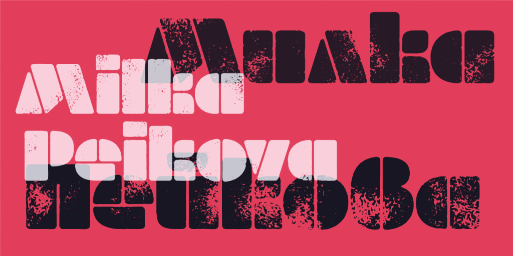
Milka is a stencil alphabet originally designed in 1979 by Bulgarian artist Milka Peikova. She worked with the team at Lettersoup to create this digital version, which includes her clean original stencil along with five other styles — so you can play with different textured effects to get just the right look.
Bely by Roxane Gataud. See Behance project page.
The Regular and Bold weights of Bely show only a hint of what gets unleashed in Bely Display. All in all, this is a terrifically fun typeface when you need to go big, and a well-balanced serif at all weights. We weren’t sure whether to group this one with the text faces or the display faces. Either way, Bely handles (and even embraces) extremes with an immense grace.
Eskapade Fraktur by Alisa Nowak
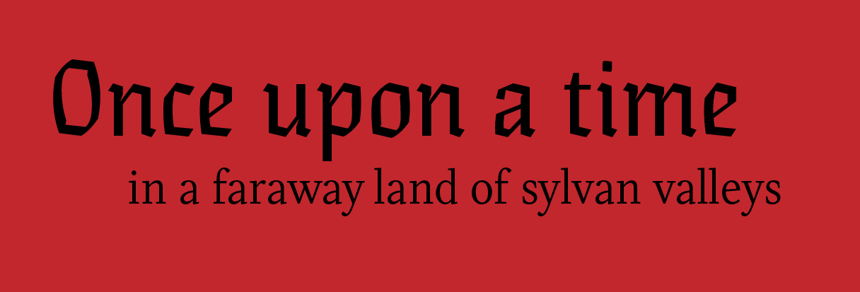
Eskapade Fraktur (top) and Regular (bottom) by Alisa Nowak.
Eskapade Regular seems like a perfectly normal serif text face, but Eskapade Fraktur is a whole other beast. This is a great choice for the Gothic-storytime feel that blackletter type encapsulates.
Japanese brush style
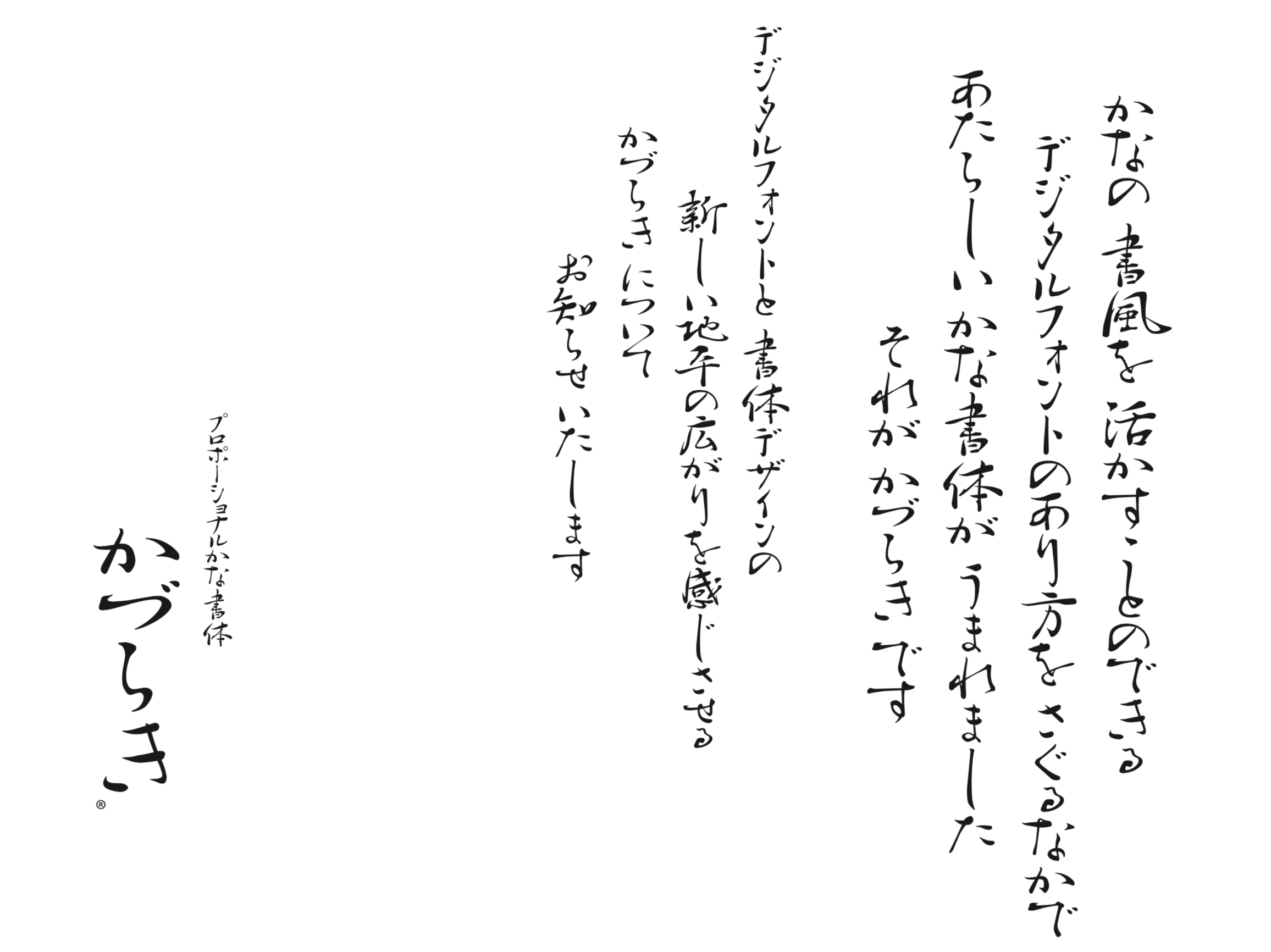
Ryoko Nishizuka’s Kazuraki has won awards twice over, placing in the 2002 Morisawa type competition and then in 2010 winning a Typeface Design award from the Type Directors Club. Kazuraki is modeled after the calligraphy of 12th century poet Fujiwara-no Teika.
Learn more from Ryoko about her design work in this 2014 interview — and if you need a different style of Japanese type for editorial settings, her latest release Ten Mincho is a great option.
Indic scripts
Last year we profiled Fiona Ross, a notable designer in this space and frequent consultant for much of the Indic type produced at Adobe — such as Adobe Kannada by Erin McLaughlin.
Adobe Kannada by Erin McLaughlin
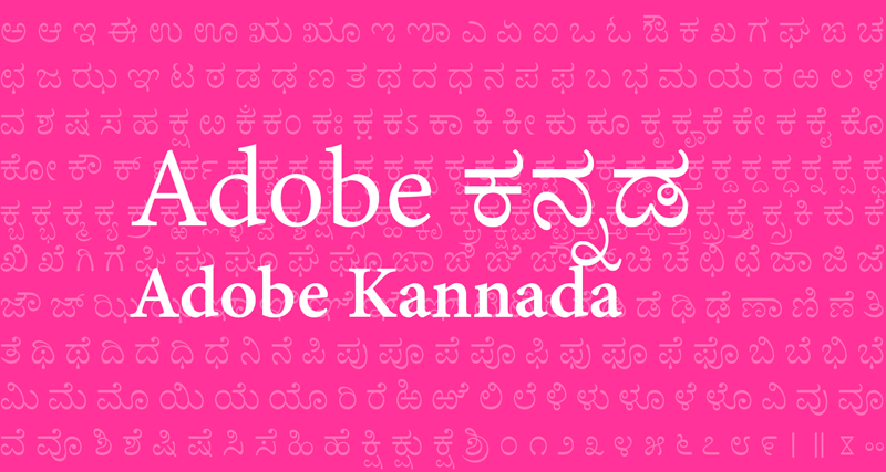
The “novel, adept approach” that Erin exhibited even while a typography student at the University of Reading was a decided factor in Adobe’s decision to hire her for the design of Adobe Kannada. Learn more about the design process in our release from 2015. (Also see her 2010 Devanagari typeface, Katari.)
Serifs & Sans
Screenshot from the Gridset Demos site by Nathan Ford.
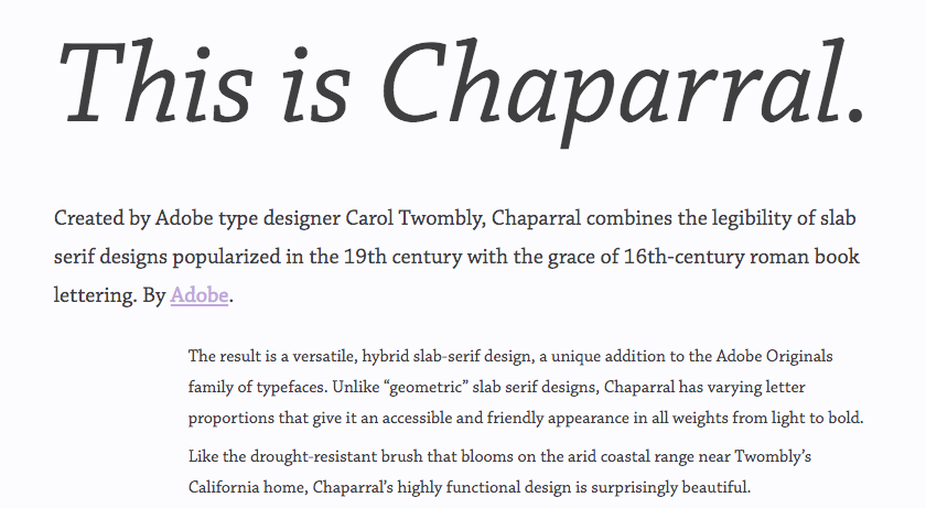
Chaparral is a slab serif, but only if you really look for its “slabby” character; the overall design feels much lighter than would be typical for this style. It’s a fantastic typeface for long-form reading, and makes great headings as well — basically a designer’s dream serif. We geeked out about it extensively in a 2011 About Face article.
When we interviewed Zuzana Licko in 2016, she shared an anecdote of being so absorbed by the content of a museum exhibit that it took her a moment to realize she was looking at her own typeface, Mr Eaves. Her work is extraordinarily wide-ranging, with many designs that are anything but subtle (Variex is, perhaps, Mr Eaves after a seismic event) — but if it’s clarity you need, this is a stylish choice.
Maiola by Veronika Burian. Behance project page.
The more closely you look at Maiola, the more skillful intricacies of its construction begin to stand out — details like the asymmetrical lengths of the strokes and serifs contributing to a hand-drawn quality that aims to appear “etched rather than created digitally.” While these details add dynamism and texture to the page (and Maiola is fantastic for printed work), they won’t distract from your message.
Get the hand-lettered look
Many flavors of Adorn, showing Adorn Smooth Serif, Pomander, and Condensed Sans.
Laura Worthington doesn’t only make script typefaces, but she does have an exceptional talent for them and Adorn is a fine example of her work. Aside from the stunning variety in the type itself, she packs plenty of extras into her fonts, too — things like ornaments and borders, which are great for giving your work a customized feel and artistic edge.
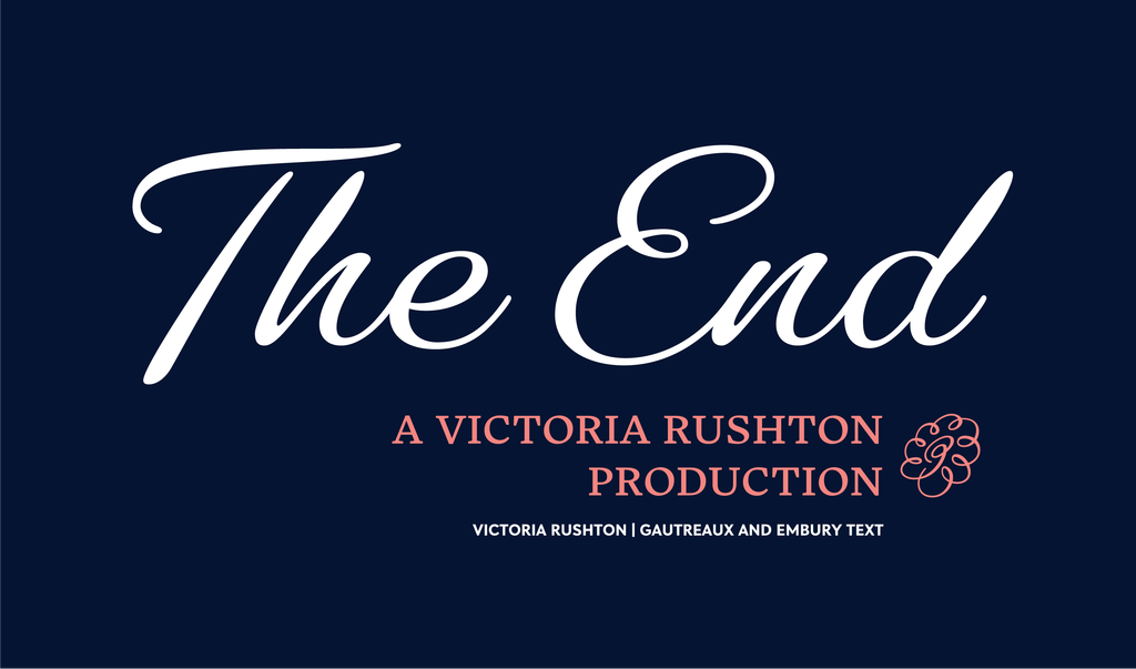
Script fonts tend to be technically complex with lots of stylistic alternates in play, but Victoria Rushton designed Gautreaux to work as simply as possible, and the result is delightful all around. Her design is styled after the practiced penmanship of another woman — Victoria’s grandmother. The full story behind that is well worth a read.
Is that all?
No! This list is not exhaustive — there are more fonts by women on Typekit than the ones highlighted here. We don’t have a firm tally on how many of the over 400 designers with fonts on Typekit are women.
We definitely recommend people support women designers by learning more about what they’re working on and investing in their projects. Here are just a few leads:
- Victoria Rushton has compiled a more extensive list of fonts by women that goes well beyond our recommendations here.
- For more insight into the type industry from women’s perspectives, Alphabettes is a fantastic resource.
- If you or a woman you know is someone interested in getting into the field, apply soon to join this summer’s Type@Paris program. Our sponsorship will support the tuition for a student again this year.
3 Responses
Comments are closed.
The link is missing from “the full story” in the Gautreaux section.
Oops! Thanks for letting us know. Fixed.
Thanks for the Heads up 🙂