By the numbers: Great type for numerals
Often overlooked, numerals are a special part of many typefaces. In some cases they may even carry more style and flair than the regular letters do.
I asked around the Typekit office for some ideas for fonts that are great for setting numbers, and got ample advice. Thanks especially to Jake Giltsoff, Meghan Arnold, Ariadne Remoundakis, and Tim Brown for your input — and to the whole team for narrowing down the vote on that zero at the last minute.
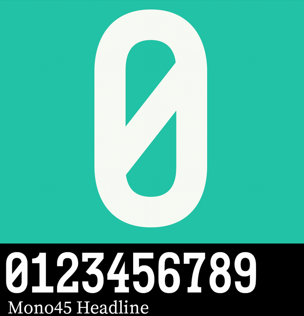
The slashed 0 of Mono45 Headline proved irresistible for this one. Zero is easily confused for uppercase O, but many of the monospace fonts in our library are specifically designed to avoid this in all kinds of clever ways.
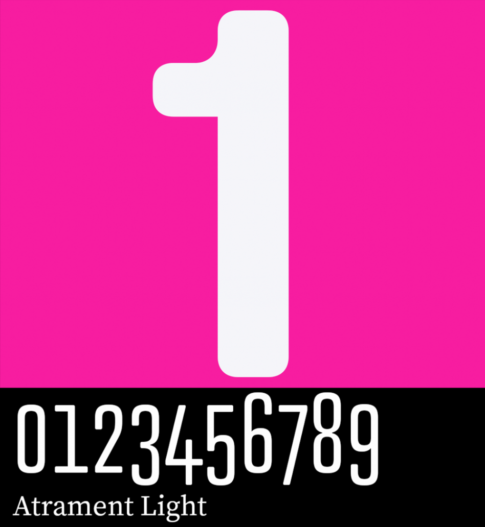
Atrament features oldstyle figures as well as lining. The big 1 featured here is the default lining style (and bold rather than light), but the glyph palette will open all the other options to you as you work with this one.
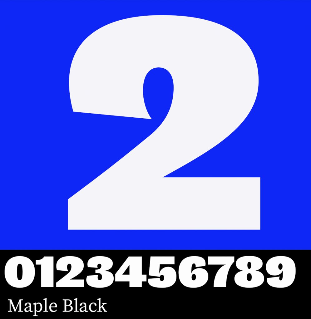
Now we’re getting into some heavy territory. Maple Black takes up all the space you’ll give it, but it’s hard not to like its quirky personality — by far the most dynamic of all the Maple weights.
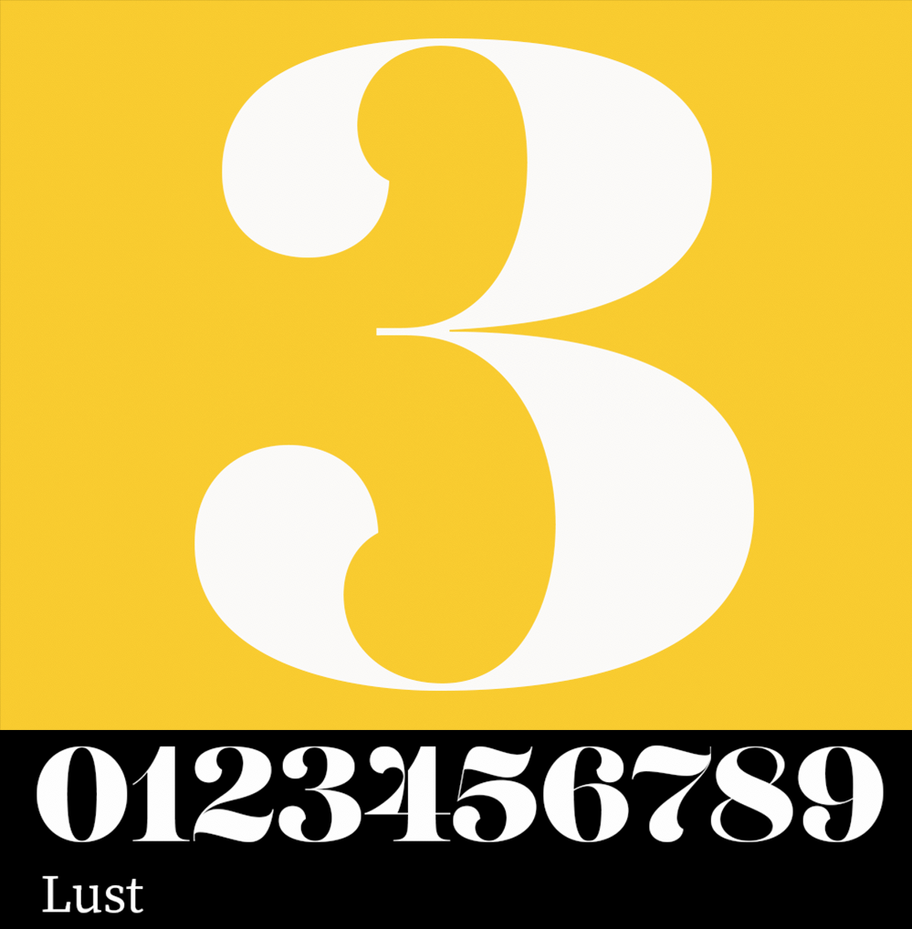
Lust has a number of different weights you’ll want to try out, but the uniting characteristic at all weights is the high contrast and wide counters. Look for a few alternate styles, too, on the 2, 5, and 8.
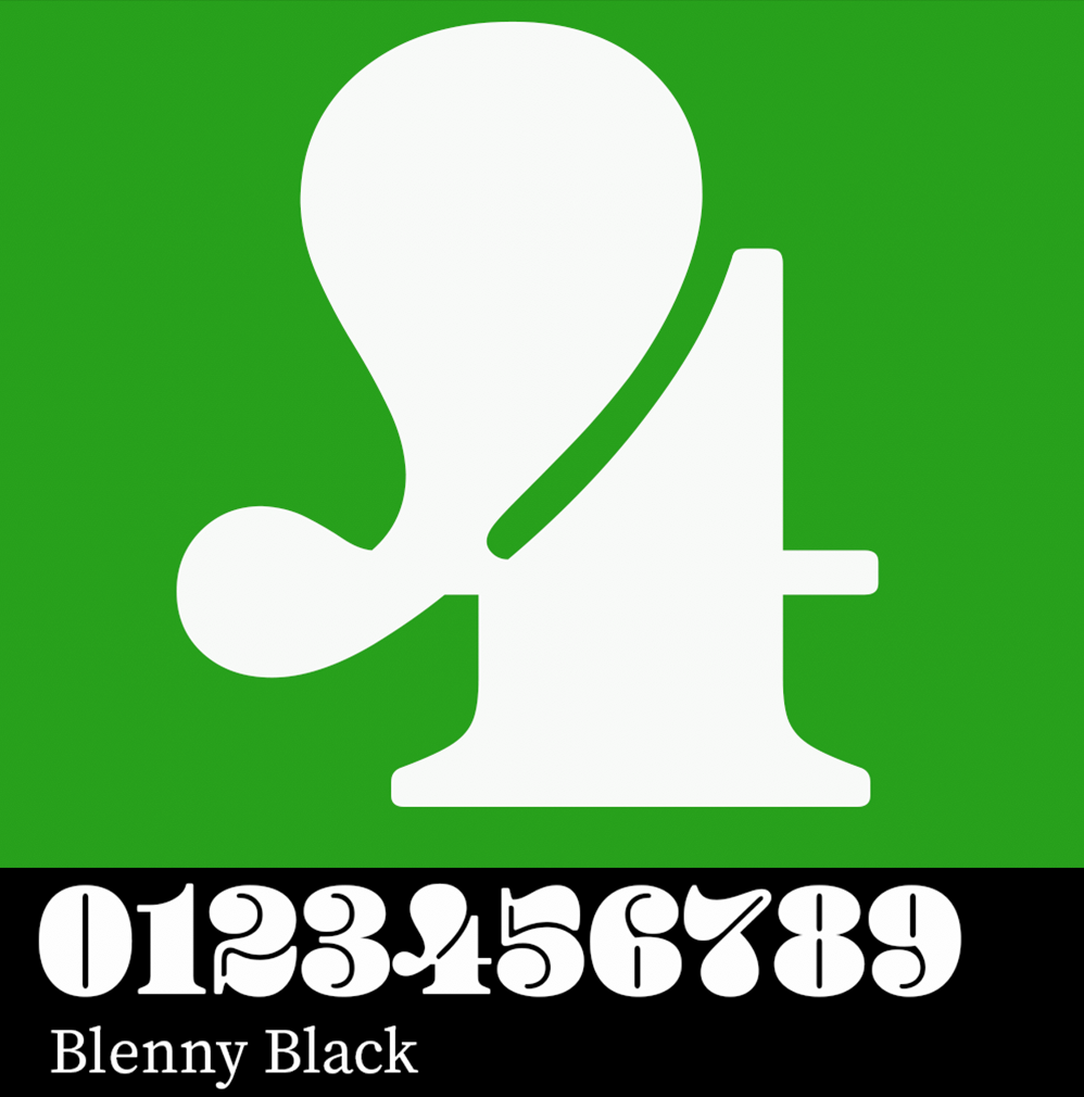
Always fun, Blenny will dominate anything else in your design and rightfully so. See even more of Blenny’s numbers on Meghan’s Advent Activism website.
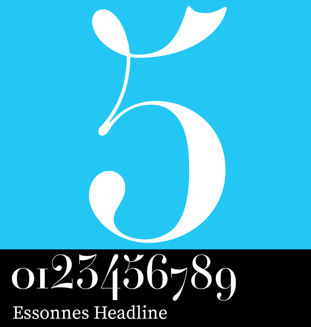
Essonnes Headline shows off the graceful lines of this typeface and would be a great choice for a dressed-up invitation. There are plenty of alternates to play with for this one, too — and don’t miss the Thin weight for slightly more whimsy.
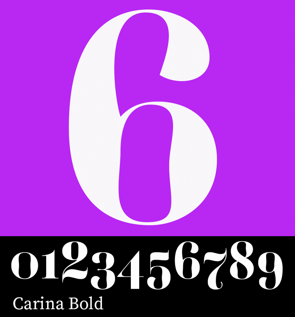
FF Carina numerals are striking on their own thanks to the unusual “wobble” in the counter. Oldstyle alternates are available for this one too, which can help blend numerals in with lines of text.
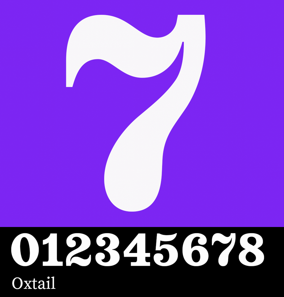
Oxtail should probably be on anyone’s shortlist for house numbers. We love the swooping curves here, and the big personality.
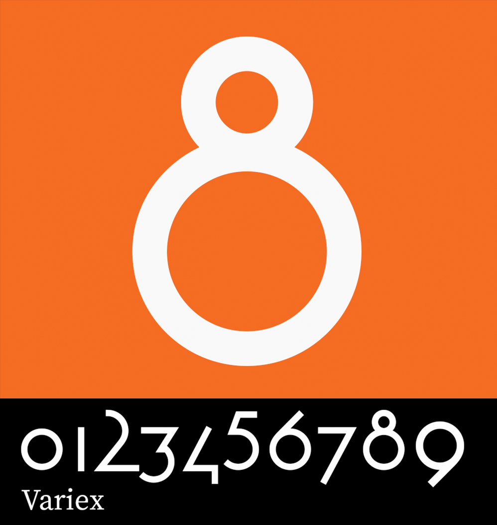
It can be hard to know where to start with a typeface like Variex, but looking at only the numbers is a neat exercise — especially when you run into an 8 like this one. Try increasing the weight size to see increasingly-abstracted versions of the shapes.
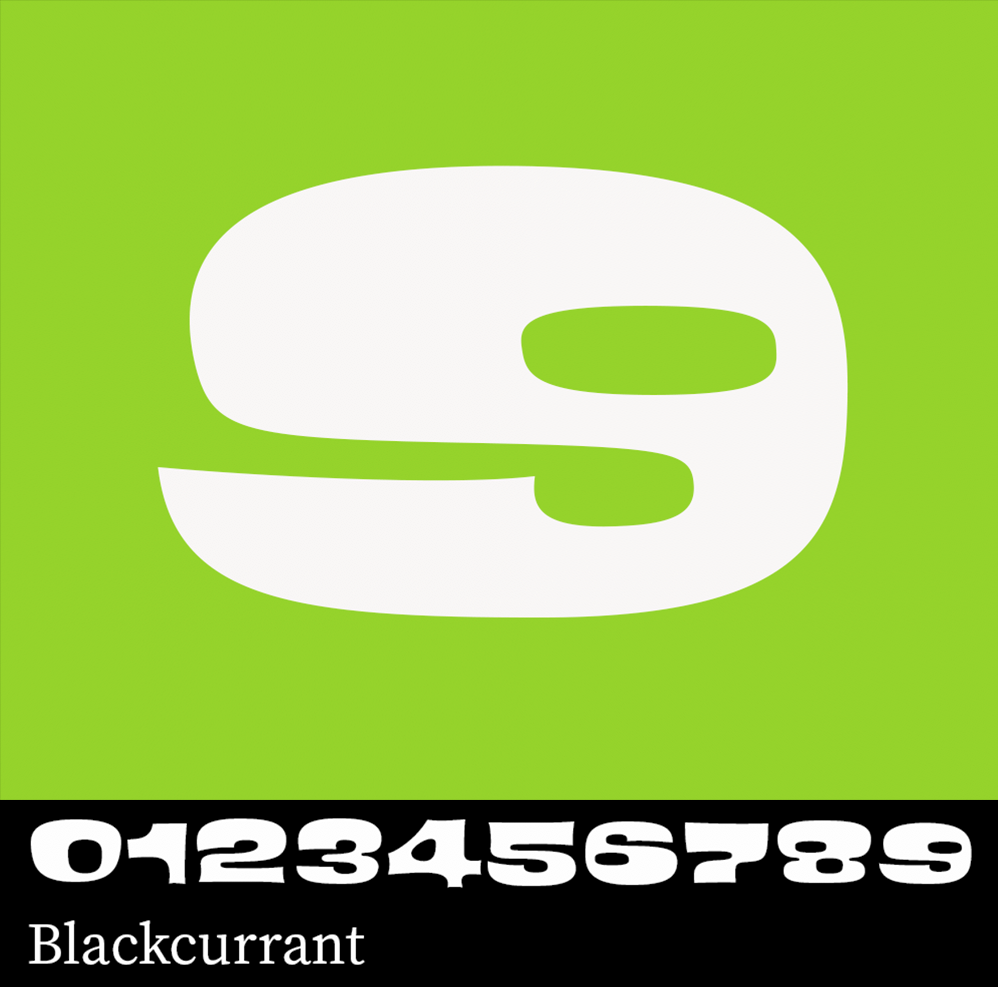
Blackcurrant is on its way to being a lava lamp, but that might suit the number 9 just fine. A little definitely goes a long way but there’s a lot to love about this unique typeface.
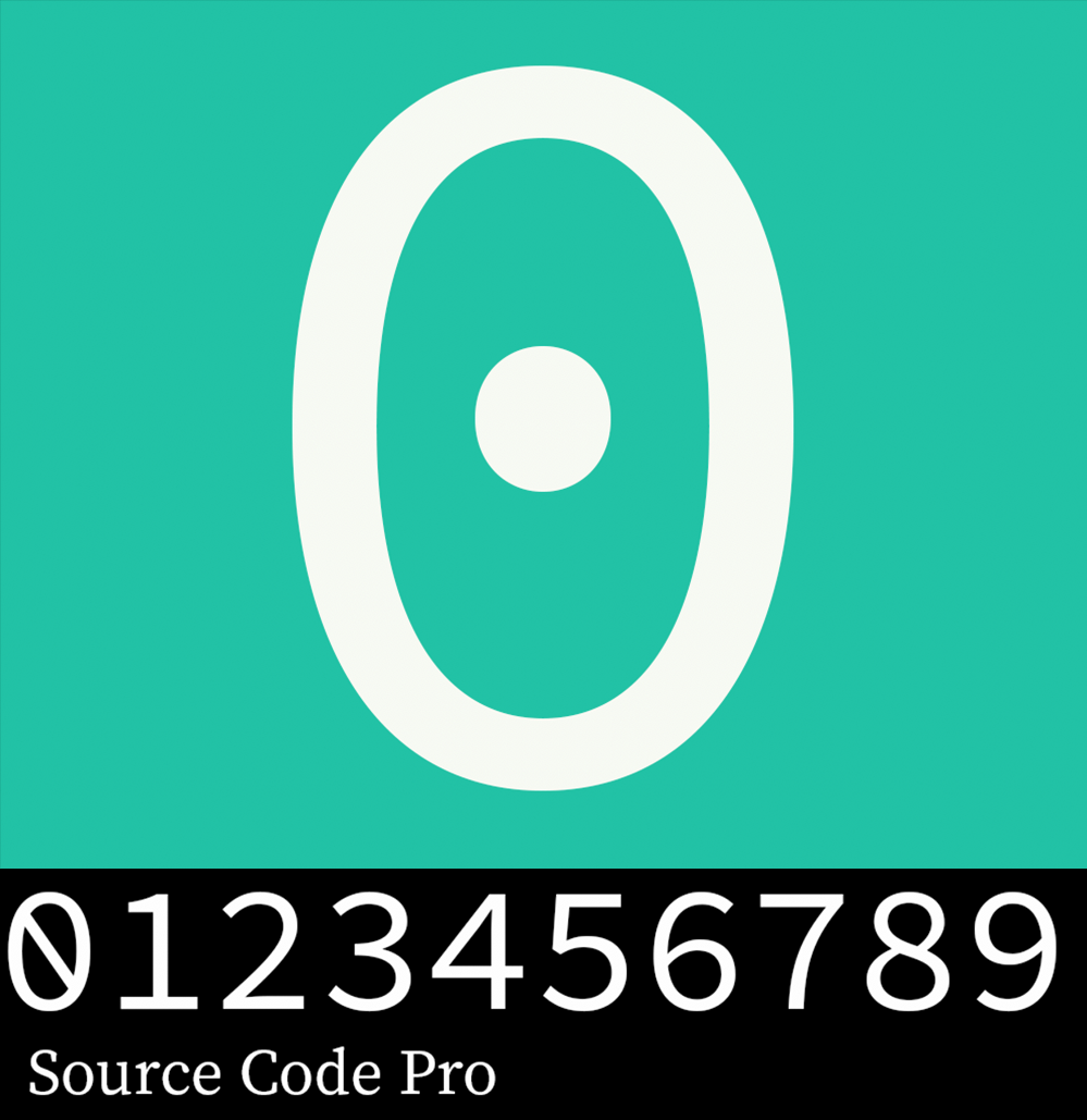
We used a decidedly undemocratic process for the type we’ve highlighted here, and Source Code Pro was a runner-up for choice zero. If the slashed zero is your jam, don’t fret — there’s an alternate to cover you here.
What are some of your favorite typefaces for numbers? Let us know here or on Twitter or Instagram — we’d love to see your picks!
4 Responses
Comments are closed.
hahah, variex makes me smile, merry christmas!
The old style numerals in Hermann Zapp’s Aldus typeface are actually great: https://i.imgur.com/lxc9RqH.png
(Zappf’s that is, of course.)
my favourite is Variex but all seems cool