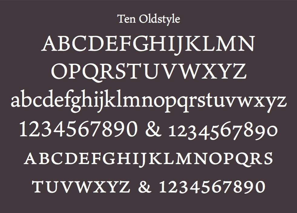
Introducing Ten Oldstyle
As type usage becomes increasingly globalized, type designers are increasingly called upon to extend the language coverage of their typefaces.
As a Western type designer, I’m often challenged to design non-Latin extensions for both new and existing designs. Because Latin has always been my initial focus, I’m used to adapting non-Latin scripts to work within Western typographic standards. In doing so, I seek to balance script compatibility with script authenticity. With the Ten Oldstyle project, the tables had turned, and I was now being called upon to develop a Latin roman design to accompany the new Ten Mincho font that was being developed by Adobe type designer Ryoko Nishizuka and the rest of Adobe’s Japan-based type team.
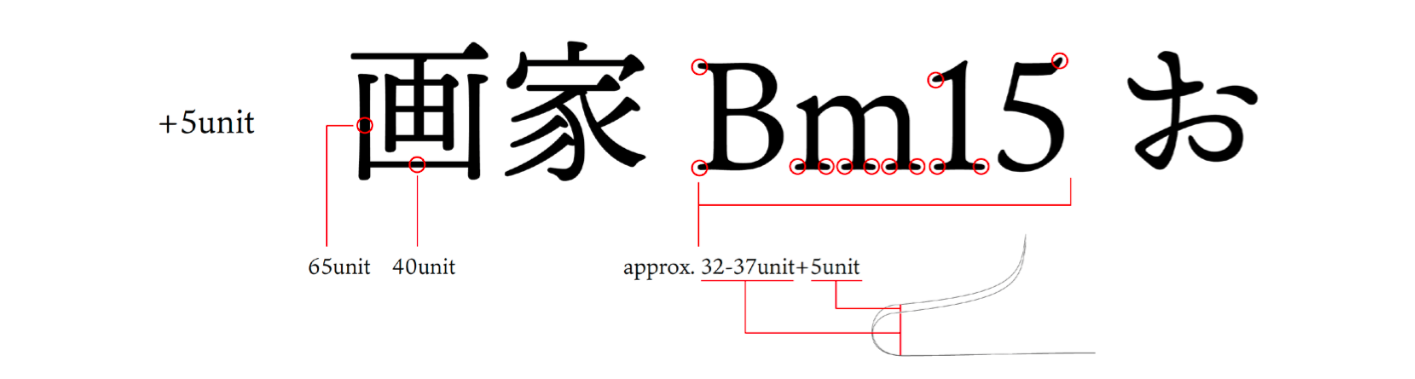
One of the challenges in designing a Latin counterpart for a Japanese font is to find ways to create a pleasing harmony between the two scripts when they are set together in text, while still aligning the Latin to the classical principles of Western type design. Unlike scripts such as Greek or Cyrillic, which have comparable design features and alignment zones for things like capital height and lowercase x-height, the Japanese alphabet has a significantly different single case square structure, and originated from a very different system of writing. In addition to needing to harmonize the Latin with the Japanese in a visual sense, it is important that they align in terms of typographic function and personality, given that they will be called upon to perform in identical typographic settings.
The Ten Oldstyle project began informally, when we were asked by the Japan team if we would be interested in producing a single roman font to accompany their new Mincho design. I had already developed a few trial Latin designs for another rumored Japanese type project, so when that project fell through, it made sense to use these fonts as a starting point for discussing the direction of Ten Oldstyle. Of the three trial designs, the Japanese team felt the most formal variation was the most promising, so I began to develop it as the working Ten Oldstyle design by modifying its features to embody more of the typographic qualities of Ten Mincho.
Initially, when we asked the Japanese team to describe the nature and functional uses of Ten Mincho, we received an email simply describing the font as being cute, mysterious, and ??? I didn’t really know how to interpret this information at the time, but from looking at the working design I could see that it possessed the formal characteristics of a text face, while also having a somewhat informal gestural appearance with only a moderate degree of stroke contrast. Ryoko later described to me in person the background of the design during a rare trip to San Jose to receive the “Founder’s Award” for her achievements at Adobe. She described Ten Mincho as being historically linked to the lettering styles used in the tile-block printed Kawaraban newspapers from the Edo period in Japan. These printed handbills were richly illustrated with animated caricatures of people and animals, and covered a topics ranging from the commemoration of social gatherings to the reporting of superstitious happenings and murders. Her description made the earlier more fanciful characterization more clear. The resulting Ten Mincho design harkens back to some of the spirit these handbills, and is being described as a general-purpose font for things such as advertising copy, book titles, and headings.
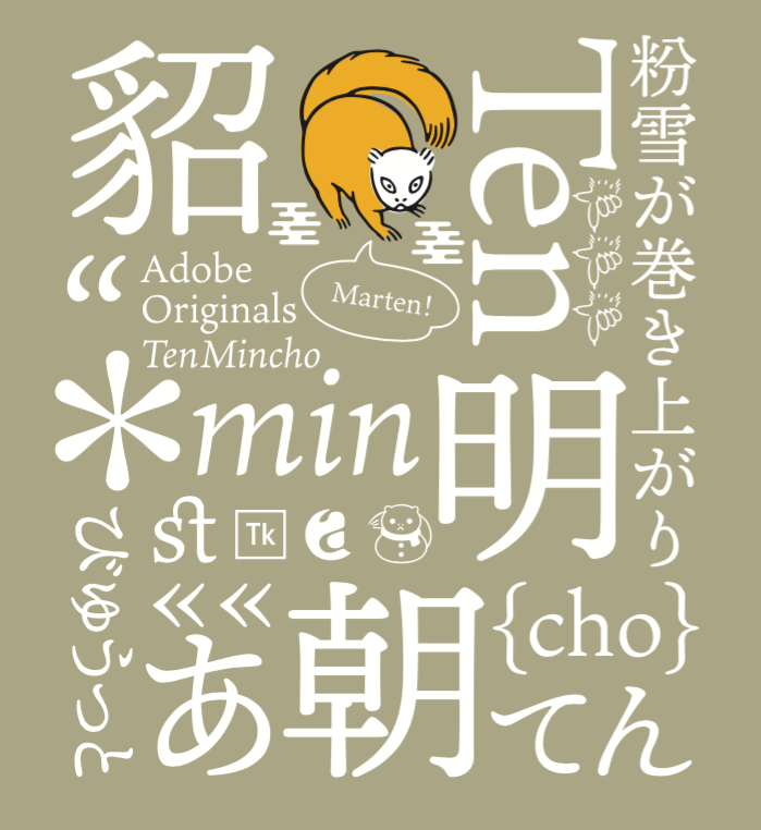
A promotional piece for Ten Mincho designed by Ryoko Nishizuka.
Given that Ten Mincho grew out of a rich calligraphic tradition of Japanese calligraphy, which is most often written with a pointed brush, I sought to imbue Ten Oldstyle with a comparable degree of calligraphic activity. Rather than mimicking the stroke style of Japanese calligraphy, I looked to the humanist writing tradition of the Italian Renaissance for inspiration. Even though these two writing systems have many opposing characteristics, including the writing instrument that is used to produce each script, they share similar organic properties derived from the act of writing, which acts as a unifying agent. The more formal upright manuscript hands of the later fifteenth century served as a direct model for early roman typefaces, and like these types, Ten Oldstyle exhibits much of the form and energy of humanist calligraphy. I also see Ten Oldstyle as possessing a lot of my own personal handlettering style, which helps give the forms added vibrance and depth. Finally, the design also embodies the soft-edge qualities and degree of contrast displayed in Ten Mincho.
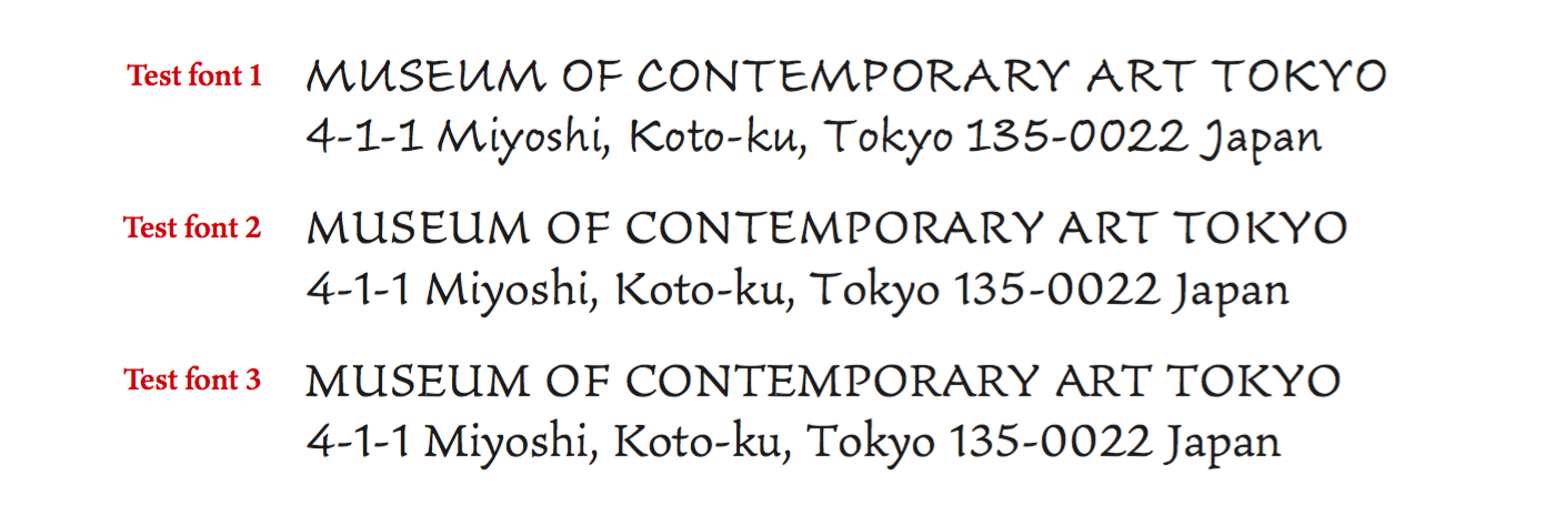
One of the early tests using Ten Oldstyle and Ten Mincho together.
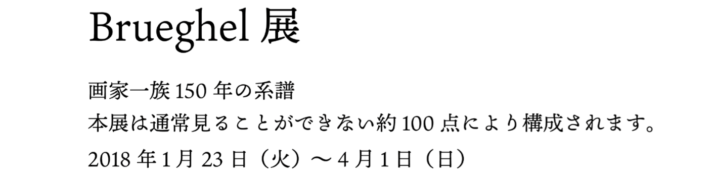
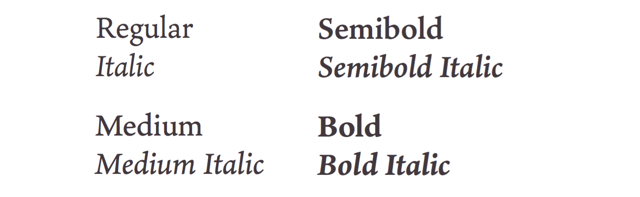
As the Ten Oldstyle design began to take form, I gave the design a weight axis, spanning from light text to bold, so that the Japanese team would be able to calibrate the weight and relative size of Ten Oldstyle to best match Ten Mincho according to their specifications. A set of italic designs soon followed, and while Latin italics aren’t necessarily a requirement in multi-lingual Japanese typography, they add another dimension of depth and functionality to the project.

James Thomson, The City of Dreadful Night (excerpt). Written between 1870 and 1873.
While most of the design development occurred without much interaction with the Japan type team, there were two noteworthy instances where I made revisions based on their input. The first was to replace the question mark with a more conventional form that would be more recognizable to a Japanese audience. The second revision involved adding a small amount of weight to the serifs to reflect a late design modification that was made to Ten Mincho.
Ryoko’s diagram which accompanied the Japan team’s request that the serifs be made slightly heavier.
With Ten Oldstyle now taking the form of a small type family, it made sense to also release it to a Western audience as a four weight family with matching italics. The end result might be described as a low-contrast semi-formal book face–a style which isn’t all that common among oldstyle fonts. These traits lend themself particularly well to reading on-screen text, especially when the content is of an expressive nature.
All in all, the project went very smoothly, and it was a nice reprise from some of the larger projects I’m currently involved with. It was also rewarding to work on a project that was tailored to a specific purpose, in which the project requirements often call for one to seek out new creative solutions. I’d like to thank everyone that was involved with the project, including the talented and very pleasant Japanese type team; David Lemon who helped to initiate the project, Dan Rhatigan for his ongoing advice and support; Miguel Sousa for lending his technical expertise, Ken Lunde for acting as a technical contributor and intermediary for the two groups, and finally to Ernie March who cheerfully took on the final production tasks, including testing and mastering the family.
Ten Oldstyle is available for sync and web use on Typekit and can also be purchased on Fontspring.
4 Responses
Comments are closed.
Your project is a marvelous idea and deals with a common problem in countries that use non-Roman scripts (such as Japan). For foreign visitors, signs on streets or rail stations and menus in cafes mean absolutely nothing. They can’t even say the word, much less figure out which subway train to take.
The obvious fix it to place a phonic form of the word beneath in Roman characters. That works especially well with place names. That’s where including Roman characters with a non-Roman font makes sense. The Roman characters can be designed to go well with their non-Roman counterparts.
—-
There’s another area where font sets are an issue at Adobe. I do science books and find Adobe Typekit frustrating. Last time I checked, I couldn’t find any way to search for fonts with a scientific/math character set. It should be as easy to search for as a serif font. It’d be great if more of your font sets included specifically scientific characters or at least that there was an easy way to locate those that do. It’s also be helpful if you distributed specifically scientific font sets such as the open-source STIX font.
The “???” In the original Ten description was “nostalgic”. Wonderful to see this out in the world now!
Another lovely piece of work from one of the modern masters of type design. Always fascinating to read about the design process, thank you!
The calligraphic flavor (particularly in that lowercase z!) is charming, and the tantalizing bits of process story leave me wanting more. Is there any chance of supplementing this post with an image of the original question mark mentioned?