An interview with Dr. Fiona Ross
Fiona Ross has played a crucial role in the type industry throughout her career, and it is largely thanks to her work that type designers and developers have been enabled to make innovations in non-Latin type design — though she would be quick to add that there is still a ways to go!
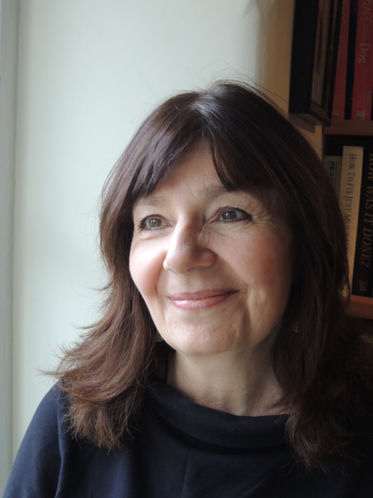
Fiona Ross. Photo by Rod Hollom.
Fiona Ross began working at Linotype (UK) in 1978 and eventually headed up their non-Latin Typographic Department — becoming the first woman manager at the company. The designs that came out from her department went on to become some of the most widely-used type designs in the world. The population that reads Bengali, for example, is about the same size as the population of the United States, and Devanagari even larger than that.
We were delighted when Fiona agreed to answer a few of our questions about her fascinating career and her work on non-Latin script designs.
Was there a clear career path when you started out at Linotype, or were you playing things more by ear?
I began as a Research Assistant at Linotype, but there was no clear career path. I had a background in Indian languages and literature, but I did not specialise in Indian-script typefaces. My first task was working on Arabic font layouts, but I became increasingly involved in the design of Indian-script typefaces, thanks to my background and the openness of Walter Tracy and Matthew Carter to listen to — and in fact, seek — my opinion regardless of my age and typographic inexperience. I was very conscious of the mismatch between the beautiful literature and Indian scripts on the one hand and their often poor representation in print on the other.
I eventually headed the Department of Typographic Development at Linotype, which included the Design Studio. There, we designed original Indian and Thai typefaces and also worked on and produced Arabic typefaces in conjunction with calligraphers or external designers.
You are a prolific writer regarding non-Latin type design, in more than one instance “writing the book” on certain topics. How have you typically balanced academic research with learning from the field?
My research informs my practice, and vice versa. I rely a great deal on primary sources — for example, archival materials such as those in the Non-Latin Type Collection at the University of Reading, and also authoritative secondary literature on allied disciplines. In teaching I have always advocated that students develop a research-based design methodology suited to their interests. Such a methodology enables one to make informed design decisions.
Do you often get the opportunity to see your type designs in use?
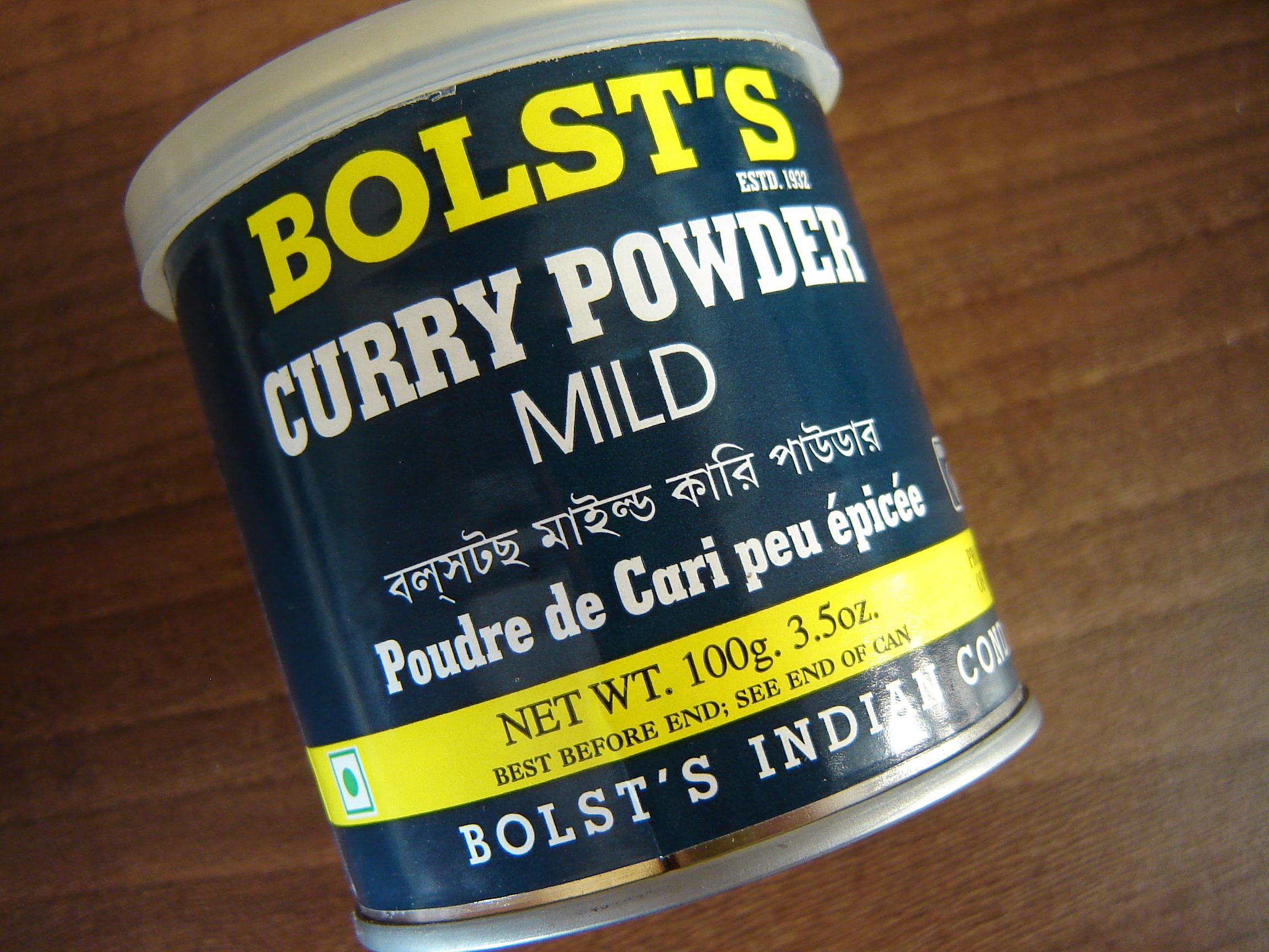
Yes, indeed. Particularly in India but also elsewhere, like the UK. Uses include airport signage in India, on a tin of curry powder, US party election literature, and even on a corner shop’s facade in Zürich. I am especially pleased to see my work in daily use in Kolkata’s leading newspaper and in the volumes of the Murty Classical Library of India.
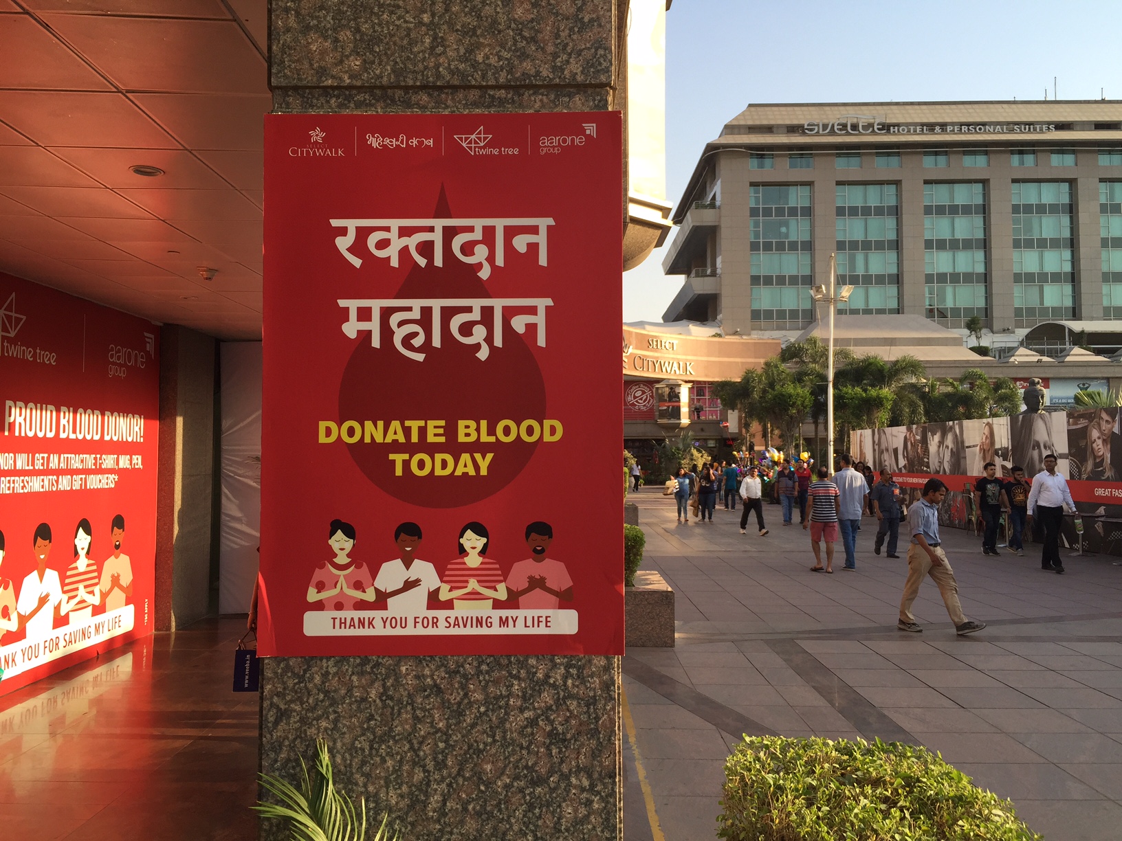
This instance of Bengali was found in the UK, but Ross adds, “Multiscript labelling is very common in India. The Indian banknote itself has 17 languages in some 11 scripts, including Latin.” Photo by Jo De Baerdemaeker.
One thing you’re well known for is the all-female core team that worked under you at Linotype. As you assembled this team, you made the decision to hire university graduates instead of teenagers for type drafting. What impact did this have on the department and its output?
It wasn’t deliberately an all-female core team. It was deliberate that I took on graduates – interestingly, Walter Tracy advised me against this. He was concerned they would question me! It was my belief that we would benefit from interrogating our work in order to achieve high standards, which we did. Against company expectations, we women continued to work together for many years – over a decade.
Did having an all-female team affect the way other teams at Linotype interacted with you?
Linotype was unused to women graduates – there were not that many graduates at Linotype when I started – and we had to deal with some unwelcome attention and remarks on a daily basis, particularly at the beginning of my time there. My response was simply not to engage with these remarks – silence can have a remarkably strong effect – and to continue to treat whoever we were talking to with the respect with which we wished to be treated. I believe there was some notion that people shouldn’t ‘mess with Fiona’s crew’. We did our jobs well, and through this earned respect from colleagues in other departments; the clients liked the designs, our beta testing procedures were thorough, and the fonts worked.
Hindi alongside Latin text in the volumes from the Murty Classical Library of India. Photo by Vaibhav Singh.
It sounds like mentorships and relationships were key drivers for your career. How would you encourage students to grow similar relationships in their own careers?
I think the world has changed considerably since I began on this path – there were no type design courses then! Students can develop a good network of relationships to grow their careers and their knowledge in this field with type design courses, type-related conferences, and mentoring assistance as provided by groups like Alphabettes. I do recommend building relationships with like-minded people to develop a supportive network.
Are there any historians you’d particularly recommend students follow or study?
The late Bapurao S. Naik’s Typography of Devanagari is an invaluable resource. I would say that Graham Shaw is an excellent historian on the printing in South Asia; look for his histories of South Asian print cultures. For Arabic resources I recommend Titus Nemeth’s website, especially his essays and his PhD thesis. He recently uploaded an earlier article of mine about when I worked at Linotype.
Adobe Devanagari in use on posters in Delhi, October 2015. Photo by Neelakash Kshetrimayum.
Who have you drawn inspiration from?
The designer Tim Holloway in particular, with whom I have worked for over 30 years. He produces the most beautiful drawings and has always been able to interpret faithfully my intentions into type forms. I also draw inspiration from manuscripts, like the Rani Jindan at the British Library that inspired the Murty Gurmukhi typeface that John Hudson and I recently designed.
Foundry type can also be a source of inspiration, and I always work collaboratively. Along with the highly talented Neelakash Kshetrimayum, we have designed a new Bengali design inspired by a foundry typeface. John Hudson produced the typeface with us, and we have just delivered to the renowned publishing house Ananda Bazar Patrika.
Can you say more about working collaboratively? Do you think there’s a misconception that type design is a solitary practice?
I am not trained in art or graphic design, but come from a languages background, and was lucky to find a most gifted artist in Tim Holloway, with whom I have collaborated on many typefaces. Our skills seemed to complement each other, and this is something I have also experienced working with others on more recent projects.
Most scripts that I work with have quite an extensive character set and – apart from design, linguistic or technical skills that may get pooled – it is always helpful to have other eyes reviewing the work as it progresses. Type design is an iterative process.
There are nowadays an increasing number of multi-script projects that again utilize different people’s specialized skills but also require a team approach in order to deliver the fonts within a reasonable amount of time — for example, the Nirmala UI typeface project I worked on with Microsoft.
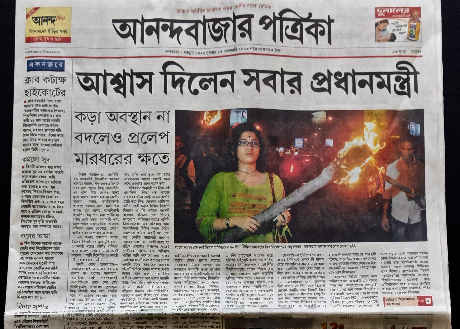
Bengali in use in one of Kolkata’s leading newspapers, Anandabazar Patrika. The headline is the first showing of the recently-designed ABP Extra Bold typeface by Neelakash Kshetrimayum and Fiona Ross, 17 February 2016; body copy Linotype Bengali. Photo by Rod Hollom.
What are you most excited to see the type world take on next?
I would like non-Latin scripts to achieve parity with Latin in terms of quality and choice – then the term ‘non-Latin’ could become completely redundant! For instance, I would like to see authentic script representation on mobile phones so communities would no longer need to transliterate into Latin script in order to send readable text messages.
I think there are now a great many exciting new developments as type design and type-making tools have become more reliable and accessible, and the software for textual composition is more favorable to non-Latin scripts. I would like the latter to develop more so that some features we would like to introduce into typefaces can be realized.
It is an exciting time to work in this area: while so much remains to be done, so much more can be done. I consider myself very fortunate to continue working in this field with talented designers from around the globe, some of whom were my former students and are now my colleagues!
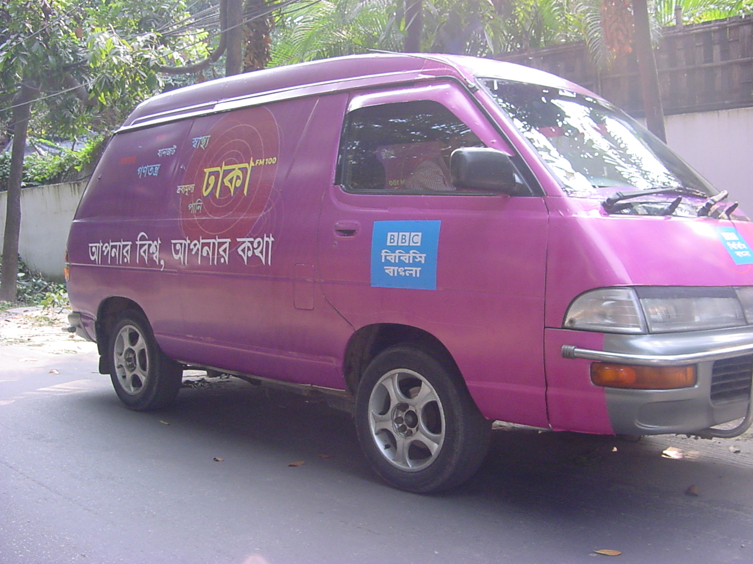
Minivan covered with graphics promoting BBC World Service radio in Dhaka designed by Rathna Ramanathan and Dan Rhatigan. This uses the ubiquitous Linotype Bengali typeface designed by Tim Holloway and Fiona Ross. Photo by Dan Rhatigan.
Thanks so much to Fiona for her participation. If you’re feeling as inspired as we are by her career and want to learn more, you may find her recommended resources a useful starting point.
One Response
Comments are closed.
This is one of the great interviews! Thinking about how hard is for a woman there! Well done!