Designing Trajan Color Concept
One of the new features added in the recent release of Photoshop CC 2017 is support for OpenType-SVG fonts — a special flavor of OpenType that allows the use of color and pattern effects built right into the font file. This version of Photoshop includes Trajan Color Concept, a new typeface designed to show off some of the possibilities of the format. We’re now happy to announce that Trajan Color Concept is also available on Typekit for sync and web.
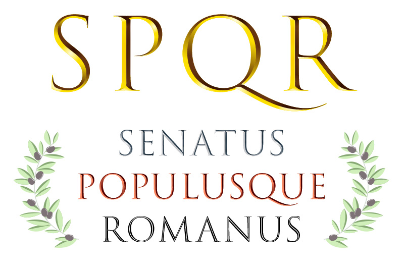
Trajan Color Concept is one of our Adobe Type Concepts: an experimental typeface developed with a scaled-down character set so that we can get it in front of adventurous customers. Based on Carol Twombly’s iconic Trajan from 1989, this ambitious update was designed by Sérgio Martins beginning while he was an intern with the Adobe Type team. We spoke about the project with Sérgio, now working as a designer in Portugal.

Sérgio Martins
Can you tell us a bit about your background?
I’m a 25-year-old designer from Lisbon and, as of November last year, I’m also an MA graduate in editorial design from IPT (Polytechnic Institute of Tomar) in Portugal. I first became passionate about type during my BA student years, although my interest for the written and printed word dates far back, to when I was a kid. For the last four years I’ve been looking to learn and educate myself more about typography. During this whole time I’ve had several odd jobs, although since 2015 I’ve been focusing on type a lot more.
What was your role at Adobe, and how did you get involved with Trajan Color?
I was at Adobe in San José for six months, as part of an internship for my MA. Before arriving, I’d talked to Miguel Sousa a few times and we’d discussed the possibility of developing a color font. The team had been discussing Trajan as a basis for the project for its historical value – both to Adobe Type and as an iconic revival of Roman capitals – and I was quite happy to work on such a famous (sometimes infamous) typeface.
What was the collaboration like with Robert Slimbach and Miguel Sousa?
I’d met Miguel before, in Portugal, but wasn’t quite sure of what to expect from Robert – I knew the name, of course, but barely anything else. Fortunately they both proved extremely helpful, although in different ways. From the beginning Miguel helped guide the direction of the project, while Robert provided more technical feedback relating to the fidelity of the design, or feedback from an outside perspective – a fresh pair of eyes, so to speak – as it is easy to get too attached to your own design. Although we disagreed a few times, I’m happy to say those were productive discussions that lead to significant improvements.
The whole team was quite patient with all the “whys” and “hows” and my attempts to discuss new solutions. The flat inline, in particular, proved quite challenging, if rewarding. I originally suggested an inline style as a fallback for the colored sets, more like the drawing one makes when carving letters in stone. Through experimentation and lots of feedback on the results, it eventually evolved to its present iteration.
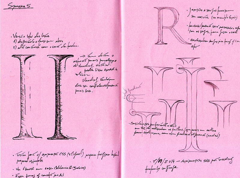
Sérgio’s early sketches for Trajan Color.
How did you feel about working on such an established design as Trajan?
I quite enjoyed it, although at the beginning I was a bit shy about altering Trajan. I didn’t quite know how to tackle this particular project, mostly because Trajan is very distinctive and has some “baggage,” whether you like it or not. I ended up throwing away some of my preconceptions about Trajan and shifting the focus from the flat design to the color aspect, since this was its own project and not an extension of Trajan Pro. Once again, being able to talk and discuss ideas with members of the Type team helped.
Once I got past my initial shyness with Trajan, most of my challenges could be attributed to inexperience — not just my own as a type designer, but concerning the practical implementations of the OpenType-SVG format. After all, when Miguel and I first discussed the subject, there was barely anything done with the format. Still, the inline proved to be quite difficult to fine-tune, prompting a different approach from the rest of the project. We took several liberties with the original outlines of Trajan for that one — and it turned out great!
What are your favorite parts of the new design?
Funnily enough, the bits I enjoyed the most were the adaptations to the outline to suit the needs of the color versions, and the new inline style. I like the metallics, but if I had to pick my favorite part of the finished design (is any design ever really finished?), it’s definitely the inline. It’s just so rewarding seeing it all together!
What kind of projects do you hope to work on next? Is there more color font development work in your future?
For now, I’m exploring my own capacities and limits, pushing myself further. In a way, that’s what this whole project gave me — new boundaries. Still, Trajan Color Concept shows only a small part of what is possible with OpenType-SVG, and color font formats have much untapped potential. I definitely haven’t ruled out going back to color fonts.
Thanks to Sérgio for taking the time to answer our questions!
If you’re ready to see Trajan Color Concept for yourself, it’s now available on Typekit for web and sync — and be sure to check out our documentation on working with OpenType-SVG fonts so you can untap its full potential.
Also, don’t miss seeing how Trajan Color is showcased on our new Color fonts demo page, designed by Nick Sherman. As Sérgio said, there’s a great deal of untapped potential for color font formats, and we’re excited to contribute towards its development here at Adobe.
One Response
Comments are closed.
As a graphic designer I am always interested on others designer. Obviously the designer who involved with Trajan Color I will more curious about them. Thanks for sharing this Interview.