New fonts on Typekit from OH no Type Co
Just a year after James Edmondson founded OH no Type Co. here in San Francisco, we are excited to announce that his foundry’s typefaces are now on Typekit!
The foundry’s name playfully echoes the presumed reaction of the type industry — not another foundry! (Insider’s secret: O H n o also happen to be the most basic control characters type designers use for spacing.)
We are including the complete OH no catalogue in our library: Hobeaux, Hobeaux Rococeaux (both by James Edmondson), and Viktor Script, a joint effort between Edmondson and lettering artist Erik Marinovich.

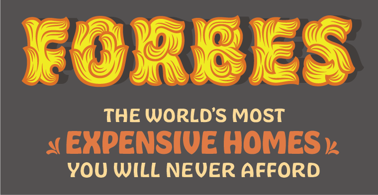
Hobeaux Rococeaux & Background (top), Hobeaux (“Expensive Homes”), and Hobeaux Rococeaux Sherman.
Hobeaux
James was captivated by Morris Fuller Benton’s Hobo during graduate school. Much to the dismay of his teachers, he decided to explore and expand the original design. After spending many months with Hobo, what transpired was a completely new design. Hobeaux still perfectly embodies the whimsy of Hobo, with its complete absence of straight lines, angles and descenders — and it adds the refinement of a modern, skillful digitization and sophisticated OpenType features.
Hobeaux Rococeaux
James’ explorations on Hobo went far beyond the source material. Among other stylistic experiments (wood log, script, or cat versions), he sought to create a decorative version inspired by Paul Carlyle’s Carlyle Roccoco. The painstaking process of drawing each character with its intricate ornamentation paid off. Hobeaux Rococeaux is a display showhorse, and a joy to admire. Style variants include a compact version of Hobeaux called Sherman, which can be used for smaller text, and a background layer for colorful typesetting. I dare you not to grin when you look at these letters.

Viktor Script with Hobeaux
Viktor Script
Erik Marinovich sought to create a quirky and casual script inspired by the vibrant signs he passed in the Mission district of San Francisco. After several hundred ping-pong iterations of Erik delivering drawings and James turning them into vectors, Viktor Script emerged. It is a real pleasure to use; the large flourishes of the uppercase letters spice up any headline, while refined OpenType features keep longer text settings harmonious. Last but not least, Viktor Script comes with a number of dingbats and symbols, many of which we are still trying to make sense of.

Dingbats from Viktor Script. (Specimen from ohnotype.co)