New fonts in the library from JTD and TypeFolio
We have two great new families in the library for you: Essonnes from JTD and Capitolina from TypeFolio. All of the fonts are available for web and sync. Let us know what you think!
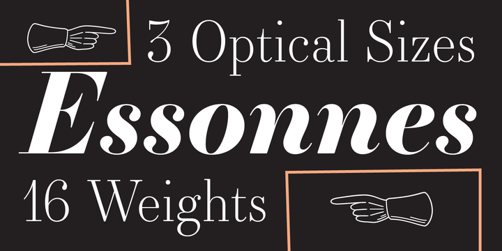
Essonnes is a reinterpretation of the Didot genre, updating a classic and beloved form to fit in with modern 21st century needs. James Todd has succeeded in creating a very legible and wide-ranging super family; the Headline, Display, and Text subfamilies each include multiple weights. In providing utility, he still manages to enhance the elements that make this genre so unique. Look for the alternate lowercase g, which was one of the first shapes to inspire him in this project. Check out the Essonne website or the JTD foundry site for even more detail and historical background.
(Speaking of fonts from JTD, we have now made Garvis available for sync use — enjoy!)
Capitolina, by Christopher Hammerschmidt and Marconi Lima, was developed with editorial use in mind. The narrow ink traps etch deep into each letter to create an almost handwritten quality, counteracting the sturdy serifs. The lighter weights lend themselves well to text use, while the heavier ones look great at large display sizes — as TypeFolio’s specimen above demonstrates. There are ten weights to play with, ample OpenType features, and extensive language support; see the Capitolina profile on Behance for a full walkthrough of all the great features in this typeface.
Enjoy the new additions to the library — and let us know where you use them!