New fonts: Anisette and Retiro, Macho, and Museo Sans Display
This week on Typekit: more new fonts! This round is brought to you by a few of our long-time partners: Typofonderie, Dada Studio, and exljbris. Without further ado:
Typofonderie, led by Jean-François Porchez, is a master of producing elegant typefaces with a particular Western European distinction. We’ve added two more families that fit that bill: Anisette and Retiro.
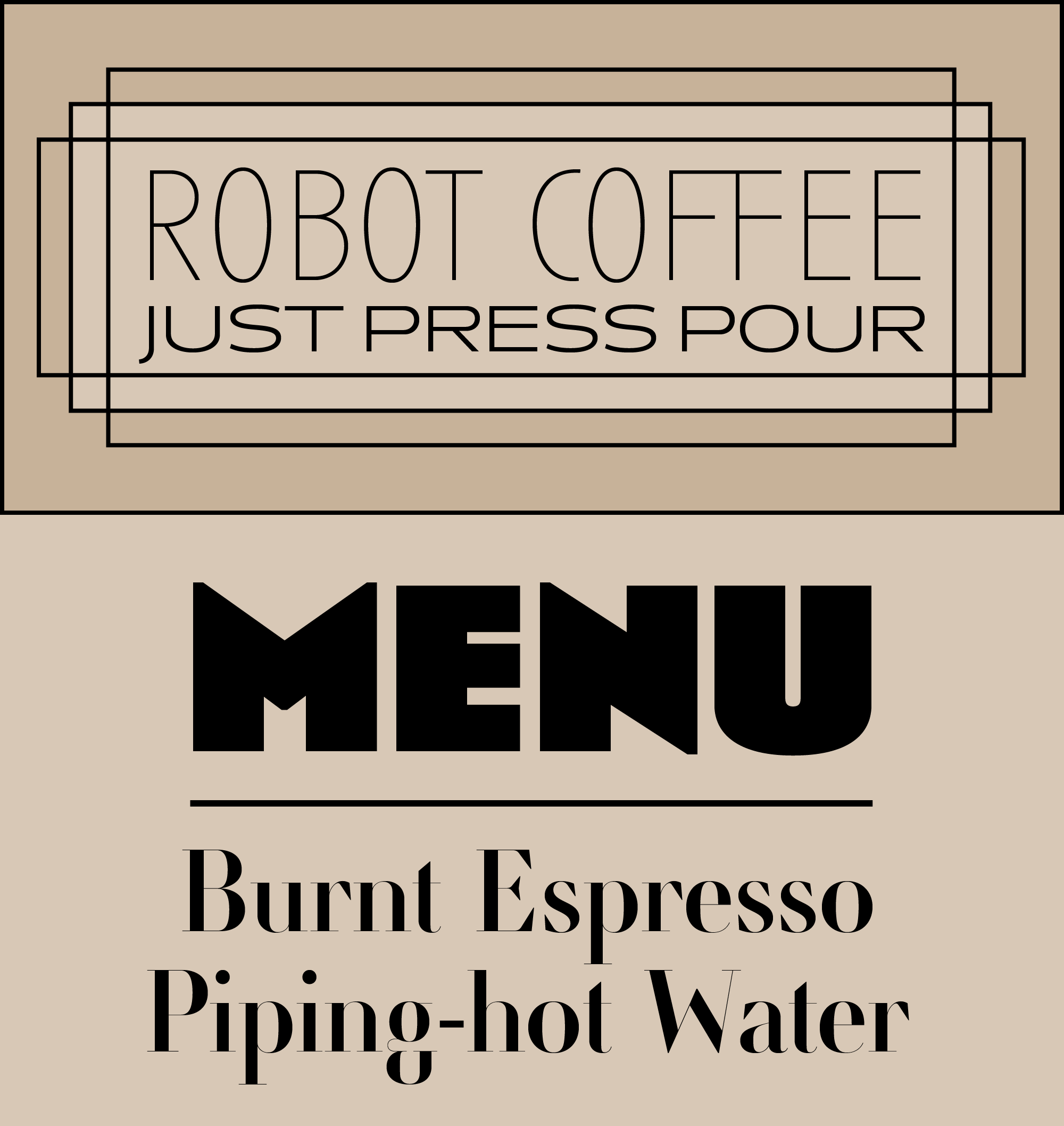
Anisette Std is an Art Deco display sans that contains two widths of capitals in each font. Its capital forms contain a wider design, while the lowercase characters produce a narrower set of caps. The Pro version of Anisette, available at Typofonderie.com – Anisette, also contains a bevy of playful cap ligatures. If you need a compatible text typeface with true lowercase, check out Anisette Std’s sibling, Anisette Std Petite.
Retiro is also a display face, a high-contrast serif design of the Didone variety. Originally designed for a Madrid publication, the Pro version of Retiro (found at Typoefonderie.com – Retiro) contains ornate alternate capital forms with Spanish influence. Retiro Std, now available on Typekit, is available in five optical variants, each named for the intended point size at which they were designed to be set. The biggest difference is in the hairline horizontal strokes: they’re ultra-light when set at larger sizes, and a little sturdier at smaller point sizes.
Anisette Std and Retiro Std are both available for web only.
Macho from Dada Studio.
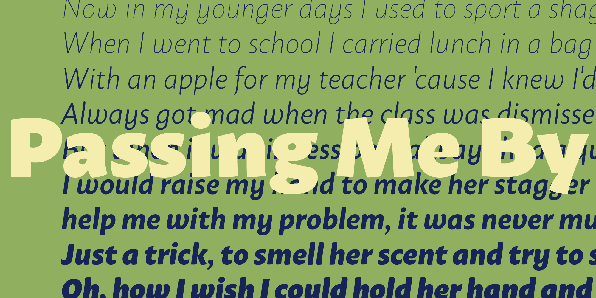
Macho, the most recent release from Poland-based Dada Studio, is an energetic sans with an almost graffiti-like script influence. Semi-rounded and unconventionally angled terminals lend to a sort of clumsy warmth — unrefined, but confident and bold. Available for web and sync, Macho is full of OpenType features like Small Caps and Stylistic Alternates, and supports Latin Extended as well as Cyrillic in all 18 styles.

Museo Sans Display from exljbris.
Museo Sans from exljbris is a longtime stalwart of web design, and has long been one of Typekit’s most popular. Museo Sans Display is a fresh addition to the family. Even in the extreme Hairline and ExtraBlack weights, Museo Sans is mostly restrained and neutral, though the large x-heights and moderate ascenders and descenders push it toward the informal.
2 Responses
Comments are closed.
Hello, how to use fonts locally?
I’m working on a site and I’m trying to use some fonts off TypeKit.
In the Kit settings, I’ve set the Domains to localhost,127.0.0.1 but I still fail to see them when I view my working page in the browser.
I’ve looked around online but can’t seem to find an answer.
Thanks
Hey Reynald, our support team will be able to help you with this: please email support@typekit.com.