Sites We Like, Brew Edition: Verdant, Modern Times, Stone, & Almanac
This week, we’re toasting the arrival of spring (and the weekend) with some brewery websites that caught our attention. Cheers!
Verdant Brewing
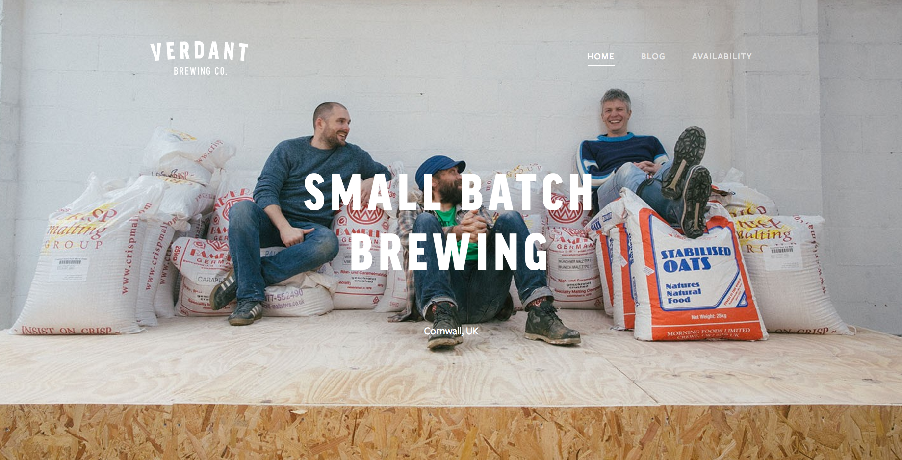
The website for Verdant Brewing in Cornwall was designed by our own Jake Giltsoff, and features FF Good Headline Pro Condensed for the header, DIN Condensed for subheads, and Freight Sans for the body text.
Modern Times
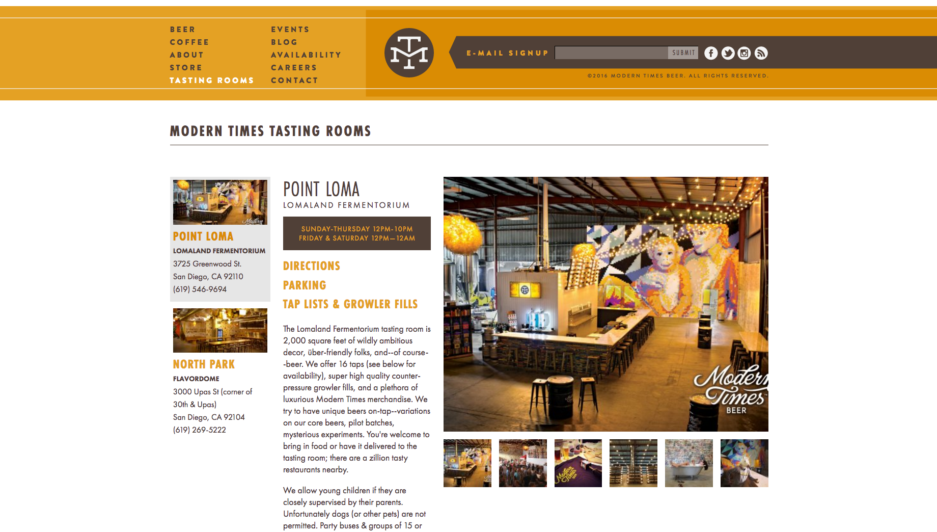
Modern Times combines Futura PT with its close cousin Brandon Grotesque on their website, and it works — thanks in part to introducing Futura PT Condensed for some variation in the headers.
Stone Brewing Co
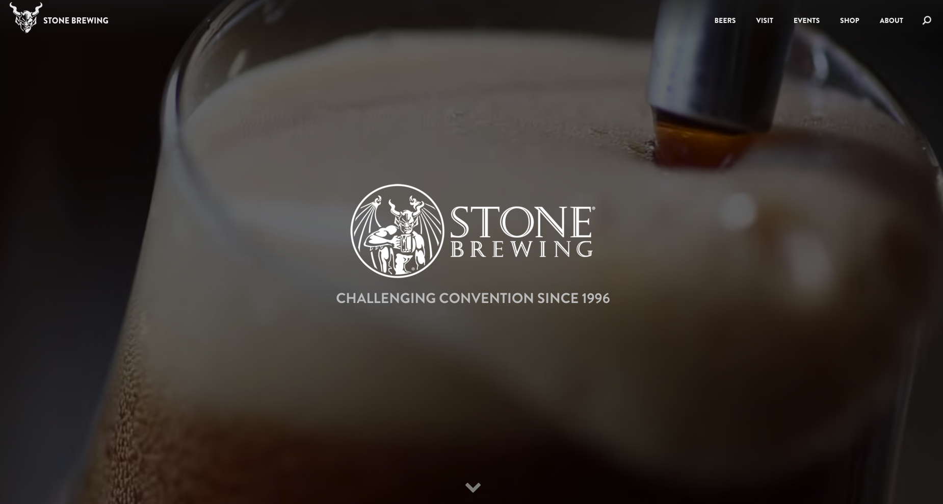
Stone Brewing Co goes all in for Brandon Grotesque on their opening page and navigation throughout, establishing a clean and consistent aesthetic. They pair this with Roboto for the body copy.
Almanac Beer Co
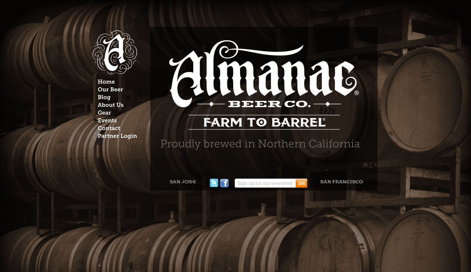
Almanac sets their web copy in Museo Slab, whose strong serifs — nearly reminiscent of a typewriter font — are a good match for the brewery’s intense logotype.
That’s it for this week; share sites you like in the comments!